Trends in Paint Colors for now and the year ahead…
I always love to hear from past build clients so when one recently reached out to me for advice on painting accent wall colors I was happy to put something together for them! Here’s the most current trends I have seen for adding an extra splash of color to your decor!
Black and Grays
Most clients have a lighter more neutral base color in their home. This makes it easy to experiment with a bolder darker color on one wall or even in one room. Take for instance the trend towards charcoal grey or black in the flex room.
Get a similar look with Sherwin Williams 7069 Iron Ore, 7068 Grizzle Gray or 7674 Peppercorn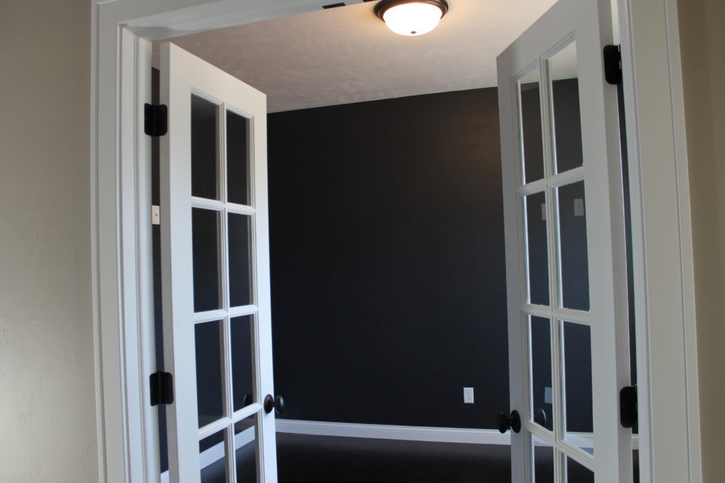
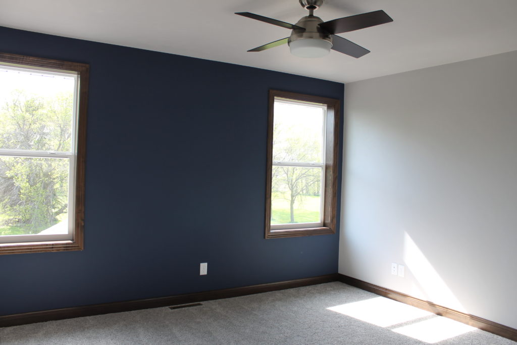
Navy Blues
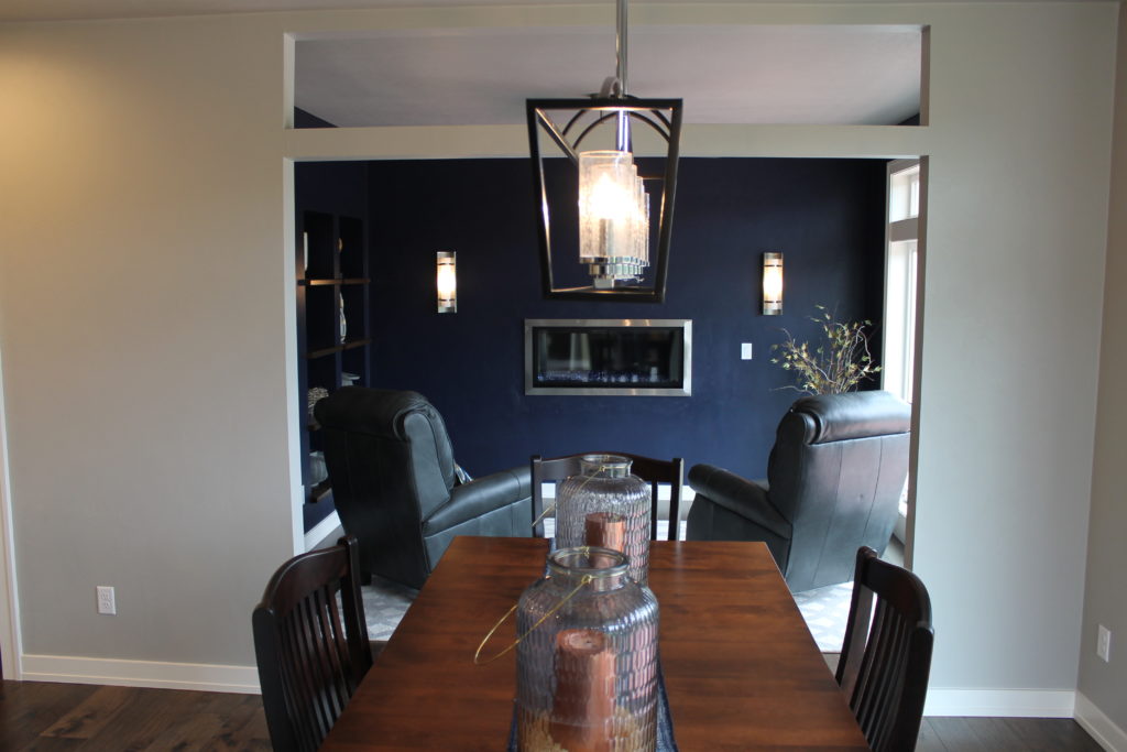
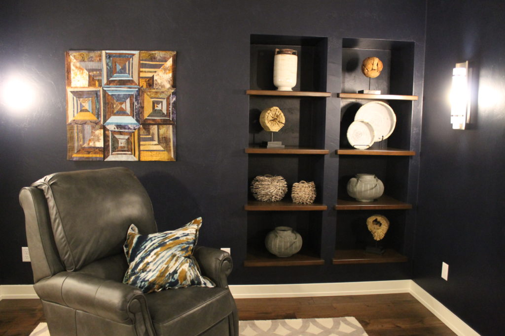
Dark nautical blues have been trendy for a little while now. They are a bold decision but what I love about them is that they usually complement both white painted trim and most any color of stained wood.
For a similar look try Sherwin Williams 6230 Rainstorm or 7602 Indigo Batik
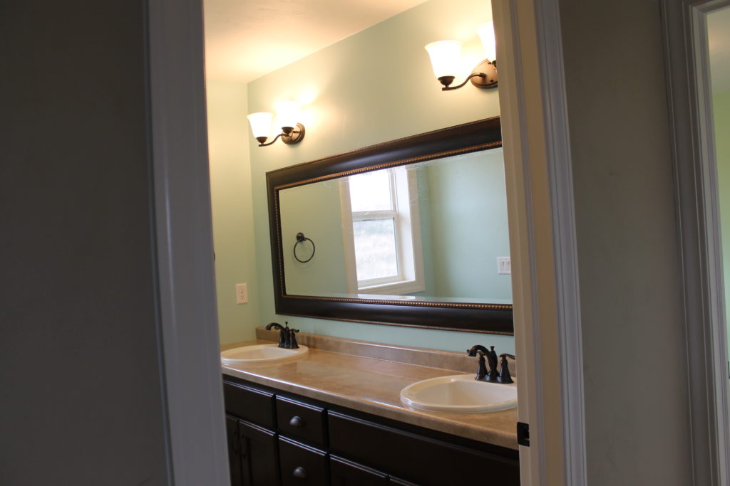
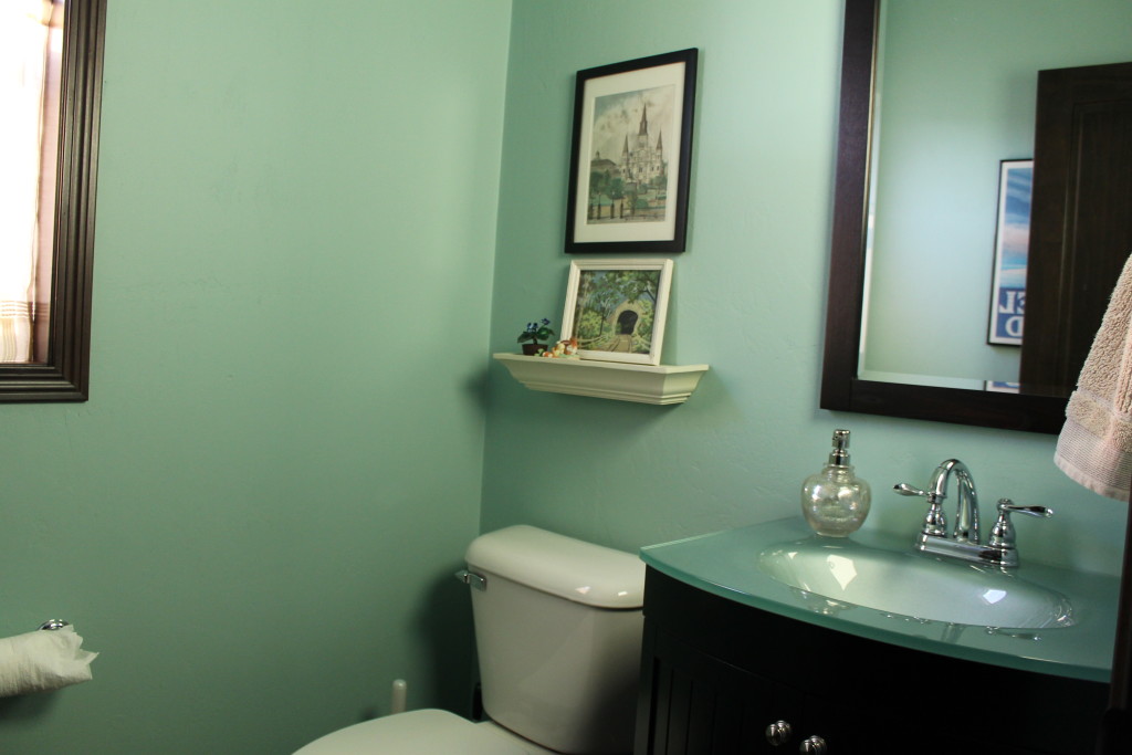
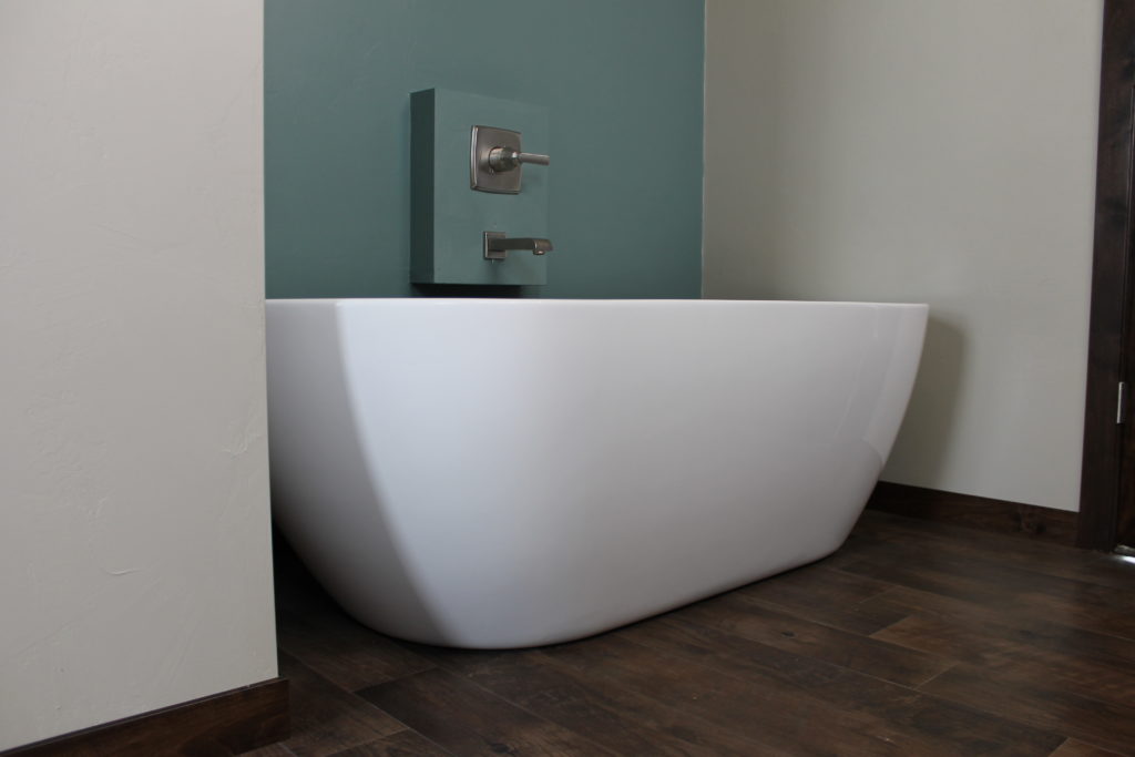
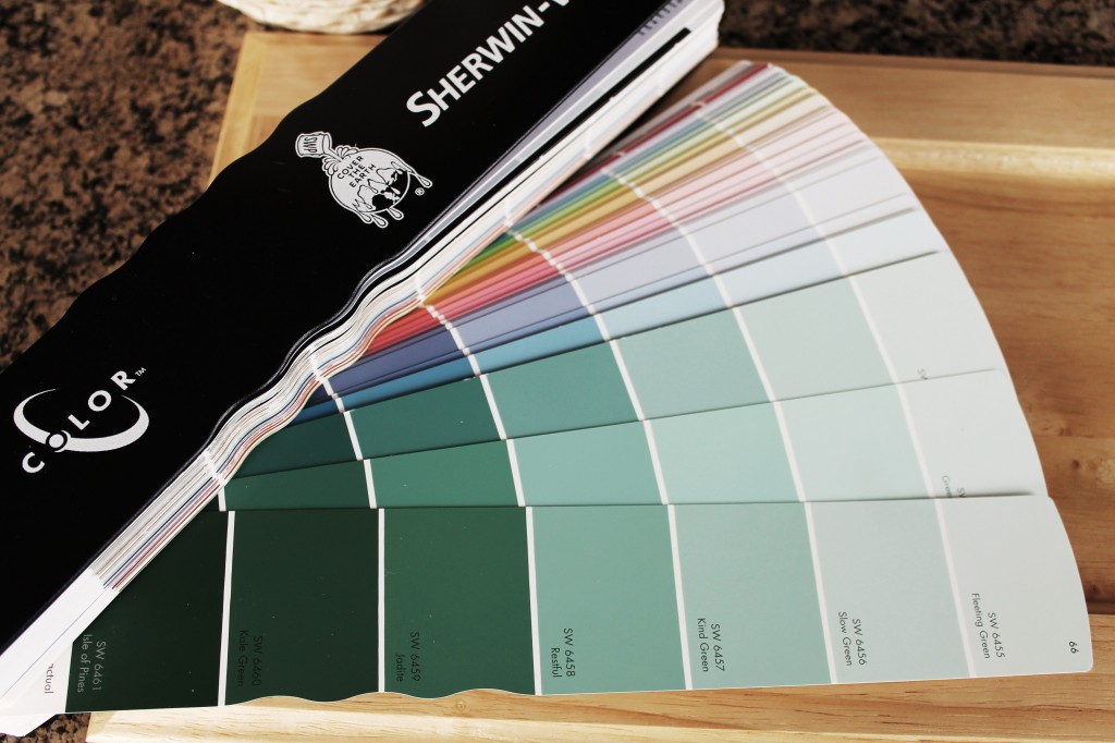
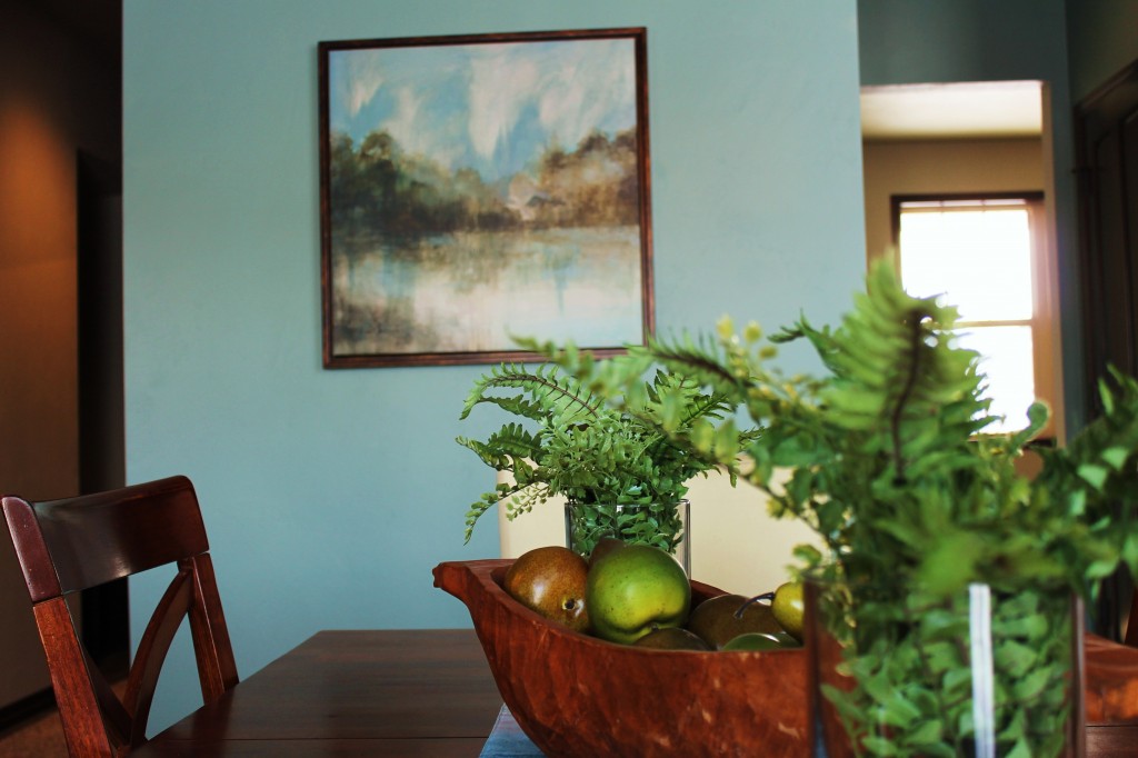
Softer Sea Glass Greens
These shades are especially pretty in bathrooms. They work best when they are just a whisper of color in an otherwise warmly decorated room.
For a similar look try Sherwin Williams 0029 Ancanthus, 0059 Frostwork or 6463 Breaktime.
Colors of the Year
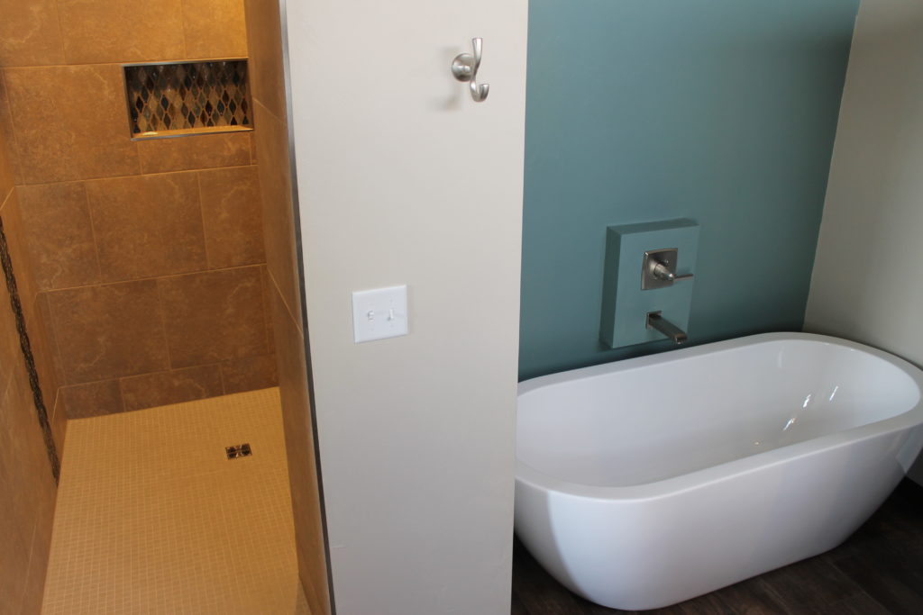
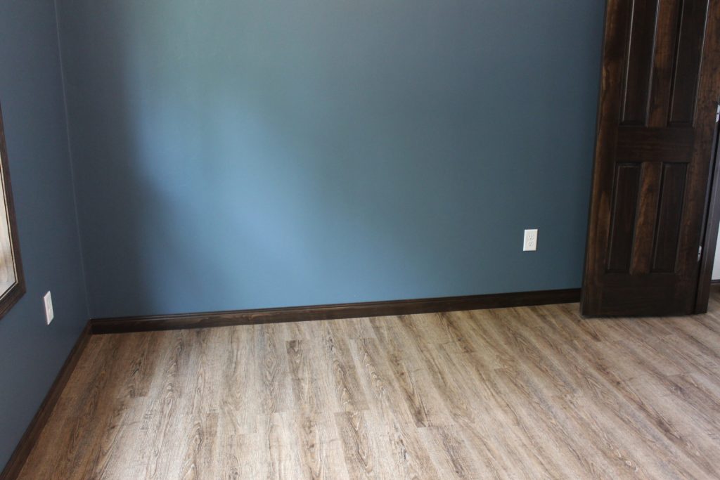
Almost every paint company out there has joined in with predicting the next color trend by announcing a Paint Color of the Year. Sherwin Williams recently came out with 6496 Oceanside as their pick for 2018. If it feels a little too bold and bright to you, try a more subtle version or a more blue shade like this bathroom and bedroom:
Get a similar look with Sherwin Williams 6486 Reflecting Pool or 6494 Lakeshore
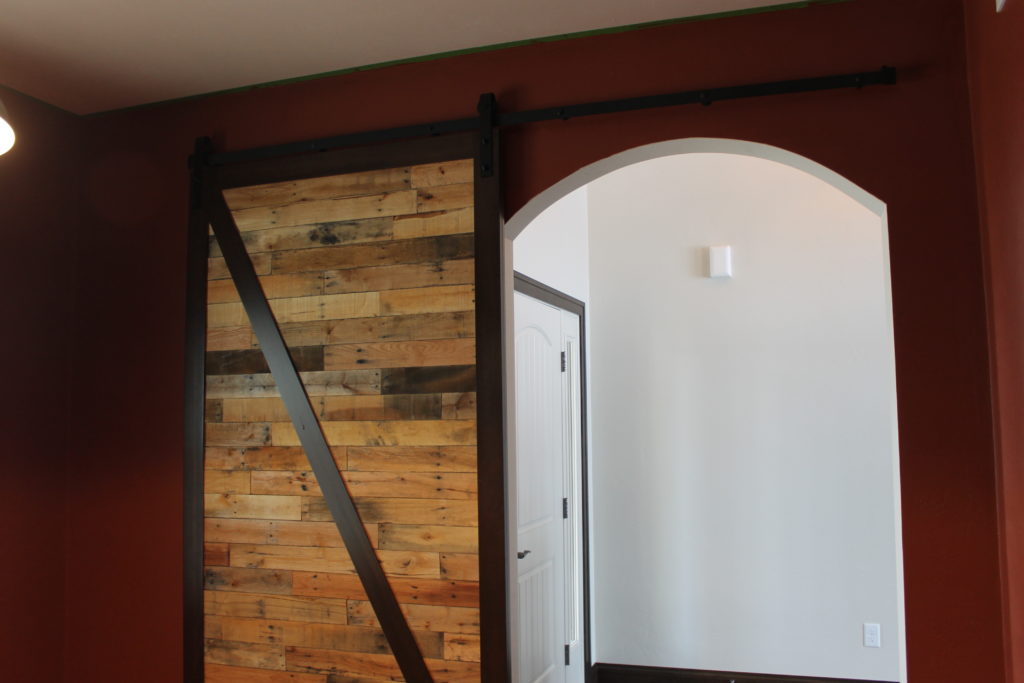
Benjamin Moore suggested we go back to the power of red and named Caliente as their 2018 Color of the Year. Similar shades are freshest when paired with a rustic element like these pallet wood barn doors. Get a similar look with SW 0008 Cajun Red.
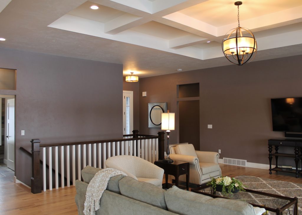
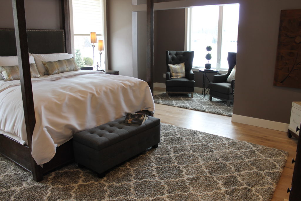
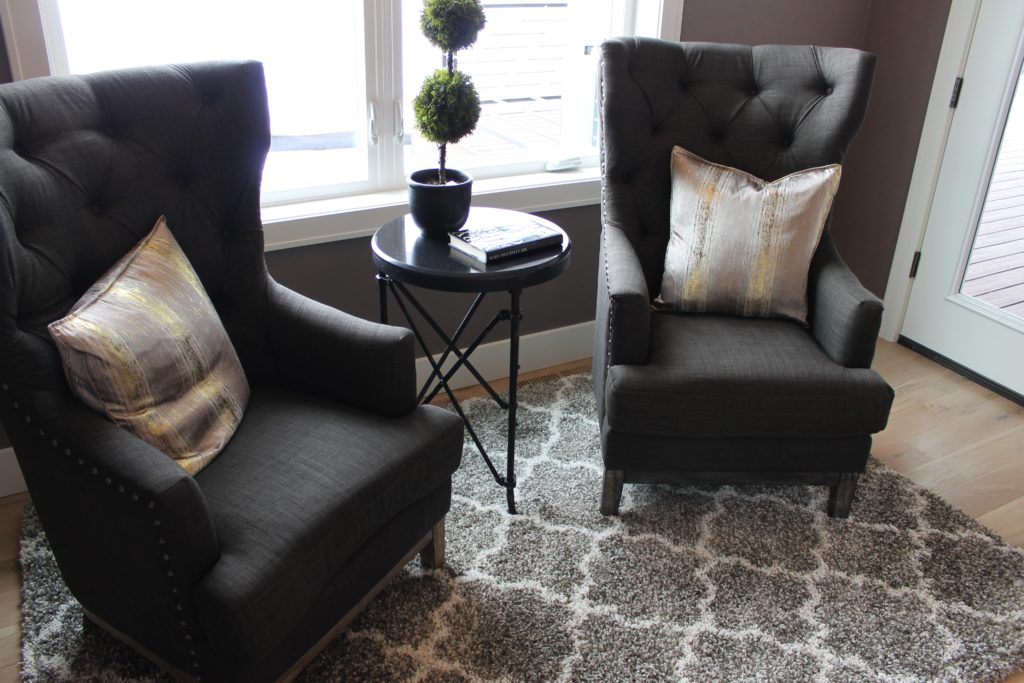
I still love 2017’s color of the year featured in our Spring Showcase Home:
This was such a versatile shade of gray with so much warmth and almost a hint of purple. It complimented both the lighter wood floor color and the darker stain used on the mantle and staircase.
Farmhouse Picks
The new authority on farmhouse inspired colors is Joanna Gaines and her paint line by Kilz. If I were to pick my favorites from Magnolia, I would go for the light grey-blue shades (Rainy Days) or the olive gray-greens (Silverado Sage & Olive Grove). I love the color of my laundry room walls, seen here through the door in my kitchen.
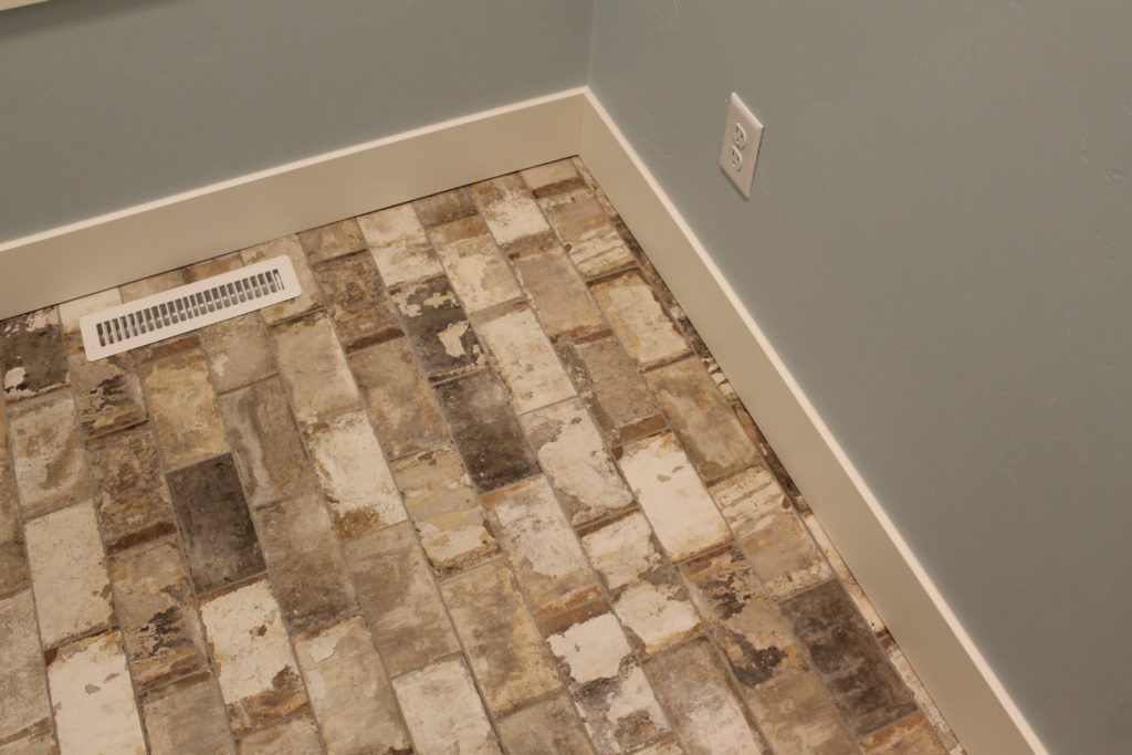
This is a shade similar to Sherwin Williams 0068 Copen Blue.
A client recently used a hue like this in their mud room with an amazing distressed brick tile floor.
My other favorite shades I look forward to incorporating into my home include colors like:
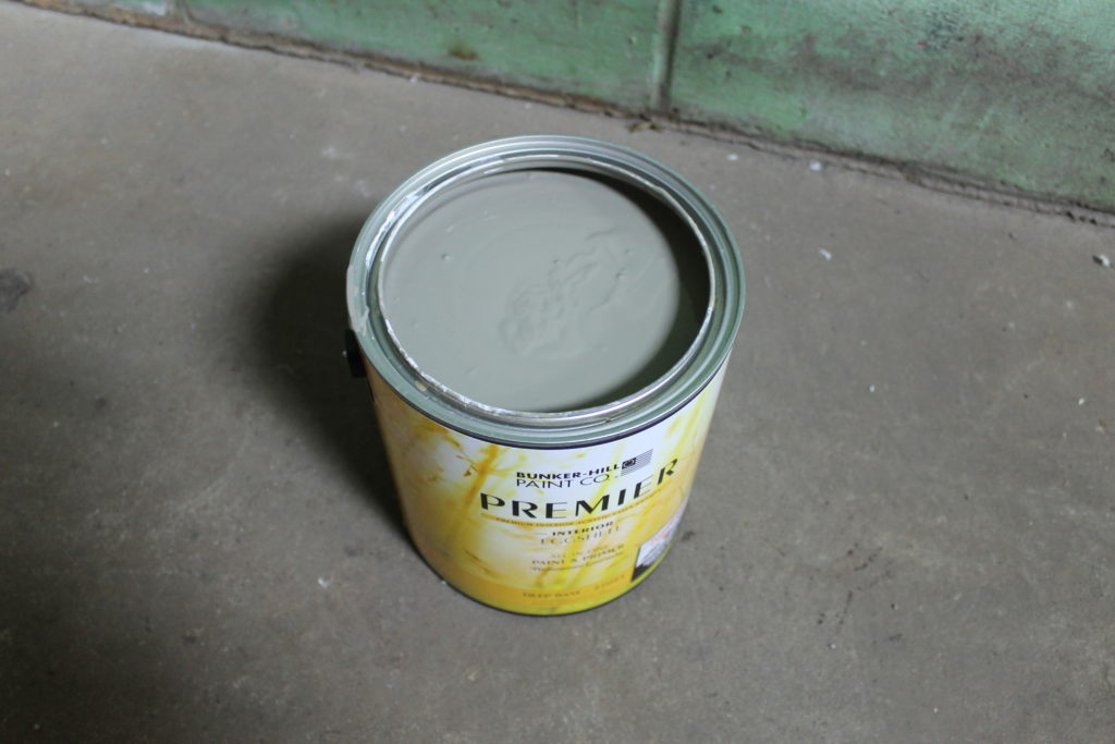
Sherwin Williams 6213 Halcyon Green (gray-green) 6186 Dried Thyme (brown-green) and 6207 Retreat. They are all colors that remind me of old cars and vintage cycles.
I am actually deep into a paint project of my own transforming a dirty neglected garage into something modern, warm and industrial. I’ll keep you posted on the progress!
Paint is tough. You want to put the samples up to the other colors in your room and know that the lighting at certain times of the day will draw out other hues. When I first had our upstairs painted I swore the gray I picked was too silver, almost baby blue. But it only looked that way with full sunlight shining on it. Once we added trim and changed out the bright white LED bulbs to a warmer light I was happy with the color and never looked back!





Leave a Reply