I Heart Color
I have been wanting to venture into a color post for a while now and today will only be an introduction. Since the trend that seems to be holding steady is a sheer lack of color, I wanted to share a few of my favorite colors I chose long ago for my modest farmhouse. I still love them, but well, that’s because I do “heart” color…
My dining room is a deep muddy grey-brown as you can see behind the bakers rack of this photo. I chose it long before grey was a thing and at the height of the chocolate-brown-everything trend. Somehow I knew I needed a more muted shade of brown and ended up with something that feels warm and classic. This was mixed from a paint brand that no longer exists but you can color match it to a Sherwin Williams 6005 Folkstone or 7505 Manor House.
Blue
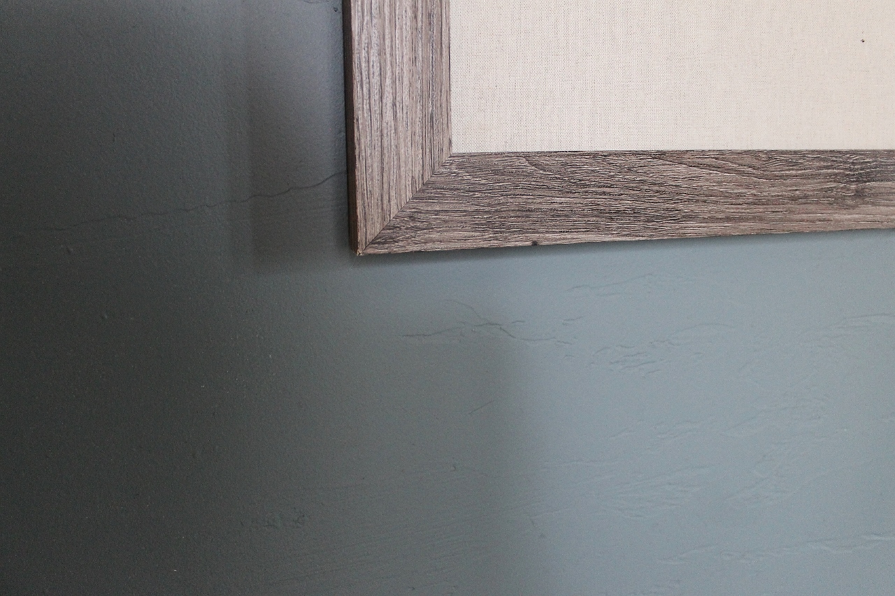
This is my first floor office color. A grey blue color that is very saturated compared to the wispy blue hues more on trend today. This room can be seen through the french doors off the dining room so the saturation level matches the earthy grey brown above. The best way to achieve a cohesive first floor in an open concept layout (besides just giving up and painting everything the same color) is to gather colors that make sense together. You wouldn’t want to pair a bold color with a pastel for example.
Sherwin William shades have a tendency to brighten up in certain lighting so I recommend checking out 7619 Labradorite or 6249 Storm Cloud if you are after a similar vibe.
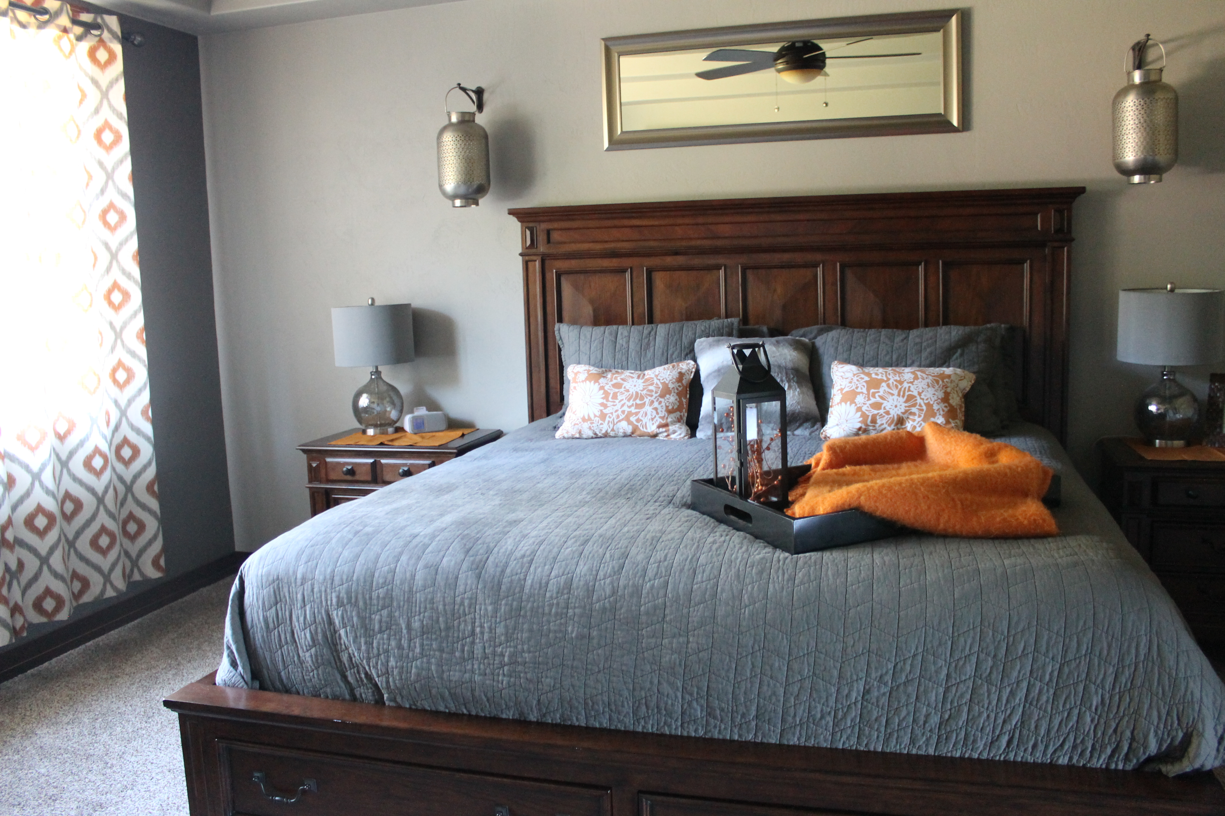
The Miller’s (Meet the Miller’s Series) original bedroom showcased a more grey version here with a darker accent wall around the window. I also pulled this photo to show how a hint of orange can be complimentary for this color story- which is up next!
Orange
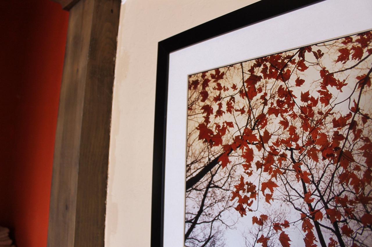
I love orange so much I am not even going to try to give it a prettier name like Copper Meadow or Clay-Pot-Sunbeam. Give me all the brightest boldest most obnoxious shades of orange! This picture focuses on the framed art of the fall maple leaves due to the fact that the one wall in my bathroom painted this fierce color has mirrors- making it notoriously hard to photograph. I’ve received some criticism for this one. Some- “Wow! That’s quite a color!” – politeness. It matches the art perfectly and it is such a flattering shade to see yourself surrounded by in the mirror that I don’t even need to defend it- I just love it!
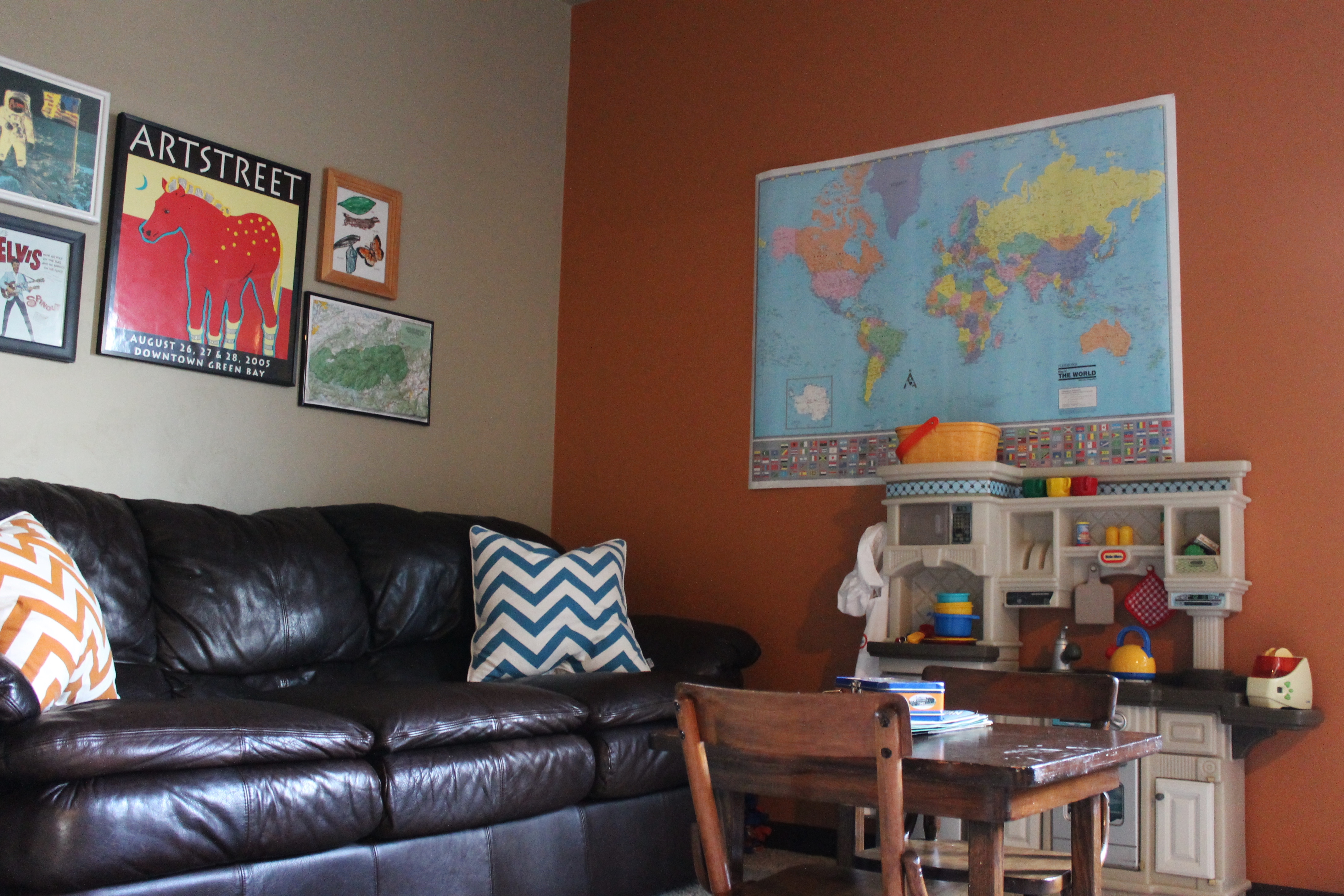
This orange might be a little more reasonable for most of you- as pictured from a client’s loft space. If this is more your preference- SW 7702 Spiced Cider, SW 7701 Cavern Clay and SW 7707 Copper Wire will get you in the right fan deck!
Creme
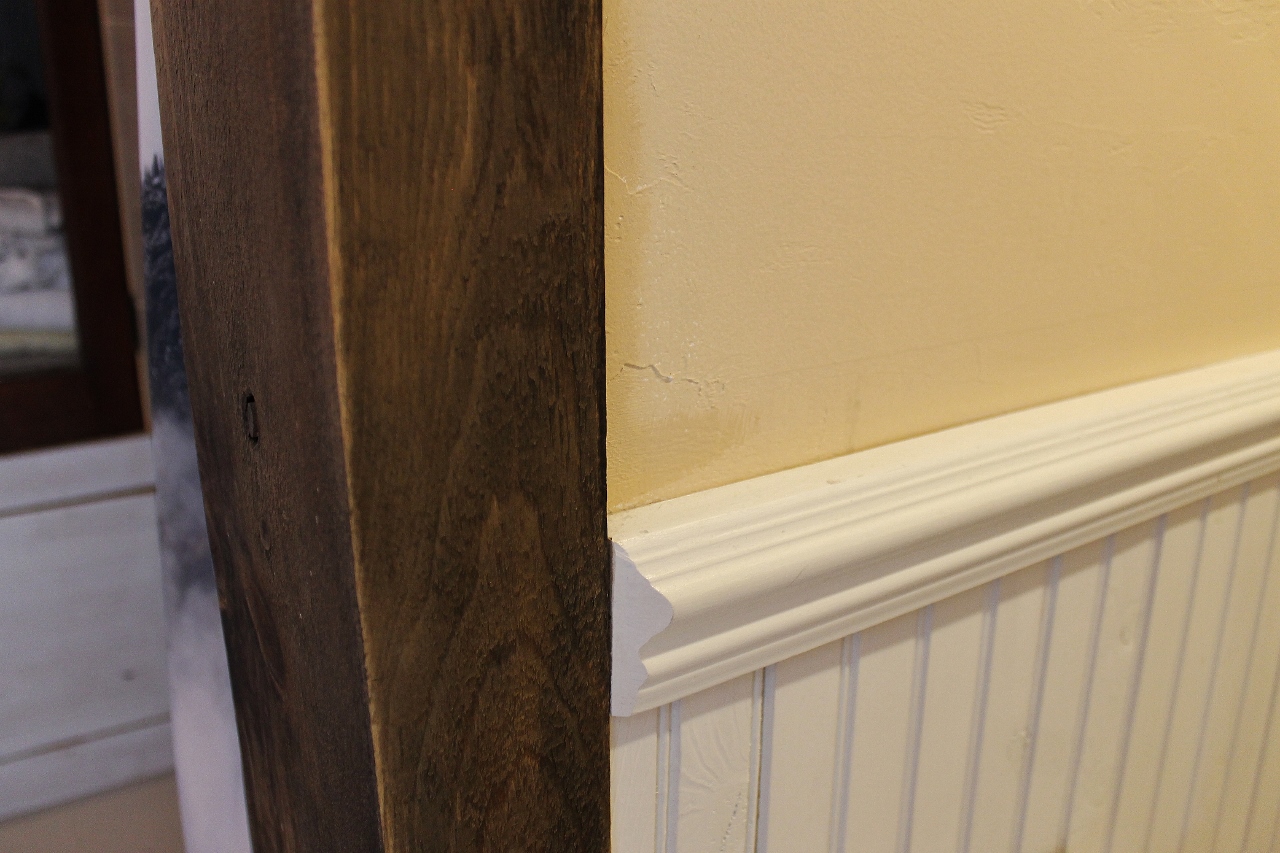
For me, this is still a color. It’s not as bold as the orange and the blue but it is not a shade of white or off white. You would be surprised how far down it is on the paint chip. This is a color that used to be popular in the mid 2000 Pottery Barn as a pretty standard warm wall color. I have this shade throughout my house offset with the bright and true white of my wood trim and wainscoting. Be wary of how yellow this might present. You will need to try it with your natural lighting and the color of your light bulbs. Start with SW 7683 Buff and SW 7678 Cottage Creme if you want to replicate this look.
The new construction farm house (below) really got a hit of warmth from a shade on par with SW 6142 Macadamia.
That’s the color story of my first floor- dining, office and bathroom. All these rooms connect and peek into each other so giving them all the same depth of color was important to me. A future post will delve into the laundry room drama- the only room in my house I have painted more than once. But that could be a while, there are a few other projects standing in the way.
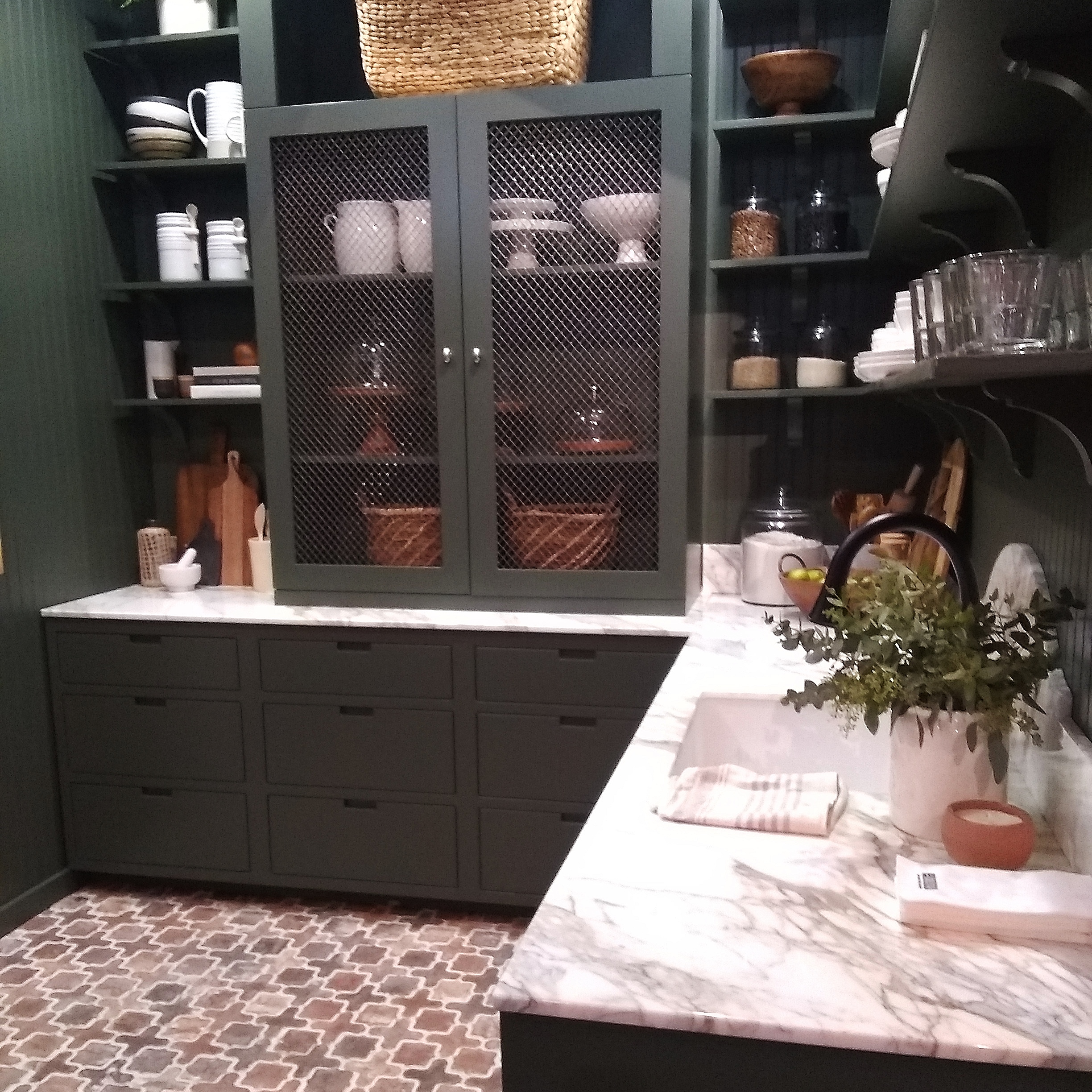
For now I’m just happy to have wrapped up these thoughts on color, as referenced in an earlier post about the growing green trend. The time sure has flown by since then! If you missed it- be sure to check it out or revisit it for inspiration. Another slew of Vegas Builder Convention inspo is on it’s way!
Leave a Reply