Since we can’t go to Ikea
Since we can’t physically visit Ikea these days due to recent events, I thought I would rehash my favorites from the last time I visited the new store south of Milwaukee, WI. A few things stuck out to me as obvious trend changes and some others got me thinking about design ideas I’ve been kicking around for my home spaces.
A Hint of Nostalgia
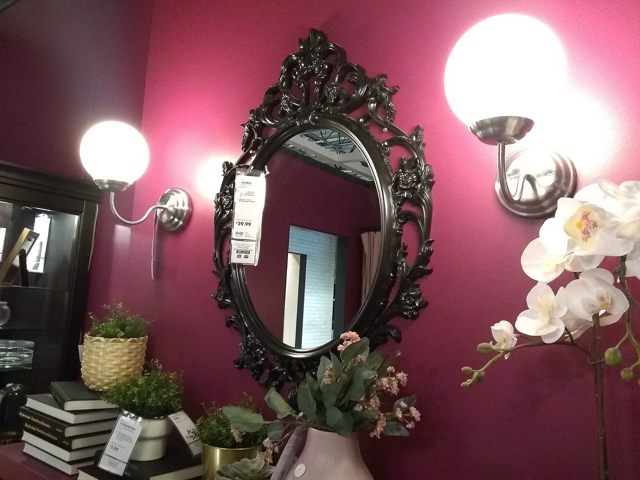
This mirror had me reminiscing over the funky decor we came to love from the set of the show Friends. I think we have seen the 90’s presenting in all kinds of ways, especially as we need to fantasize about a simpler time. This ornate mirror also gives me glam vampire vibes with its black lacquer finish.
Super feminine floral is back
The trend that stuck out to me the most was the reemergence of a pattern I distinctly remember from my childhood: floral. But not just any toile or stylized poppy or boho shabby chic print, no, this was a blast from my past: super feminine floral. At least that is what I am calling a heavy rose/hydrangea/peony floral in rich jewel tones. This is the floral I remember from the JC Penny catalogs of my younger years.
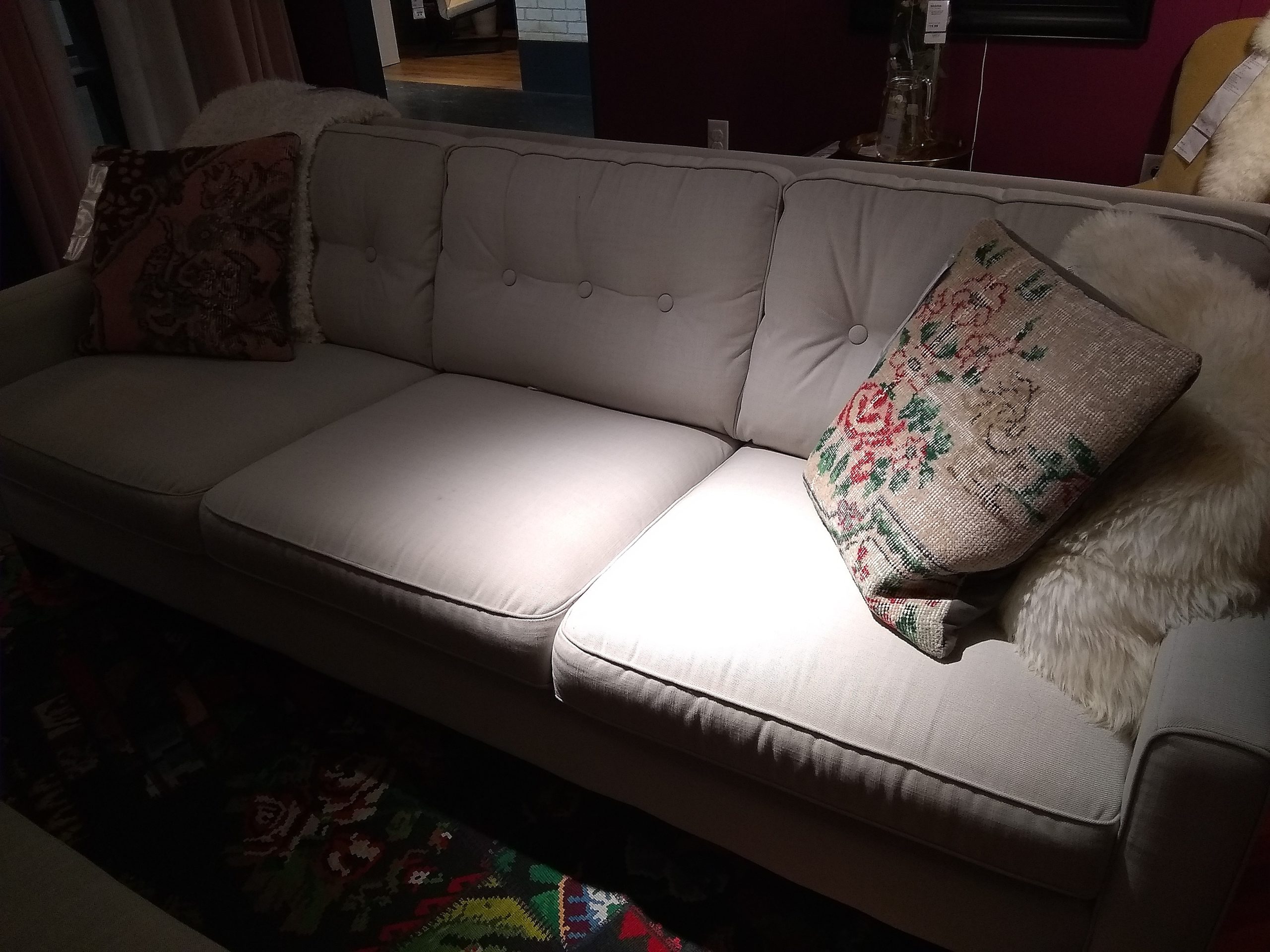
The most unique take I saw on it was this slightly worn out needlepoint embroidery texture infused into the pillows and the rugs.
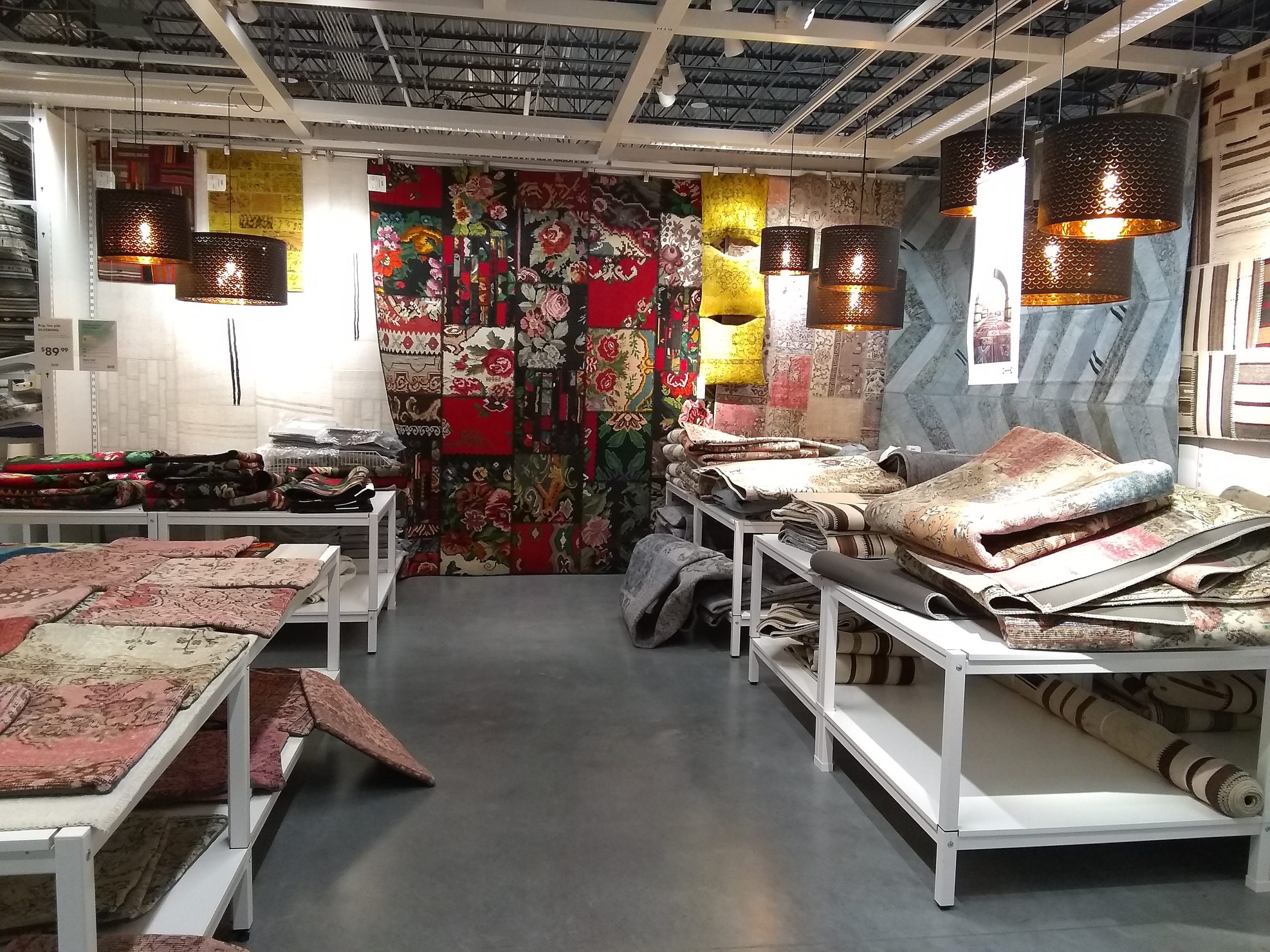
Speaking of rugs…
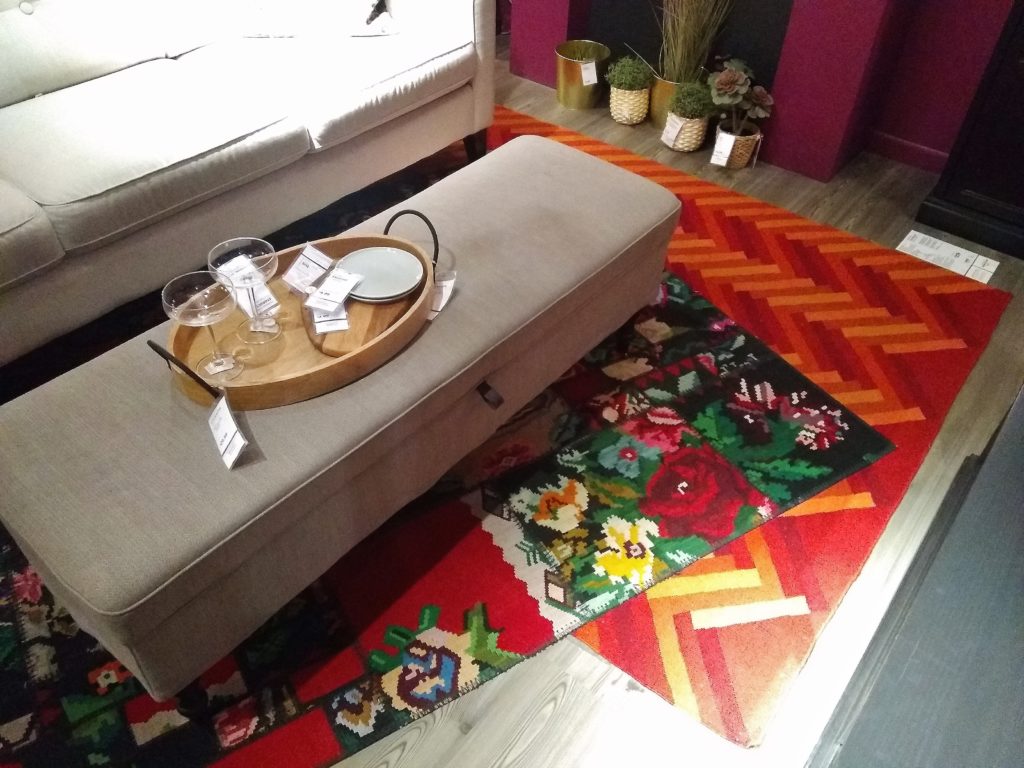
Popping up everywhere was this look of layering rugs. Now, this is by no means a new trend. I have been enjoying a layered rug design in my master bedroom after I simply doubled up out of lack of storage and ended up loving the result. But what Ikea is proving is that bold and “busy” patterns that you might never imagine pairing together can be a fun experiment!
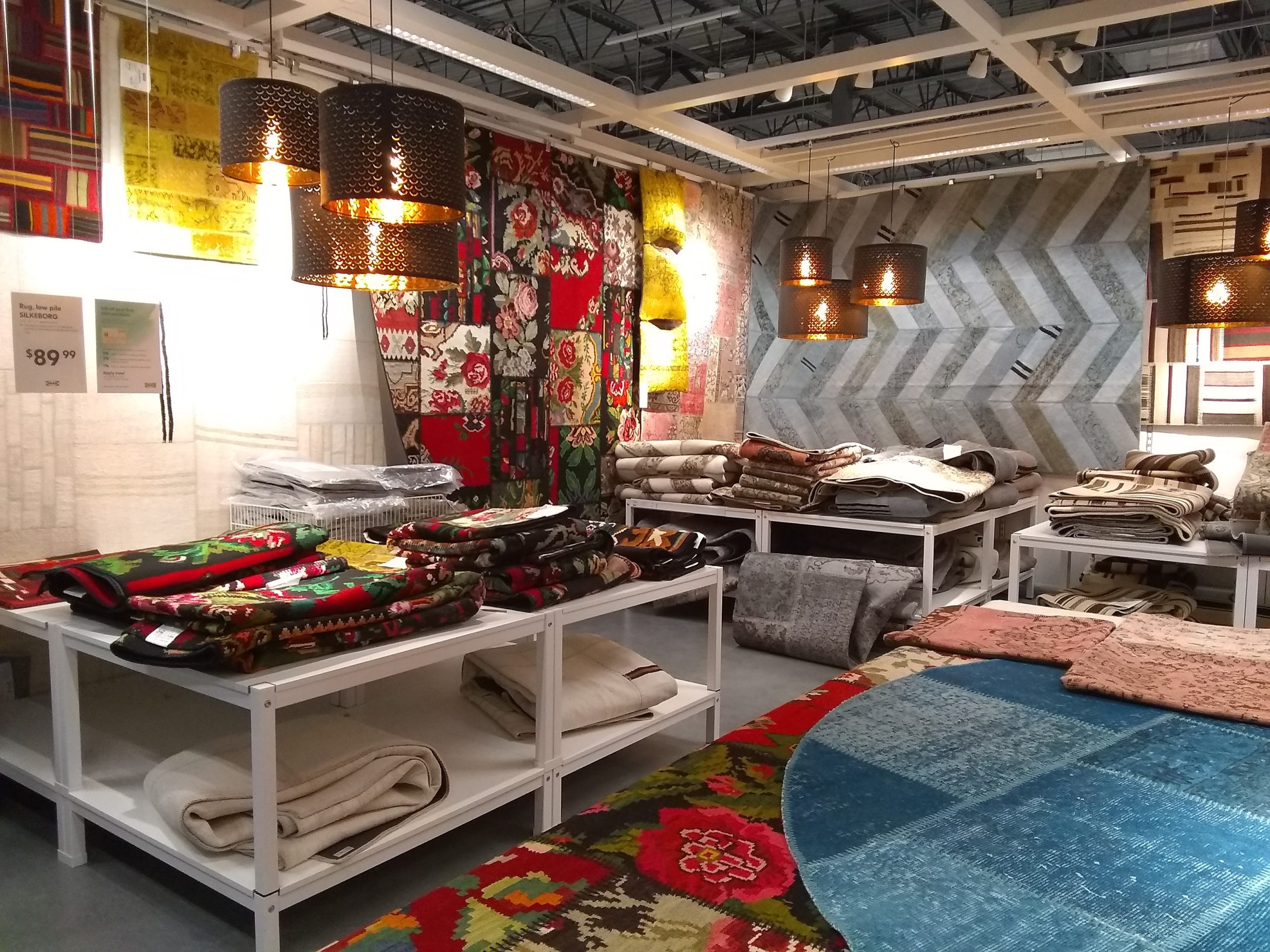
There is a color story present in the Ikea rug department that ensures any combination can have a place together. Even the “needlepoint” looking floral design has wisps of grey-blue and a dull mauve to tie it into the geometric options. The key is to choose two rugs with contrasting patterns in terms of scale (one large scale print and one small).
Speaking of patterns…
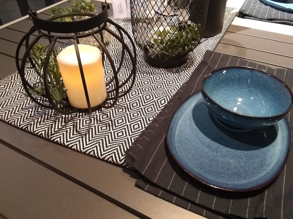
I couldn’t resist taking a snapshot of this patio table place setting. The simplicity of the grey ticking stripe napkin and geometric black and white runner was fresh and classic when paired with more hand glazed dishes and that touch of greenery on the black iron lanterns. This is one that shouldn’t be hard to replicate for any dinner party!
Gallery wall
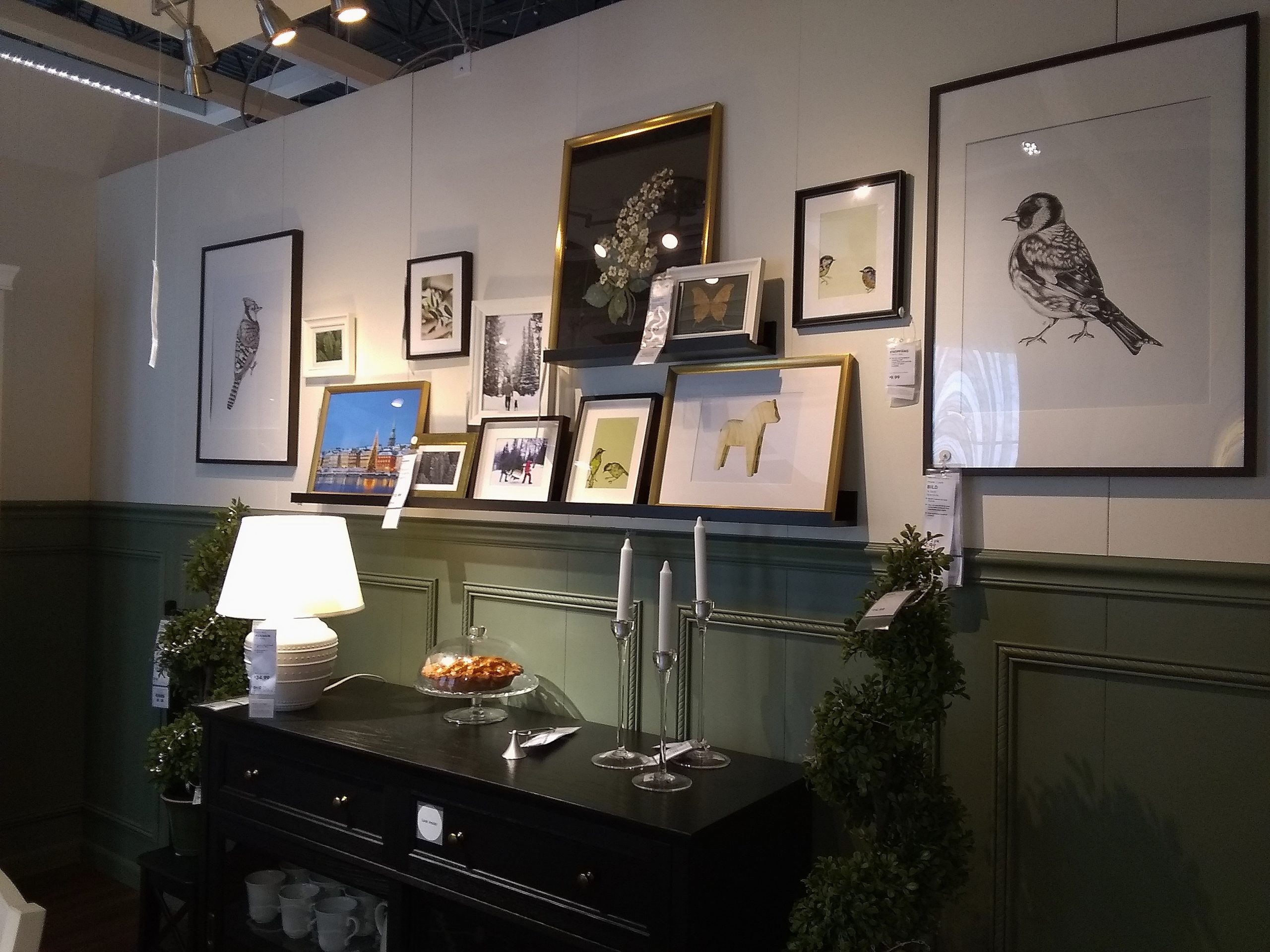
Gallery walls are not a new concept and the most common include family portraits trailing up open staircases and down hallways. But what compelled me to photograph this one was the mix of colors, frames and subject. I am always looking at the composition of a successful blending of art together on a wall. The key to a successful gallery wall is to have art that isn’t too matchy-matchy and to keep one piece from stealing focus. If one piece is considerably better than all the rest- you don’t need all the rest. That is why a successful gallery wall of art needs to feel like it is better as a whole.
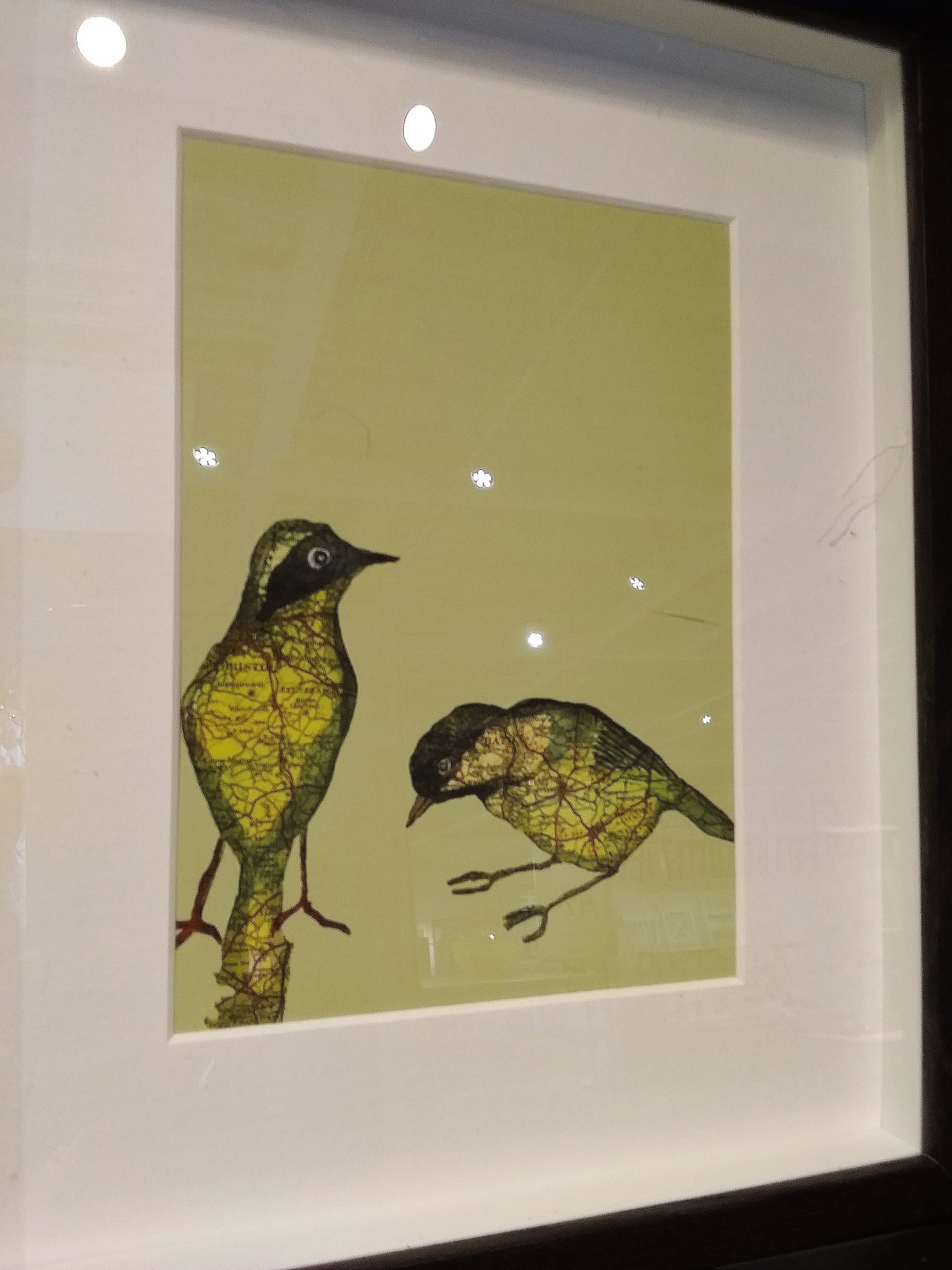
From a scrap book perspective- I liked the use of these maps cut into bird shapes seen in one of the frames. I collect tourism maps from many of our trips and this had me thinking of potential art projects I could do with them.
Faux Brick and Fun Wallpaper
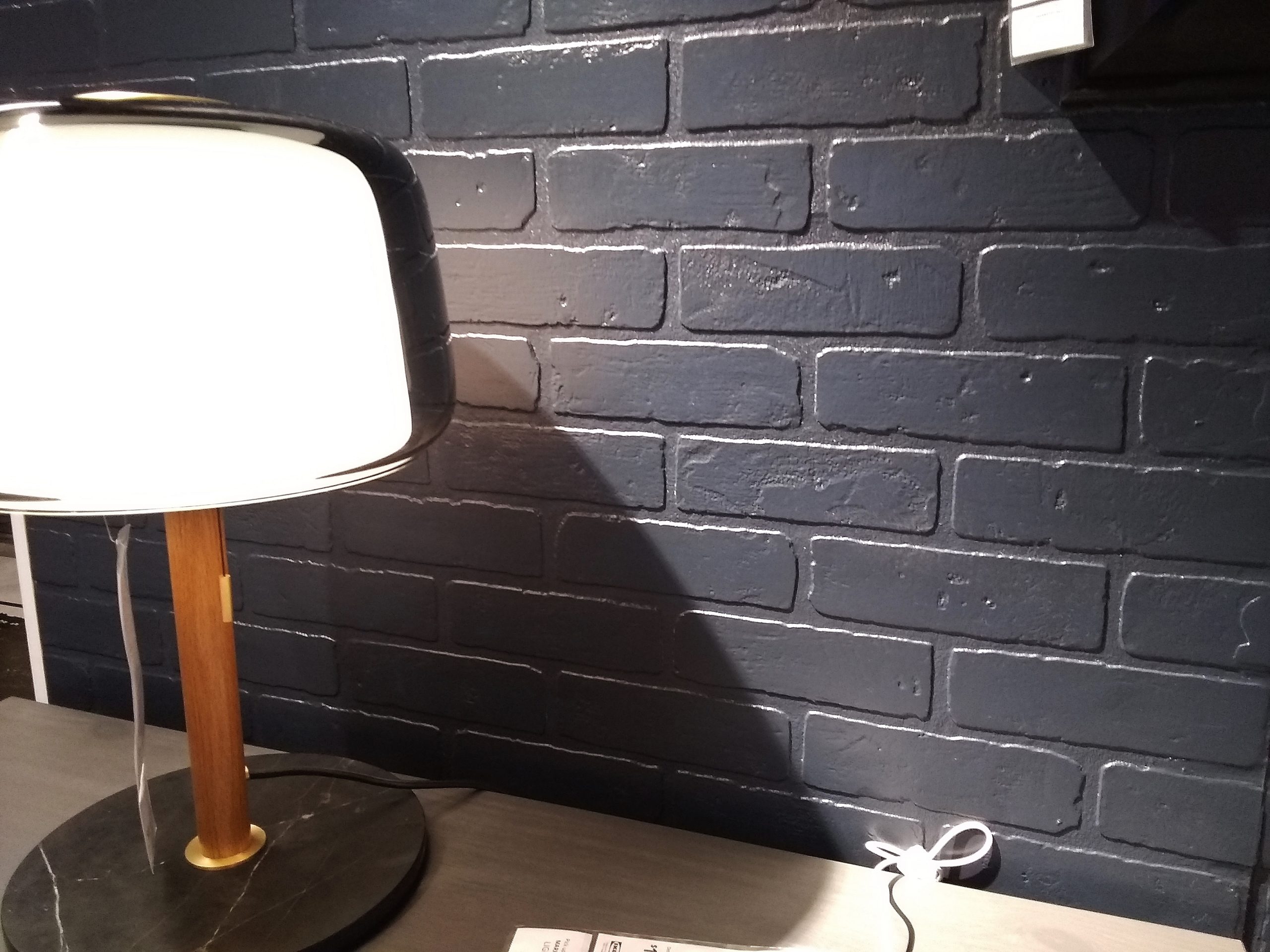
I was definitely doing a double take of this brick paneling that appears to be the same color as the paneling I used in our Mill Street garage bathroom renovation. Now this paneling may have been this color, while I bought mine from a big box store and painted it. Regardless, while not the focal piece in this display I immediately gravitated towards the texture it added and was pleased to feel on trend.
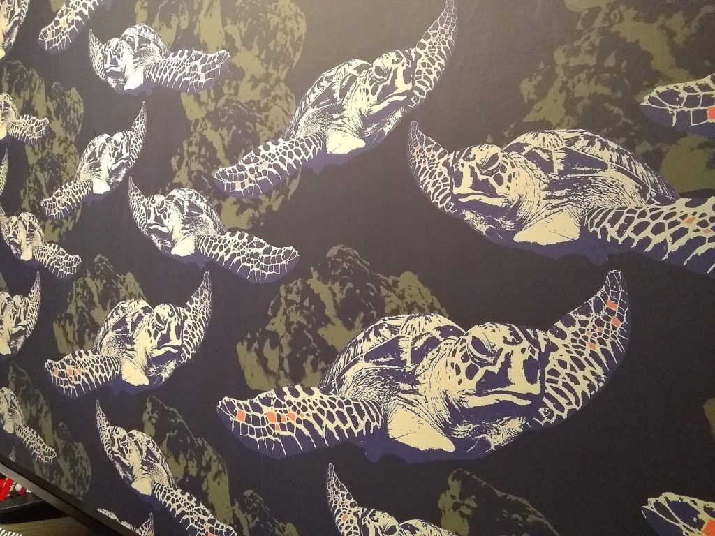
And with wallpaper on such an upward trend I was not surprised to see something bold- but these graphic sea turtles still stirred my soul!
Oh Ikea…and any store for that matter…I may not be the biggest shopaholic but the enjoyment of being in some of these establishments, surrounded by things of color and texture and interest! I miss it! All the more reason to make sure you are living your every day in a place that incorporates all of these elements. That should be a compelling take away from the Stay at Home order. Your home is important. Love your space!
Leave a Reply