Universal Khaki and the new absence of color
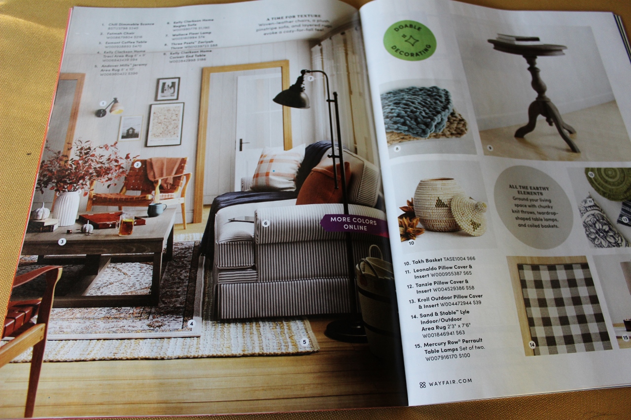
Two years ago I felt inspired to write about a catalog. Yes, a catalog. The quality of most home decor magazines had seemed to be in decline and it had been a while since I admired any printed imagery of interior design. My usual assortment of Pottery Barn, Crate and Barrel, Williams Sonoma, West Elm and Arhaus catalogs had dwindled through the years. Which is why I found so much unexpected joy in the little Wayfair booklet that showed up in the fall of 2023.
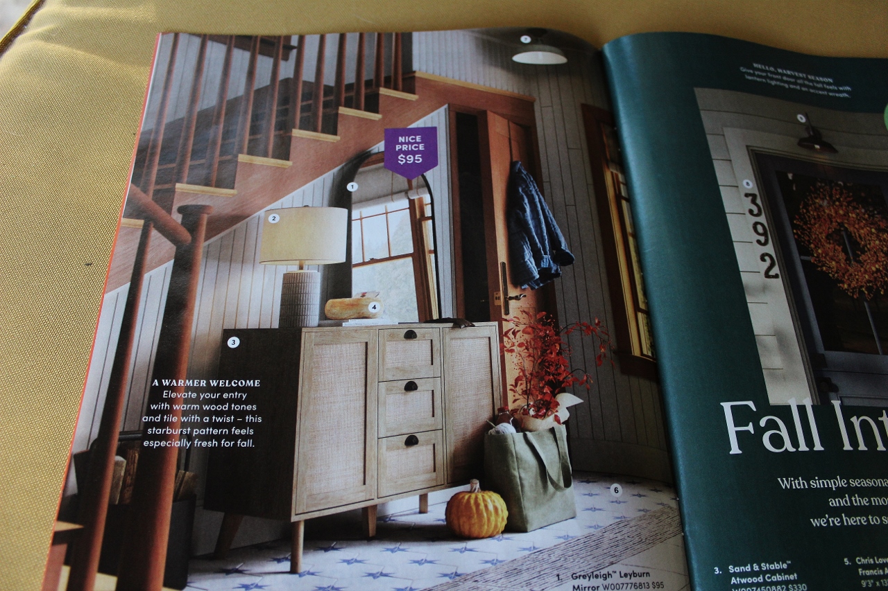
Even now, and perhaps especially now, I stand by my evaluation of how it was so refreshing to see warmth and color leading into a season when most Midwesterners crave warmth and color. Which brings me to my current dilemma. My “absence of color” dilemma.
This has been going on for a while now. The “modern farmhouse” movement took black and white and grey to a whole new level. When done right it can be elegant and classic- and when layered with texture- a comforting homespun look the farmhouse premise was meant to evoke. However, the easy to replicate color palette made decorating so formulaic that it began to take on a less than lived-in look, stripping many homes of the very character that defined farmhouses since their inception. An unfortunate side effect although not really the intention.
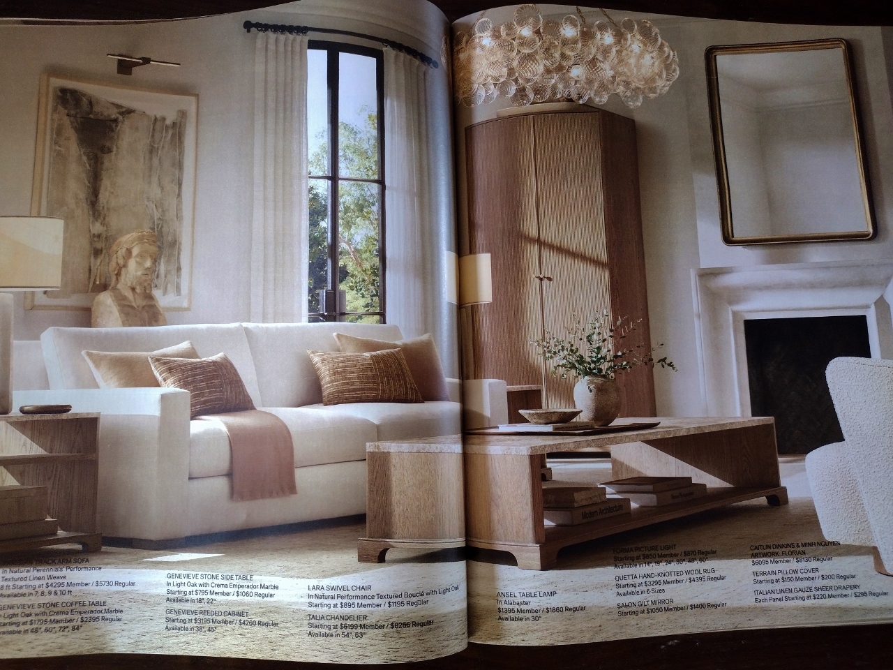
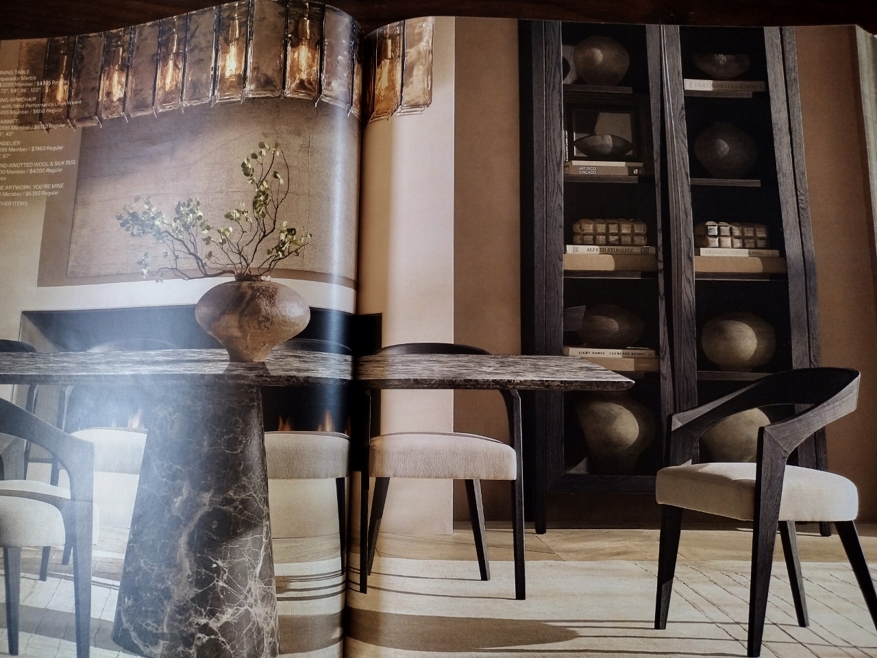
No, this “absence of color” movement feels…different. Let me start by saying the idea to talk about this began when a friend gave me a Restoration Hardware catalog this summer and said- “you should write about how everything looks the same, it’s all the same color now.” Their catalogs, if you are unfamiliar, are as thick as the yellow pages of the 90’s. I always thought the brand represented a more refined elegance and paging through it felt like you were seeing an entire year’s worth of some classy publication like Architectural Digest. While the backdrops for their furniture were never the most bright and vibrant in color- they were still captivating, and a little fantastical. But what was once a beautifully curated catalog of classic pieces set in historic settings, was now just 600 pages of rooms in a sepia filter.
Example-
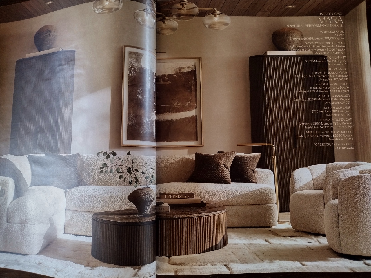
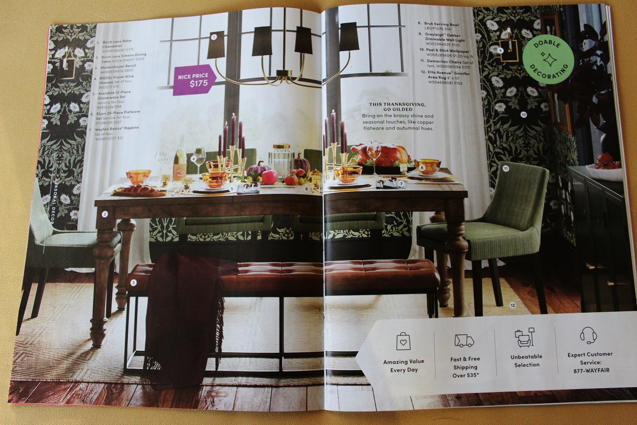
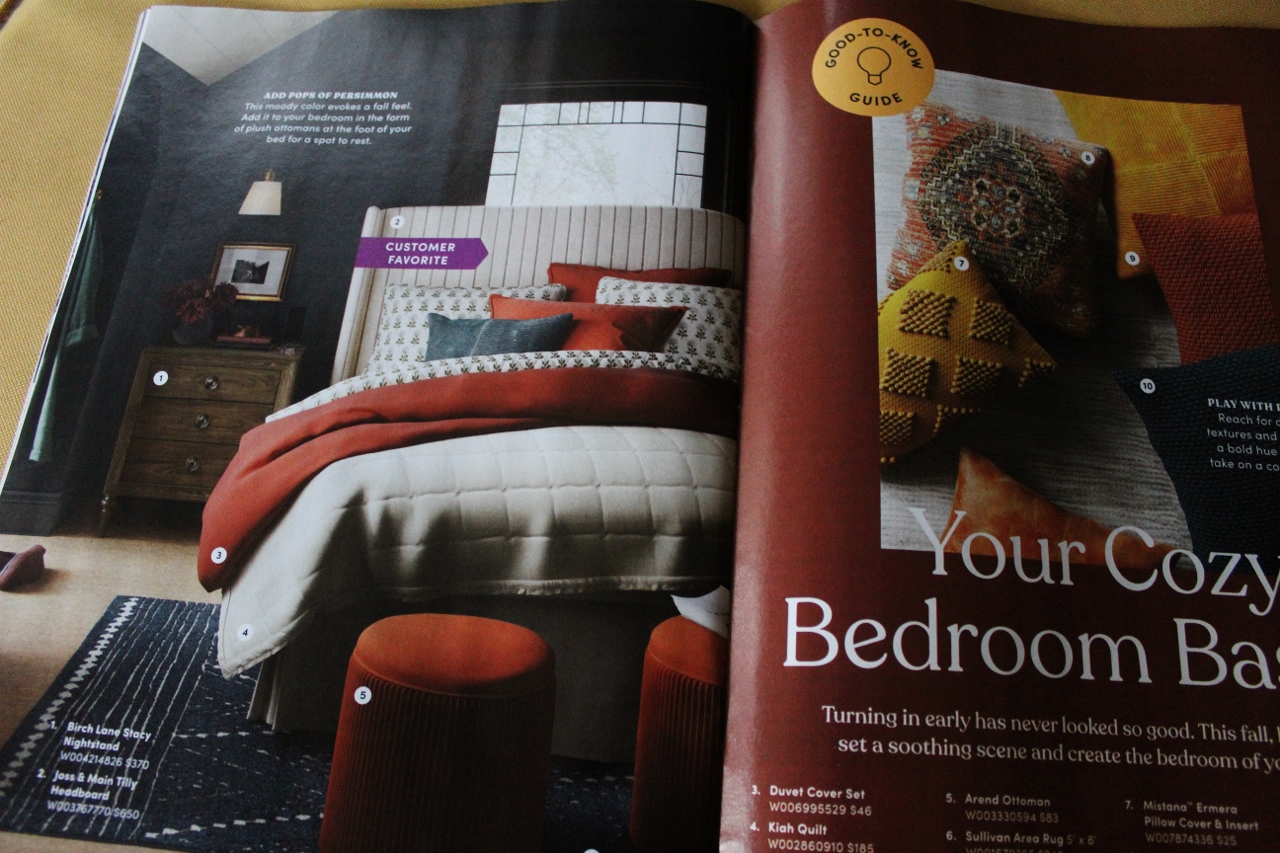
That’s it…for 600 pages…I am not even exaggerating. This is Spring 2025. Spring!?! A season usually littered with daffodils and tulips and little pops of green poking out all over. Let’s just do a quick comparison to my Wayfair Fall of 2023:
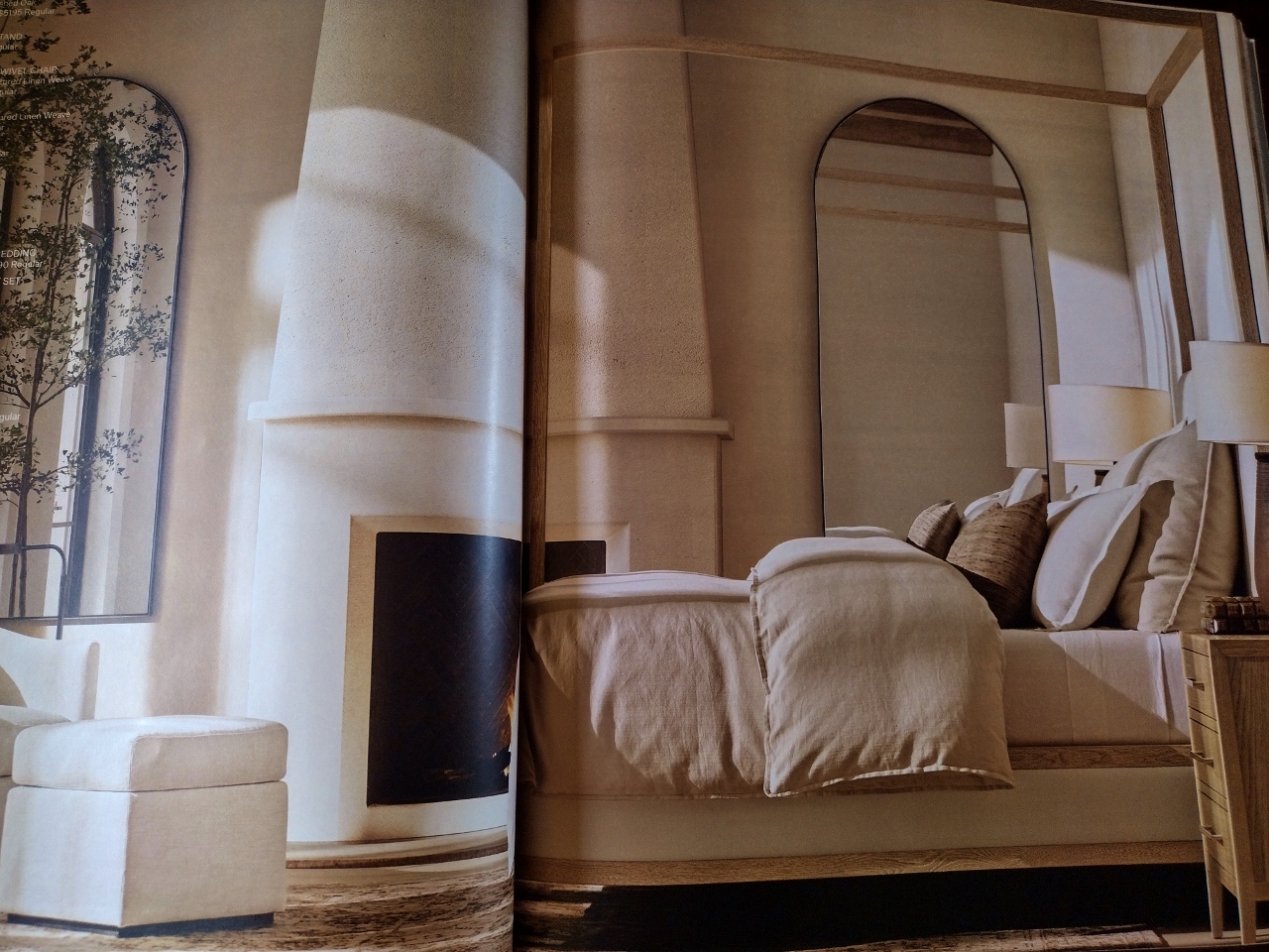
Restoration Hardware Spring 2025:
Wayfair Fall 2023:
Restoration Hardware Spring 2025:
Wayfair Fall 2023:
Restoration Hardware Spring 2025:
And even if you are shrugging this off and thinking these rooms look soft and dreamy- you have to remember the volume of images in this catalog when there is nothing more than the muted green of an olive tree branch in over 600 pages!
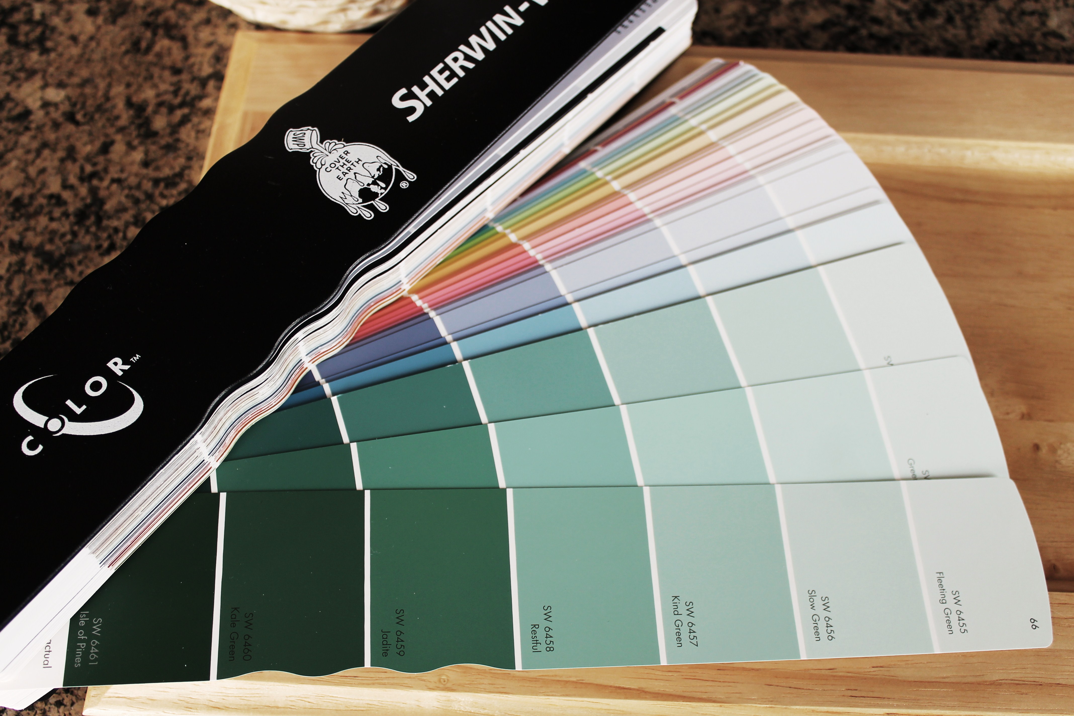
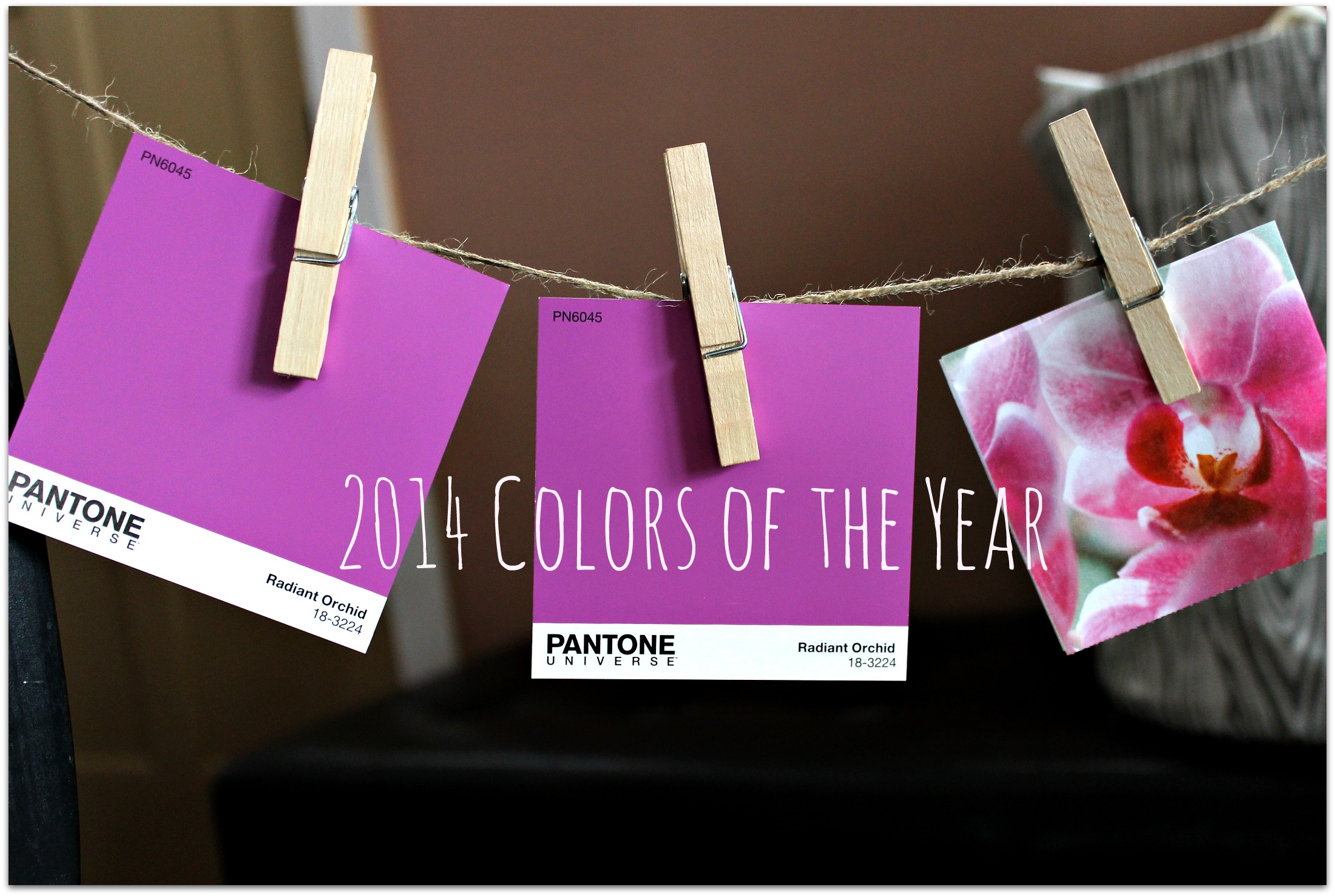
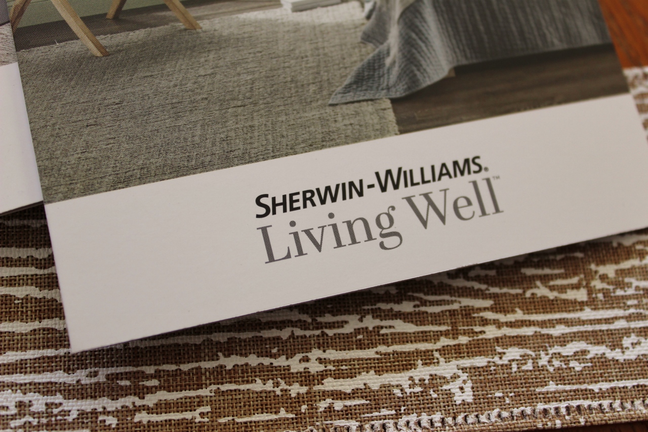
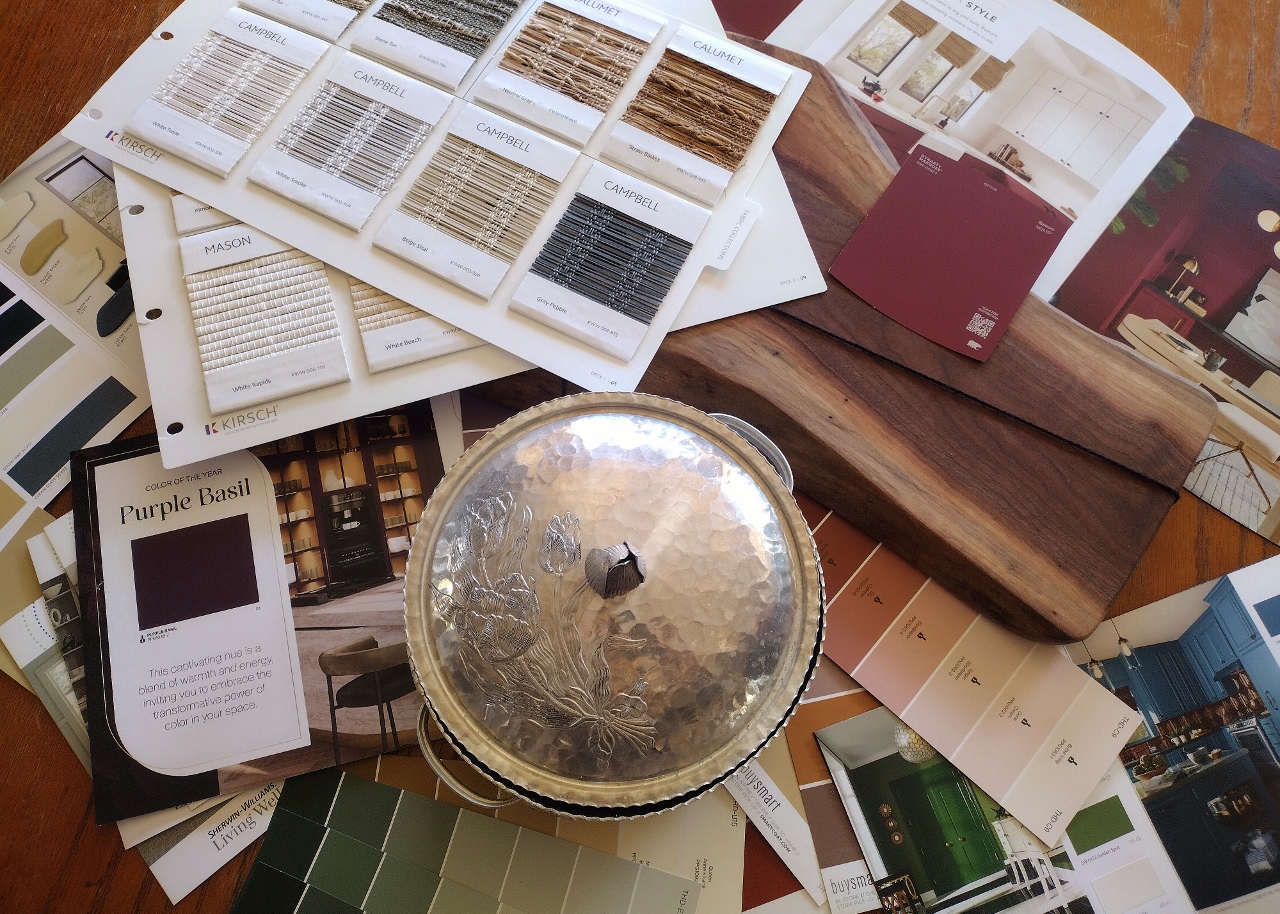
That being said, what truly radicalized me was the announcement of Sherwin Williams Color of the Year for 2026. As you know, I had started some of my first blog posts in 2014 highlighting their Color of the Year program back when only a few main paint companies participated.
Fast forward to the last two years when I took up more of an interest in gathering brochures and samples to see how this concept was marketed.
Last year Sherwin Williams threw a “color capsule” out there in lieu of a singular pick (even though it felt like they leaned in on Grounded, a coffee inspired brown). So I was interested in their proposal for 2026 and it was….drumroll...
Universal Khaki
I’m not even going to share a photo of the color chip because the entire page of the Sherwin Williams website dedicated to the 2026 Color of the Year looks identical to the four pages of Restoration Hardware Spring 2025 that I posted above. Identical.
The very first article I read that was really pushing how amazing Universal Khaki was kept referencing it as a “non-boring beige.” Which really made me think the opposite. It made me think- they know this is a boring choice but they are going to keep saying it’s not, so we all just go along with it.
Doth protest too much…
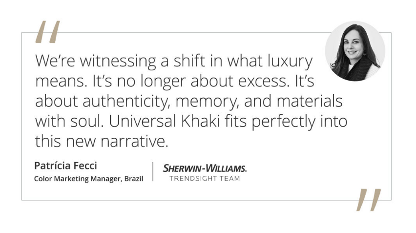
And then there are all these beautiful quotes on their website which make you think there is some lovely reason behind embracing a world of beige. Until you really stop and think- this is a paint manufacturer. Their entire purpose on this planet is to sell paint. And they produce how many different colors of paint across the spectrum. And this is it- this is what they are saying- that beige is luxury, that beige is authenticity, that beige represents soul.
Not a deep moody color that makes other colors pop…
Not a vibrant hue that reminds you of your favorite tropical winter getaway…
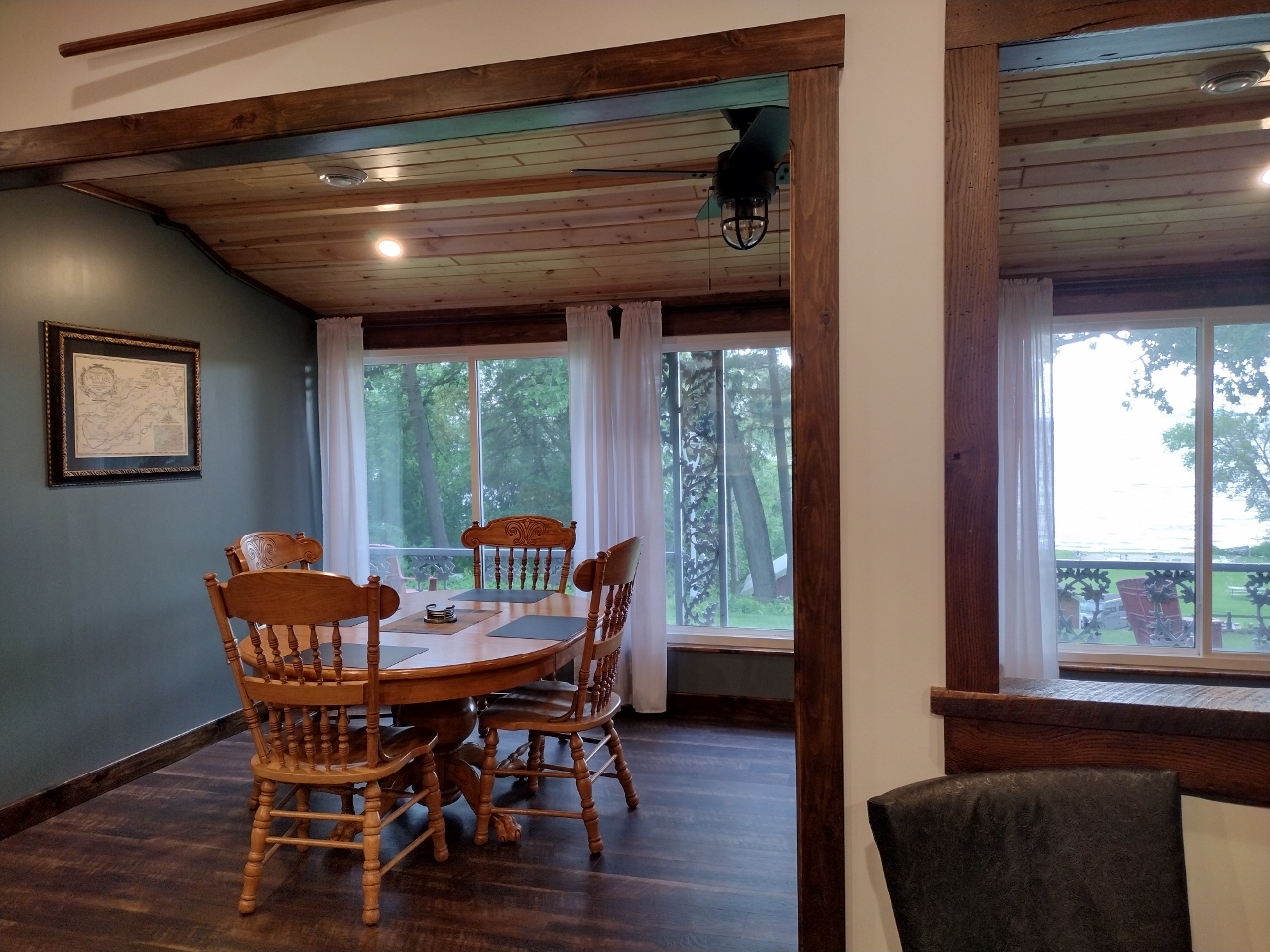
Not a rich shade of blue that mirrors the view of a water outside a window…
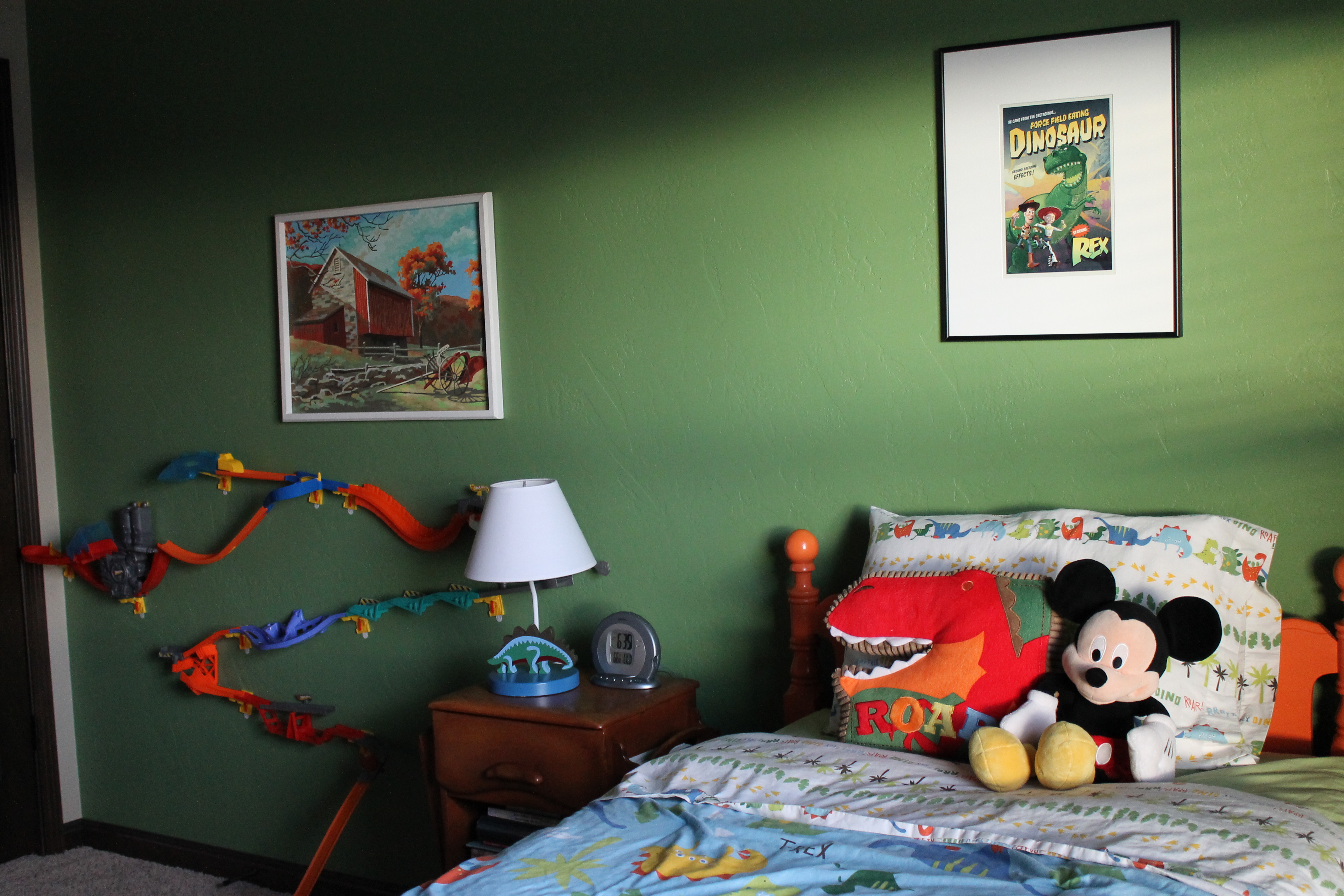
Not a green that brings joy to a childs play space…
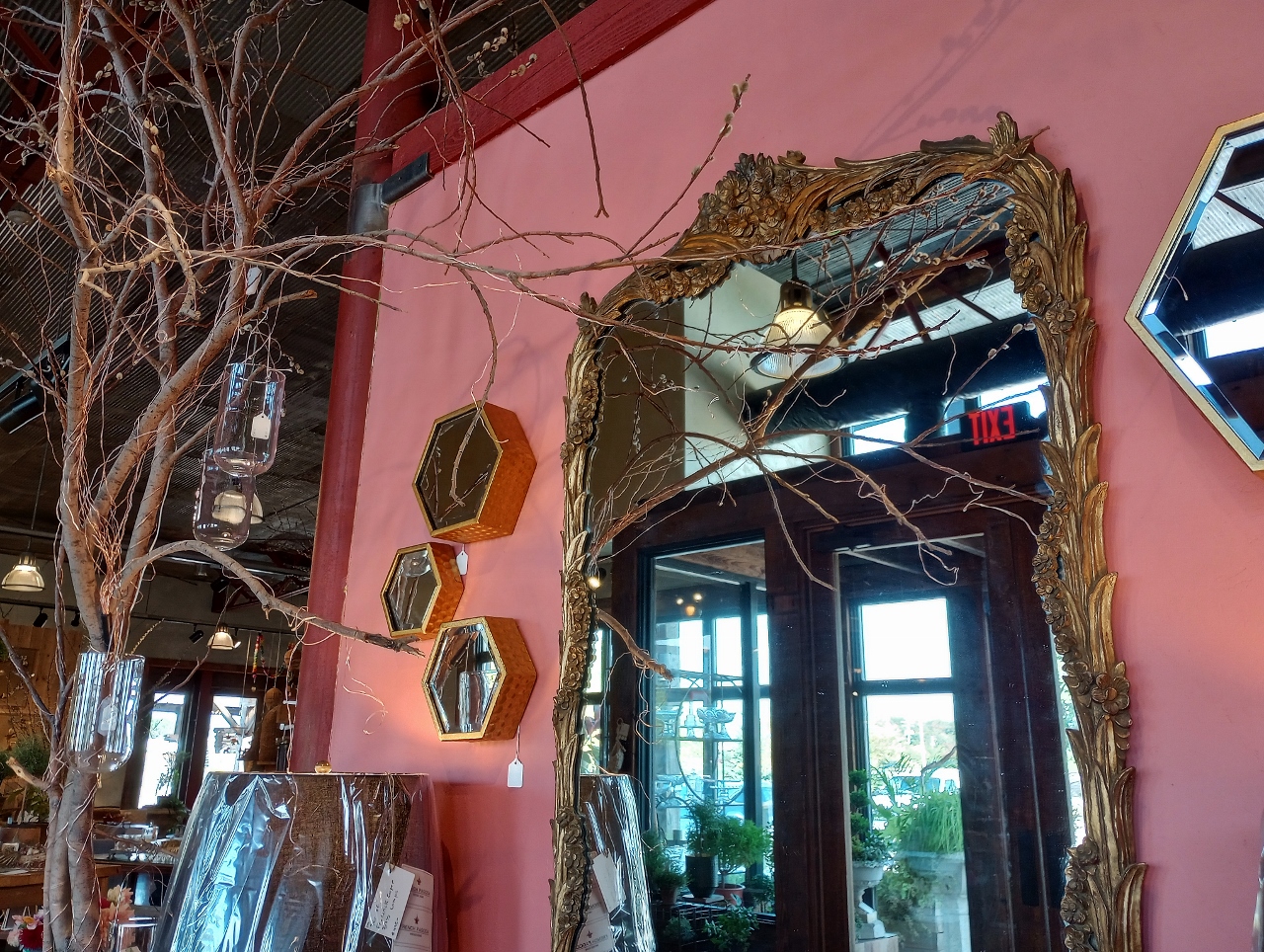
Or an unexpected accent that brings charm to a gilded frame…
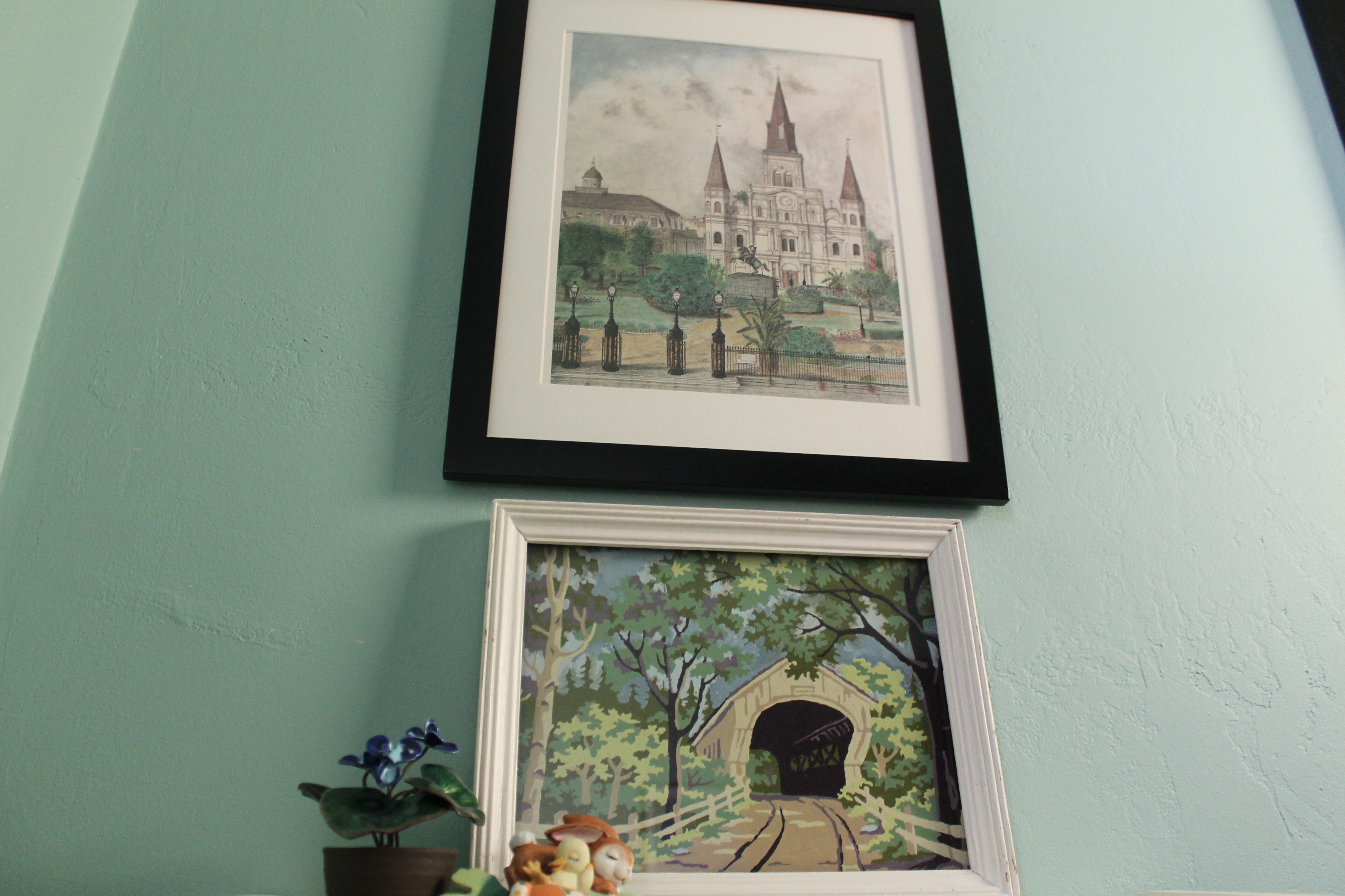
Not even a tranquil shade meant to compliment a collection of sentimental art…
No, the best advice they have for us is to go all out- really take a chance, get crazy- go beige.
The examples of color I just provided were taken from favorite places I have been and clients homes I have photographed. They are undeniably personalized spaces, not meant to be meaningful to everyone. But that’s the whole point of your own home…isn’t it? That it’s yours. And it is filled with things that mean something to you. And while I understand that there is no design concept that people will get on board with unanimously, no one color that will work for everyone, that doesn’t mean designers and manufacturers and innovators shouldn’t still try, right? Like, try to show colors and get people to take chances!?!
It has been my biggest critique of the neutral cookie-cutter spec home look-
“that in trying to create something that will be accepted by everyone you end up with something that appeals to no one.”
Maybe my biggest problem with the Sherwin Williams color of the year announcement is not the “Khaki” part, but more the “Universal” part…
Leave a Reply