Four Ways the fall Wayfair Catalog restored my faith in design!
*This is not an affiliated post. The genuine reason for this post was sparked by receiving the actual physical catalog in the mail that reminded me why I enjoy absorbing design through this form.*
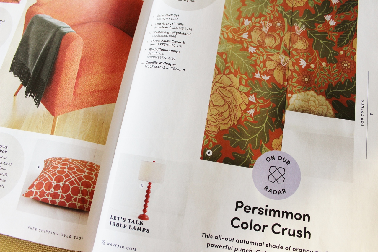
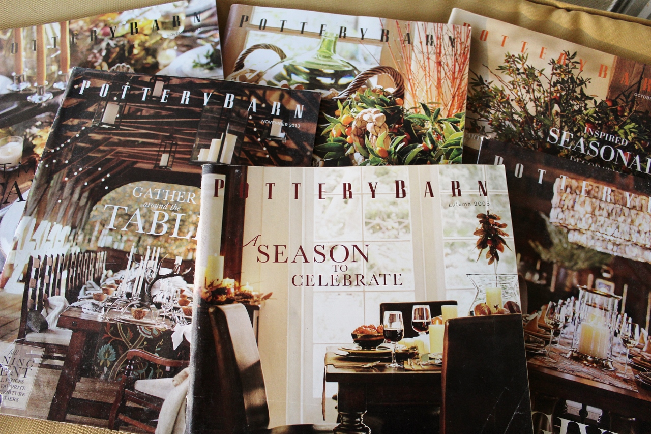
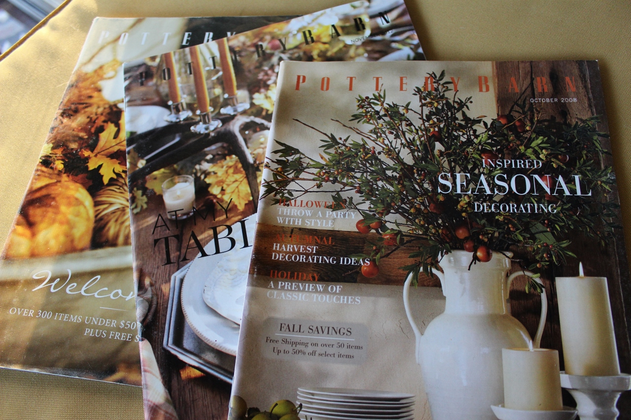
There is something about shopping for furniture and home decor online that loses its luster for me. Less and less effort goes into the big picture. This is for good reason- screens have gotten smaller and it is easier to show an item against a white backdrop than identify it in a completely decorated room with a tiny little letter or number next to it. My old-school analog soul misses the home decor catalogs that used to flood my mailbox. I have kept a collection of Pottery Barn fall entertaining issues circa 2006-2013 and I realized I still love what drew me to them in the first place- beautiful photography of classics like leather furniture and wood dining tables set in scenes of old barns or homes with interesting architectural features like stone walls, pane windows and wood beams.
It’s been a few years since I opened a magazine or catalog that gave me those same fall feelings…which is why I was pleasantly surprised by both receiving a physical Wayfair catalog and the warmth of home design it evoked. Here are the four big reasons why it’s restoring my faith in design!
#1 It embraces the Holidays
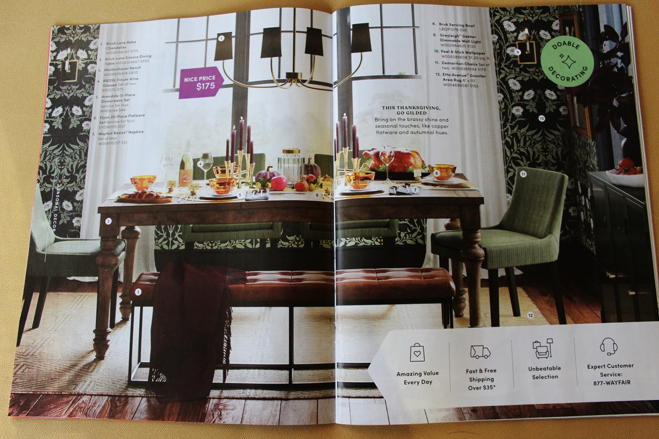
This traditional dining room is set for Thanksgiving dinner! This is everything I look forward to seeing in design around this time of the year. A beautiful table decked out with place settings, candlesticks and pumpkins! The other details drawing me into this room are simple- the table is a classic style in a non trendy wood tone, the walls have a William Morris style wallpaper in a warm dark color and the seating is a combination of inviting fabric and rich leather.
#2 It remembers that practical can still be stylish
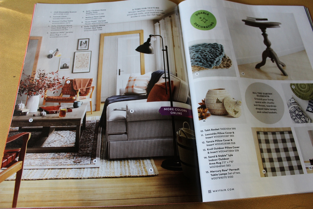
This looks like a real living room in a real house. Somewhere along the line we went from the extreme of modern furniture you couldn’t trust your kids near to over sized sectionals that not everyone has the room for. I missed seeing the practical and stylish rooms at the heart of those older Pottery Barn catalogs I had. This room is rocking the striped sofa, the layered rug look and the leather accent chair. While the chairs don’t look as comfy as the couch- therein lies the balance of this design.
#3 It reflects real spaces we need to decorate
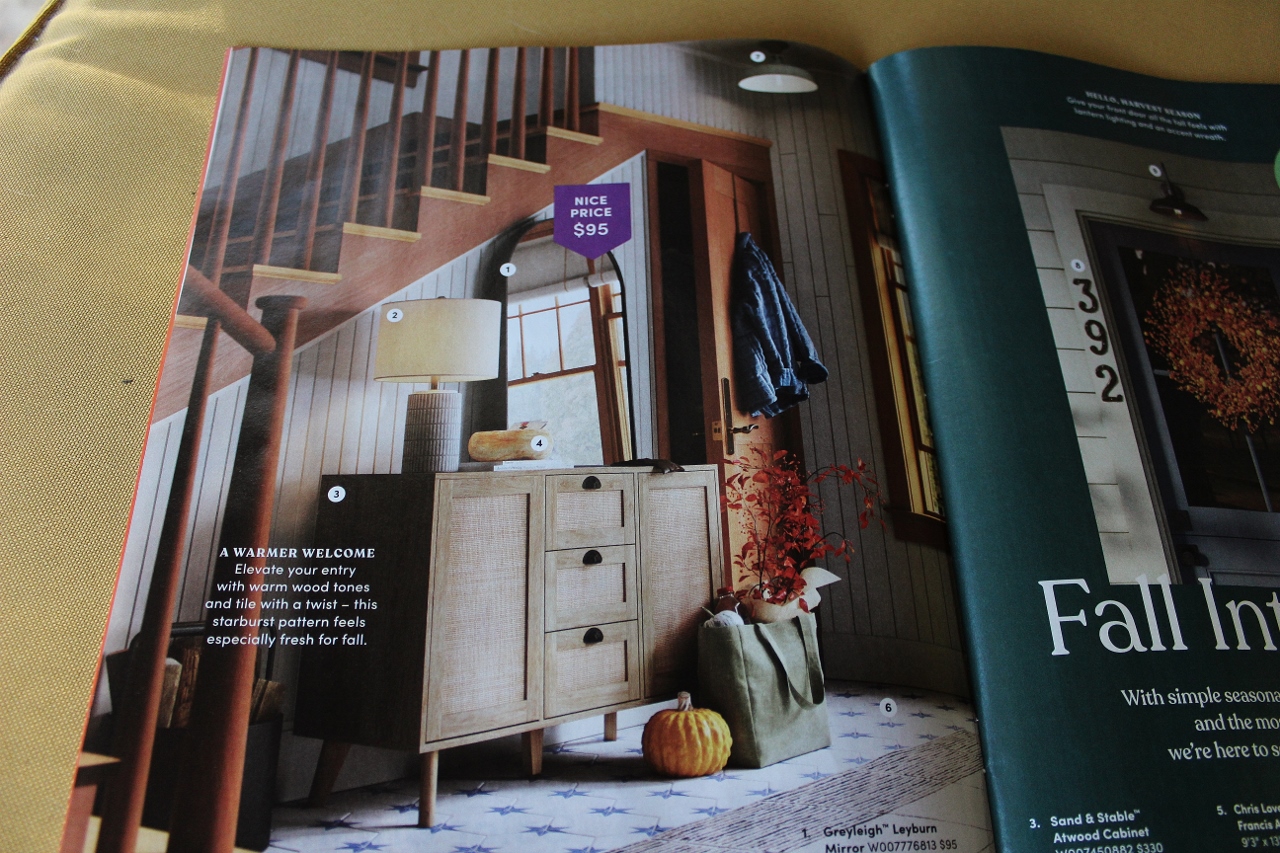
Similar to the previously mentioned living room, this staircase wall looks like a real space in a house. The angles of an open railing, the vertical lines of paneling, and the encroachment of a closet door- are all challenging the design, but in that very real way people need to see. From the height restriction of the mirror to the placement of the lamp next to it, these design solutions are what makes a page like this 100x more interesting to look at then the simulation of a room set up in an industrial warehouse. Bonus points for keeping it real with the mix of woods and the way the skirt board turns into the door header at the top step.
#4 It’s not trying so hard to be a farm house!
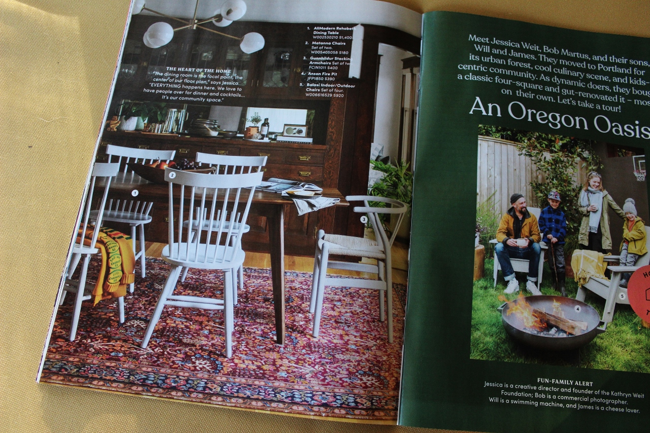
While all of the other pictures could theoretically still be rooms inside of a “modern farmhouse” this room reflects my favorite feature of the old catalogs I kept. This is clearly an old home with an authentic built-in. I can picture the rest of this house and the type of family that settles in here. There is this Craftsman feel in the woodwork but the owners are more into mid century mod so the table and light fixture have cleaner lines. And that rug! I have been in so many homes with this vibe and they always have a fantastic busy oriental rug. I am in full support of a good quality rug with a bold color. It makes the room.
BONUS
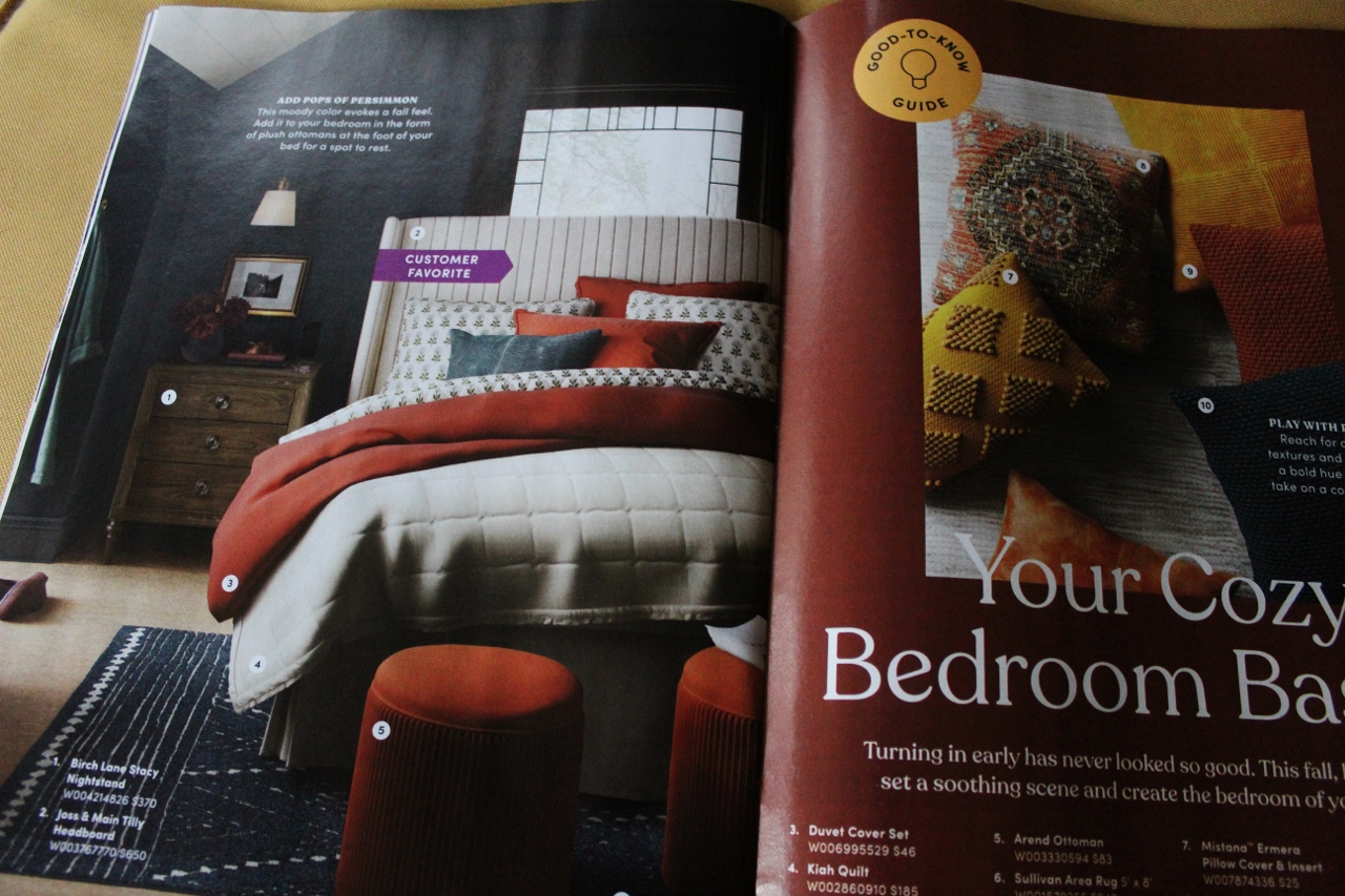
I have to include this bedroom picture from the retail marketing side of things- if you are trying to sell bedding then you need to remember to make every bed look like this! Pottery Barn has this down. The bedding in their catalogs always looked lux and layered. There was always a masterful combination of a texture, a print and a color. Every one of those beds made me want to buy whatever magical down insert or quilted suede coverlet it took to get that comfy cozy look. This picture does the same for me. This is not a platform bed on a floor with a corded pendant dangling over it. I smile looking at this room. This is bedroom goals.
Every one of these Wayfair pages had a a common theme that I can’t help feeling is missing from our online shopping experience- they all look like real rooms in real homes that you could easily walk into and enjoy. For some of the more conceptual interior designers, this mainstream livable approach might seem somewhat mundane. I accept that take.
Pottery Barn and Wayfair catalogs are not for the same demographic as Architectural Digest. And while I have stacks of both I have never returned to AD for inspiration on setting the table or arranging a photo wall. You should love the rooms you come home to. You should want to jump into that bed and pull up the thirteen down comforters. You should want to sit on that sofa with a cup of coffee. The return to colors, to warm stained wood tones, to the textures and the layering of rugs, pillows and blankets- all of this! It felt like the retail market was settling in a place where only one style was being represented, but this- this has restored my faith in design!
Leave a Reply