Five Colors to consider for your next sofa (and none of them are grey!)
August Haven surprised me the other night when I had a little time to kill between appointments. I was expecting to see more of the same- white and grey and black and maybe navy blue. When I touched upon the rising color trends in a few shops last fall I felt I was off the beaten path more in terms of design. While August Haven isn’t your run of the mill furniture giant, there is still a people pleasing commercial element to it that I expected might influence a certain restraint. To be fair, even high end designers want you to buy your big main furniture components in easy to accessorize neutrals. However, I could see a stretch towards color that was very much appreciated. Here’s new colors for your next sofa!
Forest Green
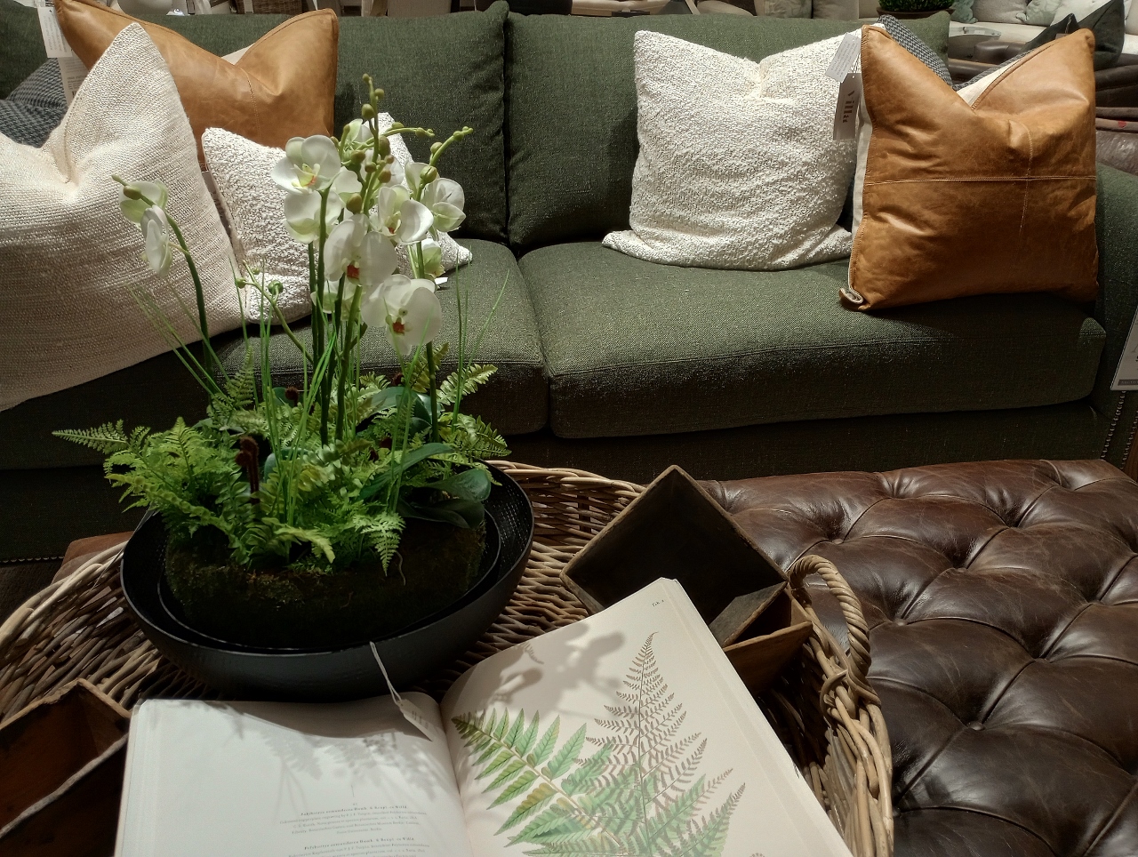
For me- this is classic! You have the tufted leather ottoman-turned-coffee-table up against a rich evergreen color sofa. The combination of nubby white pillows and caramel colored leather keep the look warm and interesting without getting too heavy, which an oversize pattern or woven pillow print could easily do.
Oatmeal
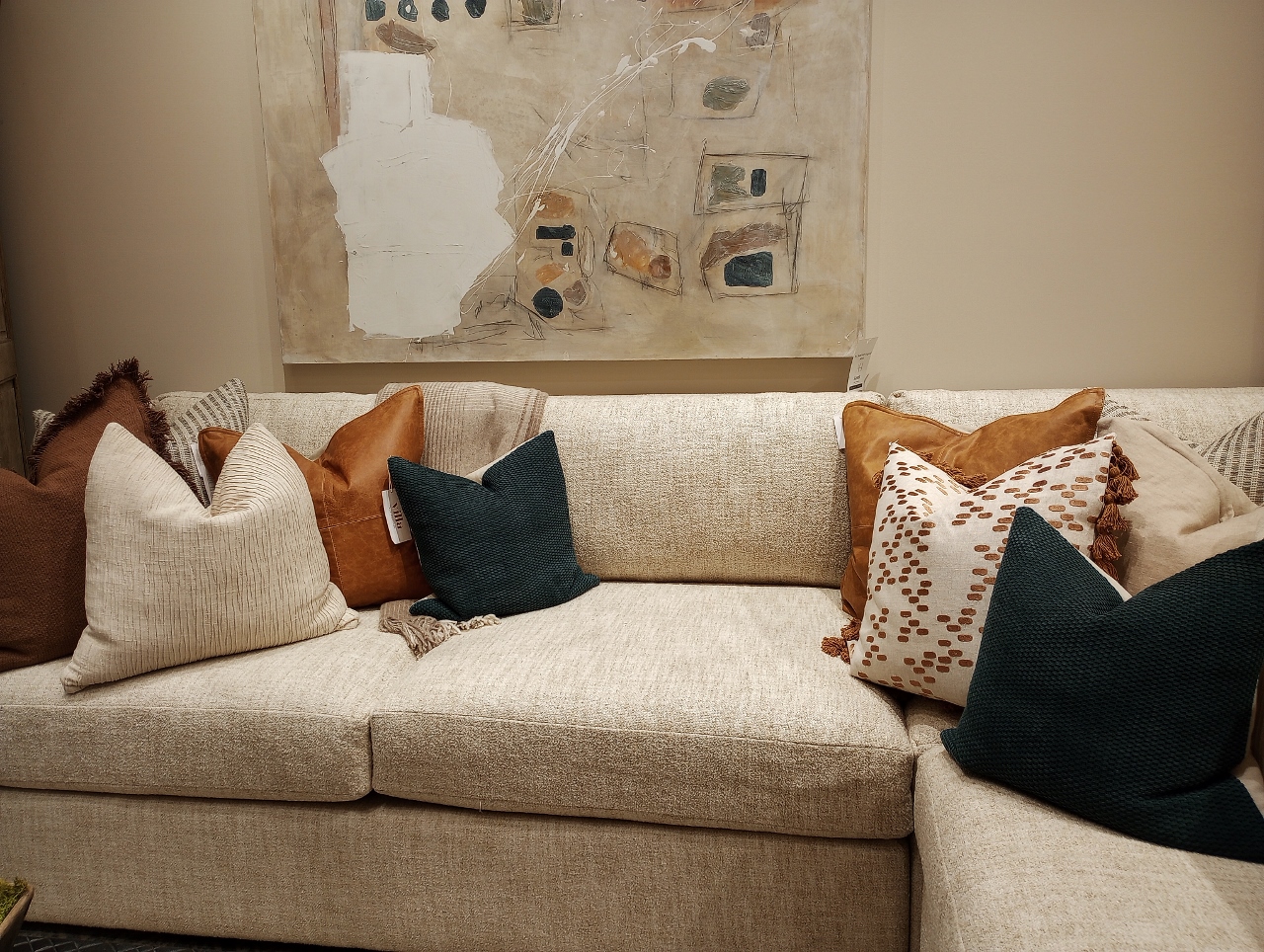
This is for those of you who have already committed to this light cream colored sofa. The pillows are adding so much richness. You have this very dark midnight teal blue mixed with the burnt orange patterned pillow with tassels and again- the caramel colored leather. I purchased leather pillows on clearance hours after I was here and I think it was because these displays subliminally sold me on the idea that leather pillows enhance every color scheme!
Paprika
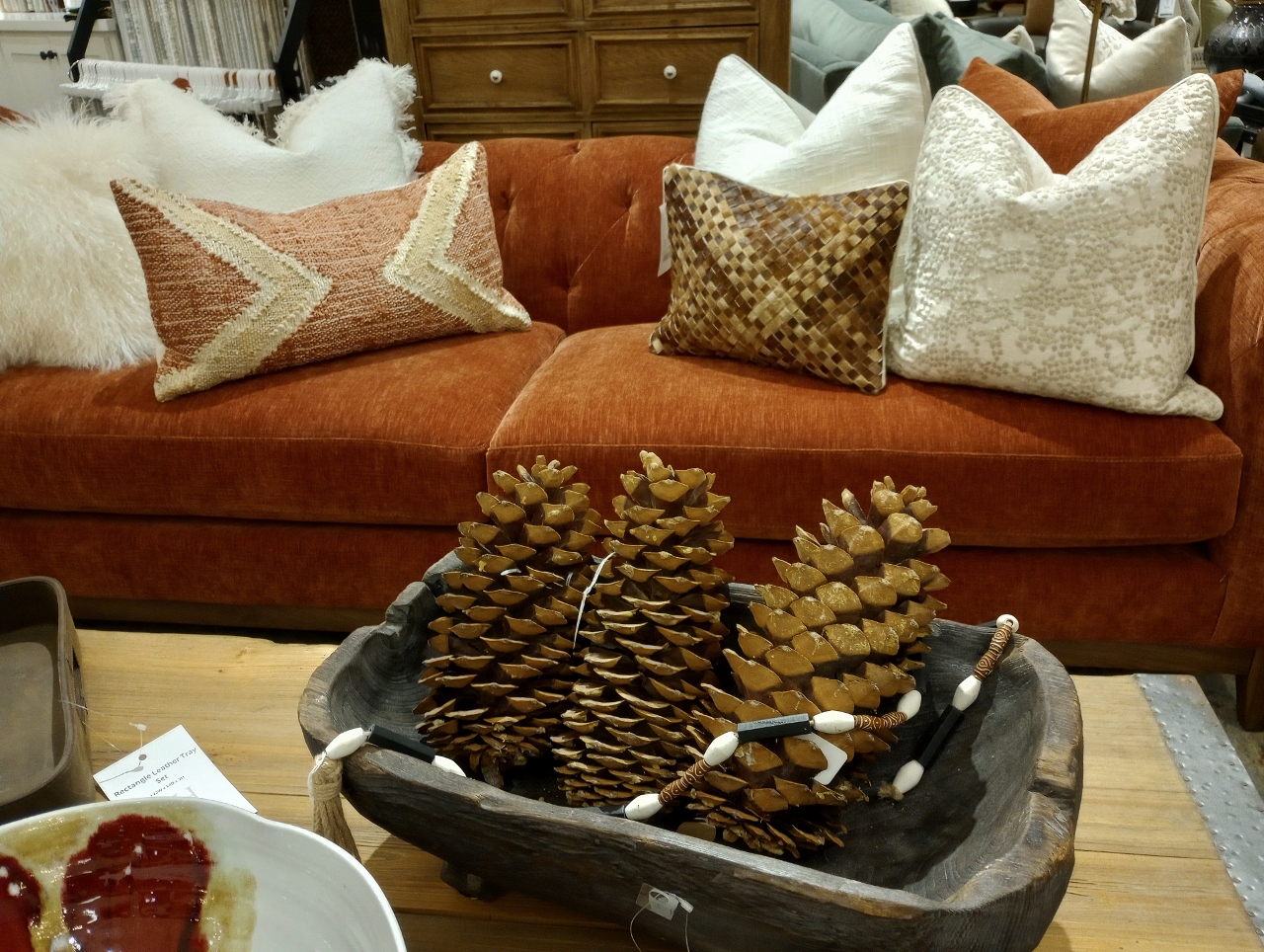
Bittersweet is what I would be calling this one. It also feels very throwback to me to a time when Pottery Barn was rich with color and it did this shade proud! This hue also looks great with the return to the natural woods we are seeing and even the middle brown shades we might have in an older home that we haven’t been able to remodel yet.
Spruce
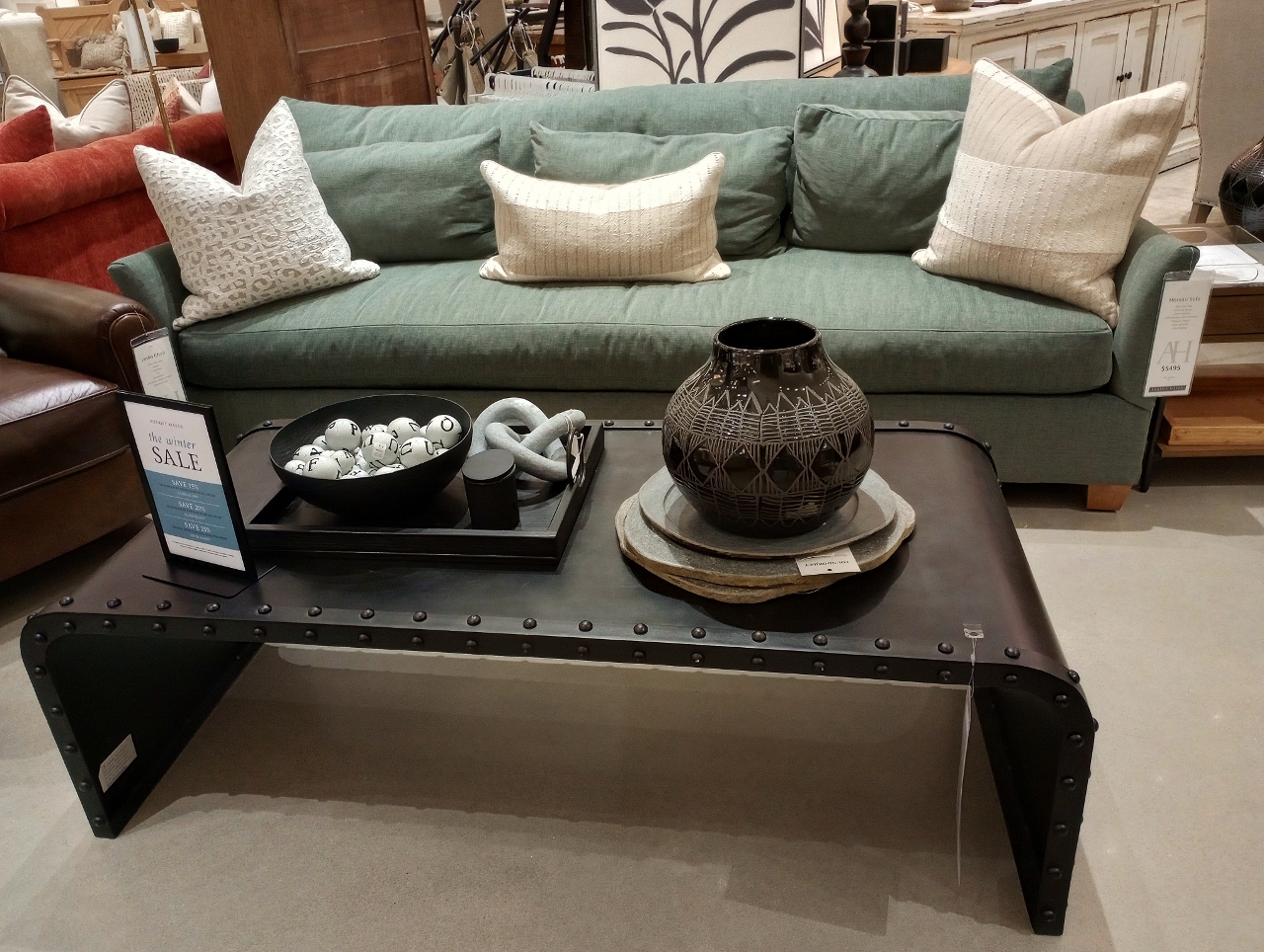
This color is not as obviously on the blue spectrum as the sofas in last year’s autumn post but it is a really pretty in between shade of blue and green. I can’t imagine many other colors that wouldn’t be complimented by this shade which is why my only criticism is the lack of staging with any sort of pop outside of the serious black coffee table accessories and the simple white pillows.
Imagine, for example, my ski pillows combined with this color:
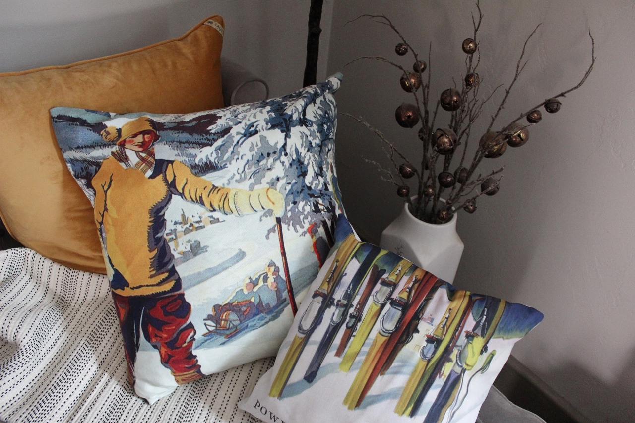
You could add to this with solid pillows in gold or that brunt orange. A plaid white and black wool blanket would be fantastic as a throw against the blue green background. A solid sofa color and an interesting pillow print or piece of art can offer a vast array of inspiring color schemes.
Honey
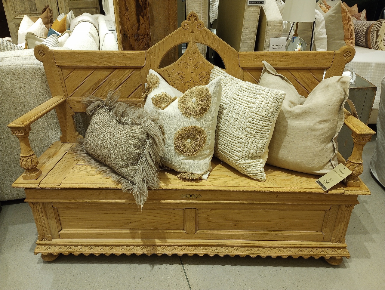
While this is not technically an upholstered sofa the color represented in this refinished piece is undeniable. The wood has been stripped down to a natural and raw shade that represents a honey yellow gold tone. The matte aspect of these new finishes is what saves them from being identified as the “golden oak” of our past. While the pillows lack an exciting color story they are giving us big texture. Extra woolly fringe that looks like the fur of my barn cats in winter, floret bursts that could have been cut from brown craft paper, a chunky sweater knit with a herringbone inside an alternating checkerboard pattern…the monochromatic scheme is what saves them from appearing heavy handed and the pumped up tactile are what saves them from being boring.
Other…
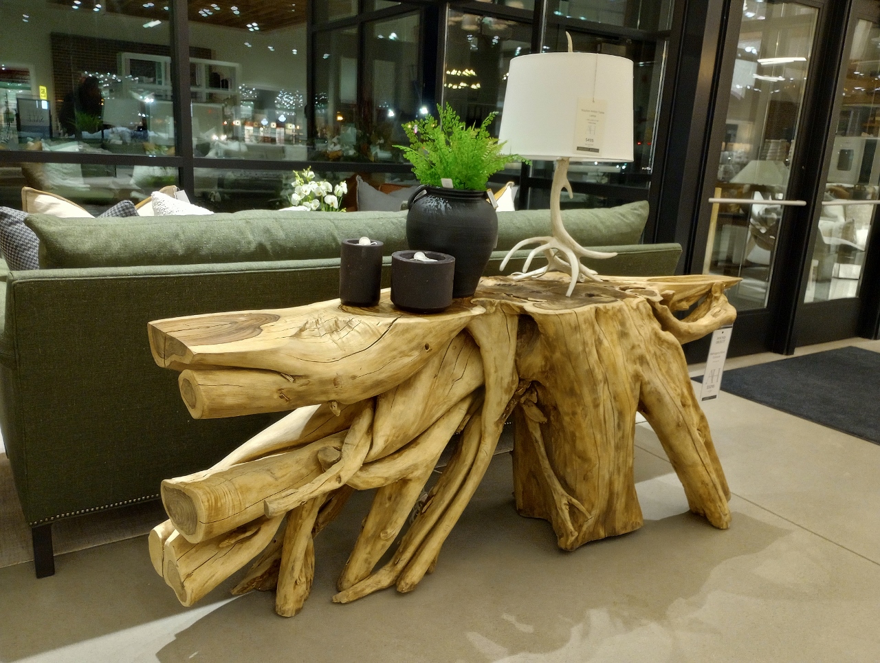
Other honorable mentions from my walk through this showroom that has nothing to do with sofas and everything to do with creating an individualized space with color and texture would be this root table. We see the same light yellow toned wood wanting to be resurrected. It looks beautiful against the backdrop of the green sofa and is kept in check by the black accessories and a near white antler lamp.
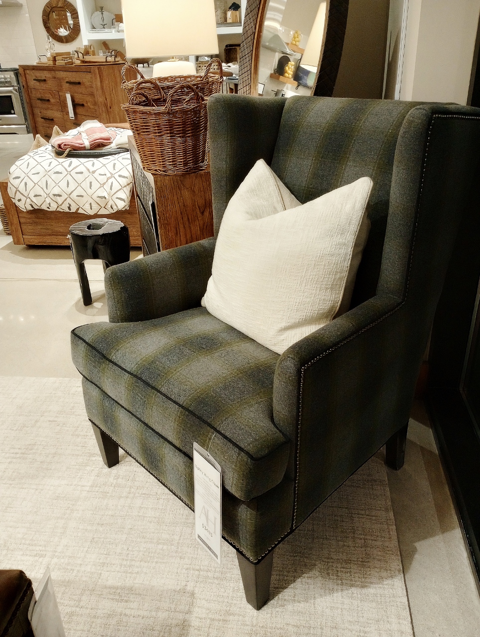
This wing back chair has everything I love right now- it is a casual plaid fabric on a classic silhouette chair in colors that range from grey to blue to green. It could accompany every sofa shown above (even the bittersweet example with the right accessorizing).
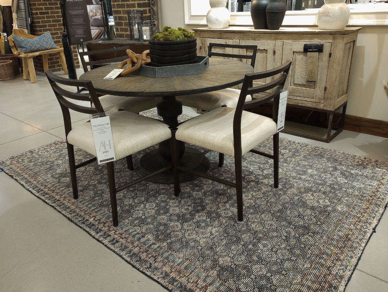
There is a color story waiting to be told in this dining set and it starts with the rug. This goes back to the inspiration post I started the year off with. This rug isn’t wild or too specific in style but it offers many directions for the design of this potential room. The chairs are transitional modern with the black iron and simple white upholstery and yet the sideboard and table top gives us a vintage and more rustic viewpoint. The rug brings it together while also challenging the design to introduce a mauve or a deep moody blue color.
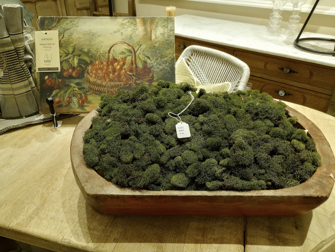
And finally, we have this: signs of spring. Not the bright green easter grass color of a protruding tulip leaf but a wooden bowl full of moss that could have been collected from beneath the melting snow of a cedar swamp. I have also been following this new trend towards small fine art paintings in collections on walls. From deep unruly landscapes to simple baskets of fruit, these rich watercolors and murky oil paintings appear to be art from an old encyclopedia or a book on a botanical study. They are curious as an emerging trend as they are not abstract or modern. As an art movement it’s a small nod to another era, an alternative way of life, when we sought joy in something as simple and wholesome as collecting your own fruit.
And that’s it- my picks for August Haven’s sofa shades should you be considering something new!
Stay tuned for more inspiring posts this month about achieving your collected home vibe, taking a second look at second hand and an update on the latest projects at my own home remodel!
In Case You Missed It!
Leave a Reply