2024 Paint colors of the year
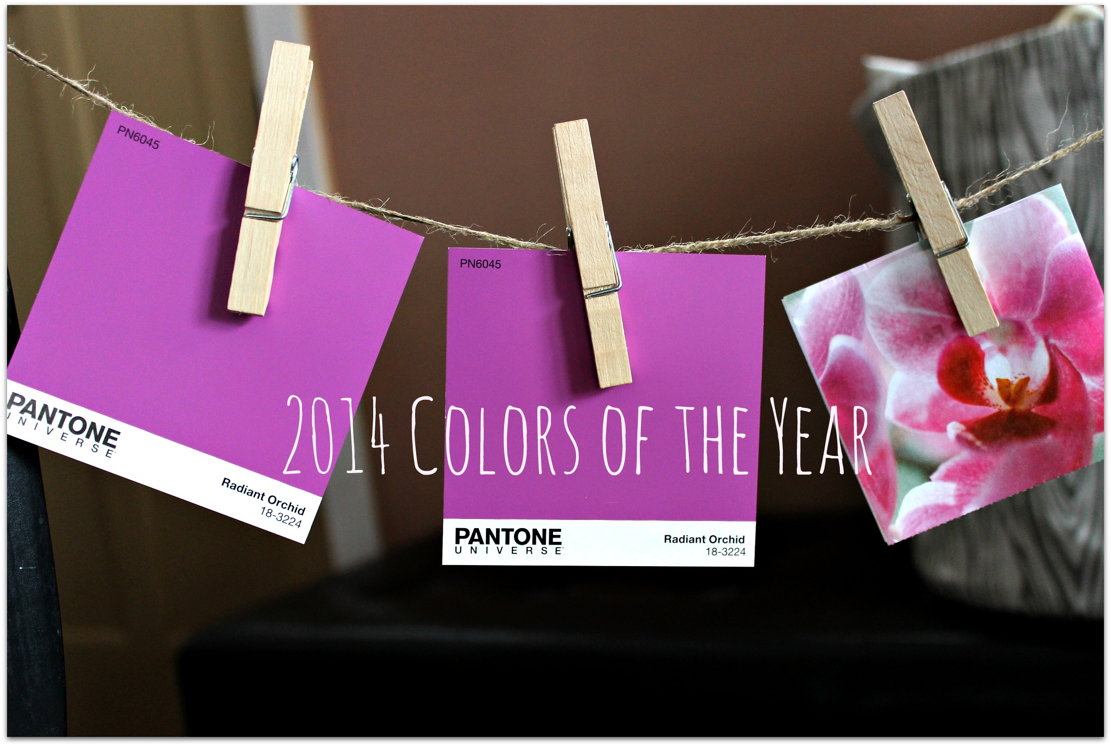
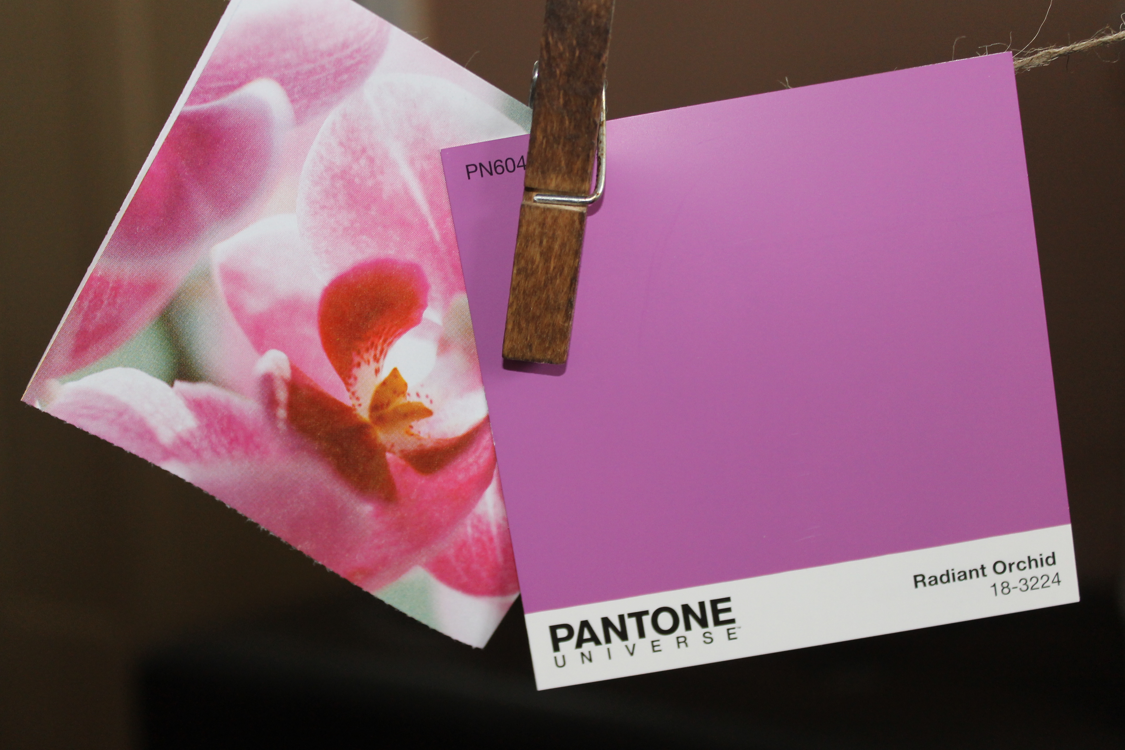
Year one of this blog, as I was finding a voice and learning the basics of how to assemble a story, I started with a simple little post about Pantone’s color of the year.
This was the experimental phase and this post was as good as any of a place to start. There aren’t too many words and just a couple of original pictures.
I hadn’t felt compelled to do a Color of the Year post since. Mainly because I always had enough other content rolling around in my brain. That’s not to say I haven’t written about color:
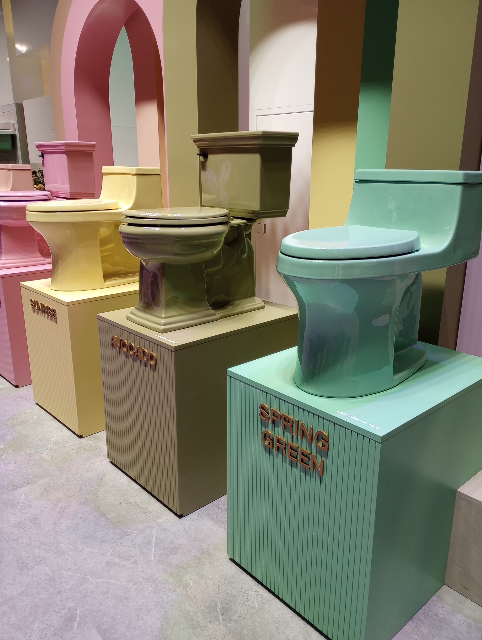
Colorful trends at the Las Vegas Builder’s Convention
Sherwin Williams National Painting Week
Sherwin Williams National Painting Week ll
But this year I wanted to revisit the idea of the individual paint brands announcing their Colors of the Year. They actually announce all of these colors in December but I believe most of us aren’t greeting the new year with a paint brush in hand. We are probably just now getting around to thinking of starting another mess in the house we just put back together after the holidays. So here goes- for your amusement and consideration- the 2024 Paint Colors of the Year!
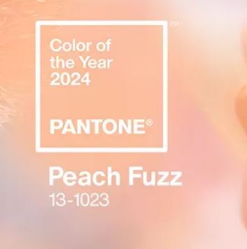
Pantone: Peach Fuzz
I was curious about reception of this color and I opened a Reddit chain that got me this gem-
“Ah, the colour that makes me look like a Victorian child dying of influenza.” -_Frozen_Rose_
My take is that at least they tried to give us a color that challenges the design world to do something with it.
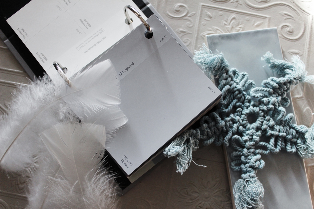
Sherwin Williams: Upward
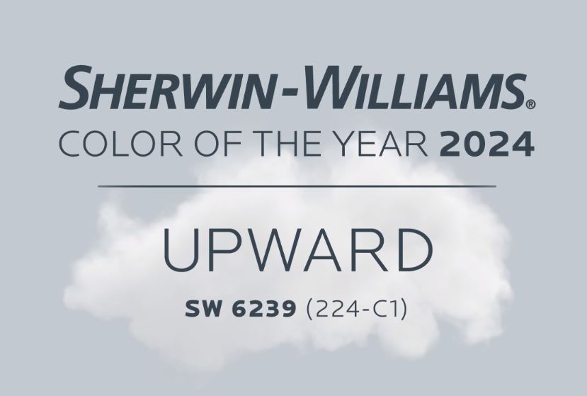
On their website the rooms and cabinets painted this color read as light and airy sky blue while the paint chip appears to be more grey. I tried to capture the playful color of their images by adding some blue accessories into mine.
Let me share the quote on their website- “A hint of silver lining. Introducing Upward, a breezy, blissful blue. The color found when we slow down, take a breath and allow the mind to clear.” Love that description. Love the use of alliteration. Wish the color was as compelling.
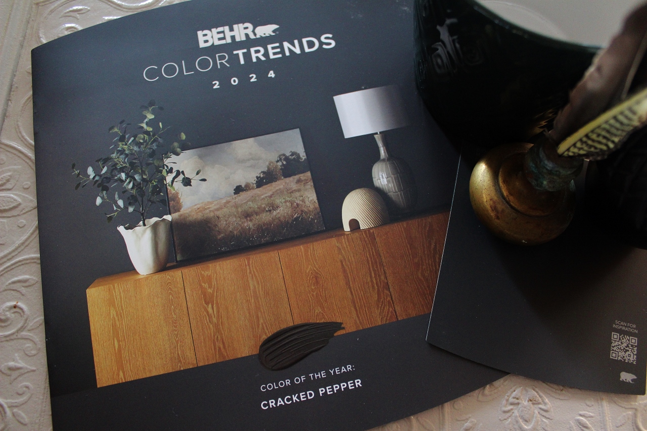
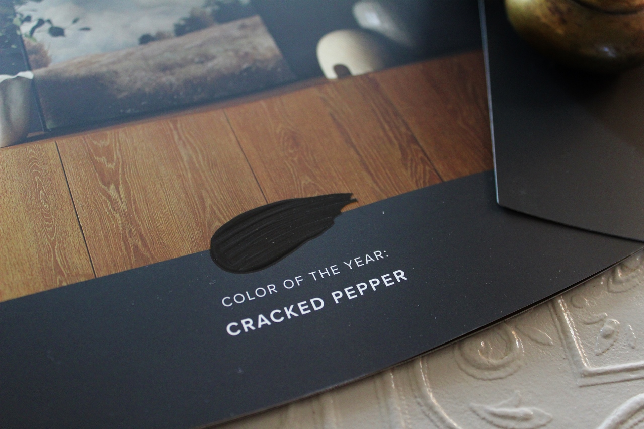
Behr: Cracked Pepper
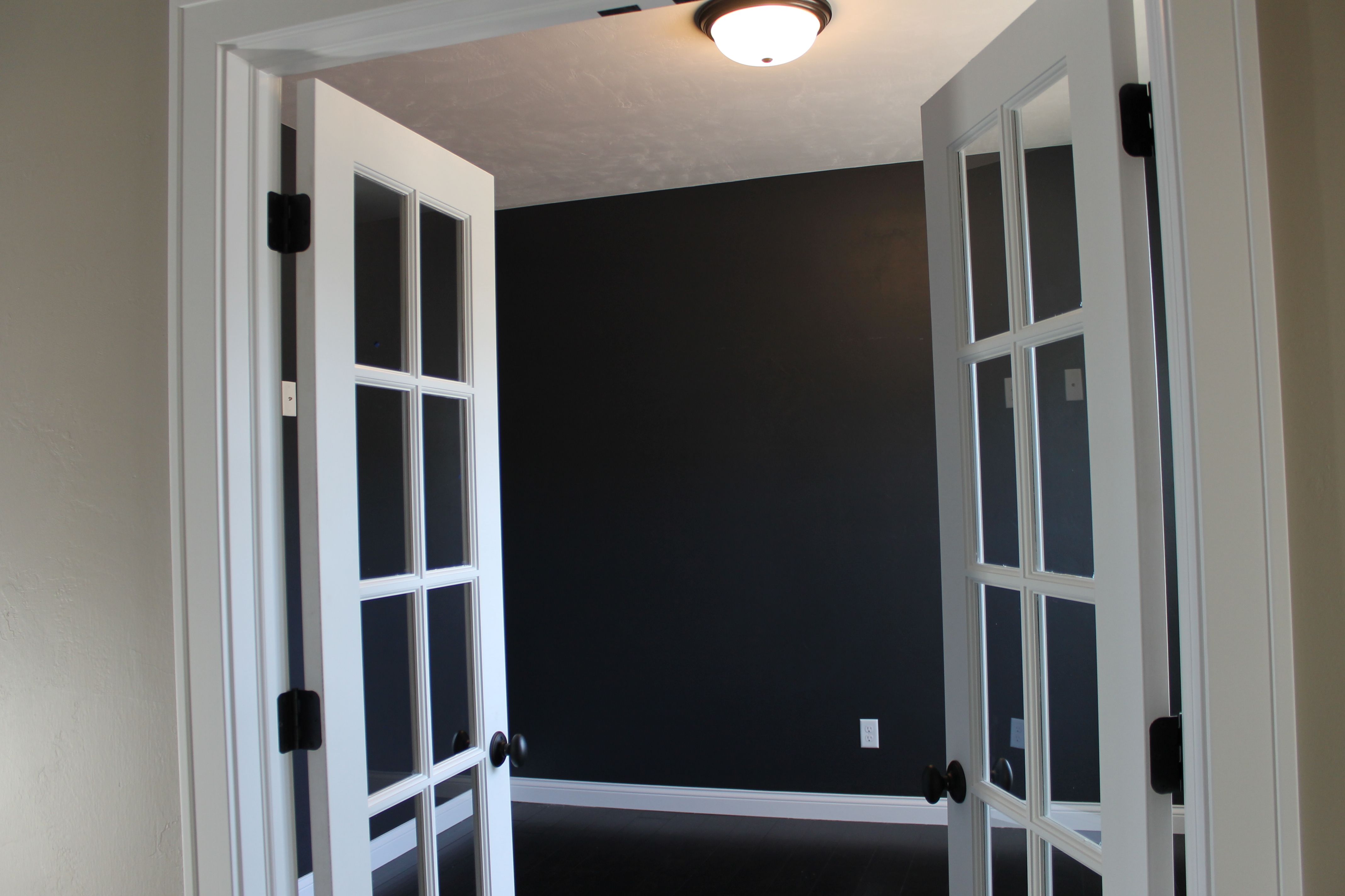
I suspect Behr just went for the winner. They seem less about creating a new trend and more about recognizing the uptick of people painting rooms dark, bold and moody colors.
Looking back at my post from 2017 we had already started the trend of painting rooms black (not to be confused with red doors). This one has had surprising longevity.
Glidden: Limitless
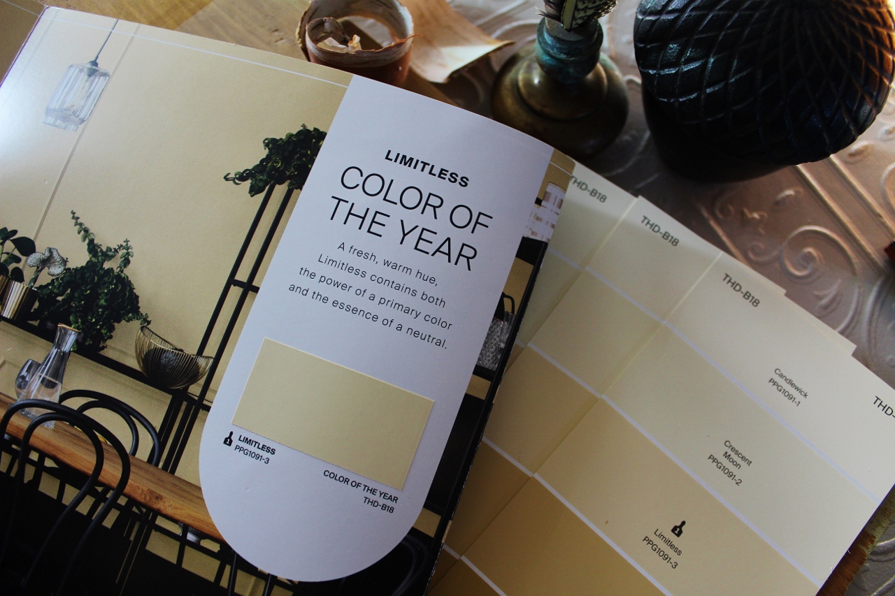
Limitless- “the power of a primary color and the essence of a neutral.” Trying to have it all? As far as a neutral I like the idea and have followed a similar concept of this in my own bathroom.
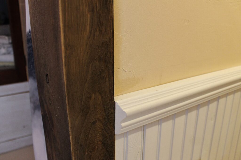
In this photo it appears very similar, in real life my wall is a lot less buttery yellow than Limitless- which could be the turnoff to the Glidden color for the masses. The brochure of complimentary shades is worth a grab if you are working with a historic house pallet as many of the colors presented were quite rich and pleasing.
Benjamin Moore: Blue Nova
Benjamin Moore picked another blue, a totally different blue than Sherwin Williams, but they ultimately advertised their color of the year as more of a color story and marketed it with their complementary shades. Polar sky is closer to the promise of the shade of SW Upward. Of this line-up I am actually most drawn to the three non blue shades. Antique Pewter reminds me of my upstairs trim, Hazy Lilac looks like the color I almost chose in my loft and Regent Green is a shade I would love to find a room for in my home.
It’s interesting to me that none of the choices of the five brands felt particularly new or innovative. When I first pulled 2014’s Radiant Orchid I was smitten. I’m sure it was too bold for most people and therefore probably unmarketable as a best selling wall color- but it had spark! It made you think.
Of course, Pantone did just celebrate their 25th anniversary of the color of the year program. I suppose 25 years is a lot of years to try to keep reinventing the color wheel.
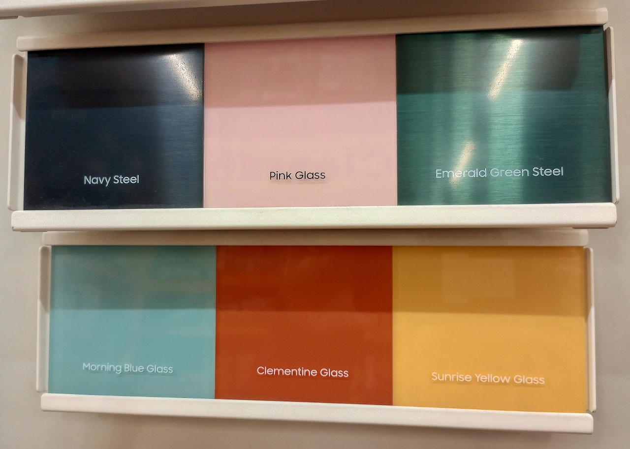
Coming Soon- What’s new in Appliances!


Leave a Reply