Living Well: Paint Trends for 2025
While we all know that the main color you pick to represent a room of your house should be based on your senses and not a yearly “trend” I do enjoy seeing what is in the forecast across paint brands. Paint swatches and brochures are a fun free way to check in on design at our major commercial hubs. So without further adieu – here are the best of the 2025 paint color trends and my thoughts!
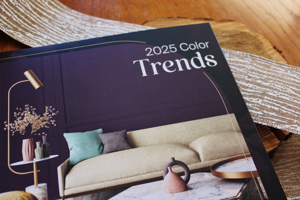
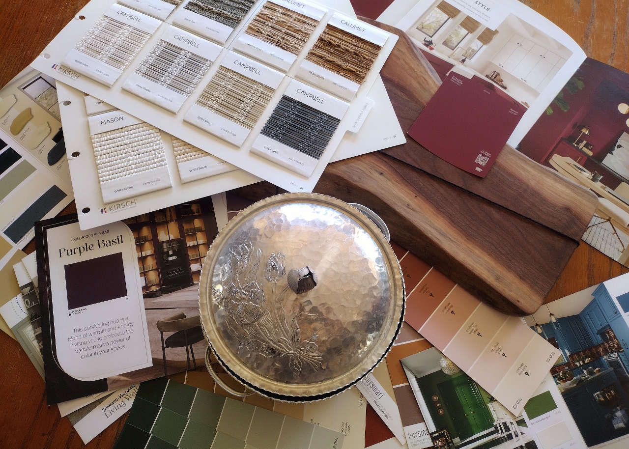
Of all the paint stores and departments I visited, Glidden and Behr did the best job of marketing their Color of the Year promotion. The flyers and booklets were on hand and the main character color they choose was bold and fitting. Take for instance Purple Basil.
Glidden
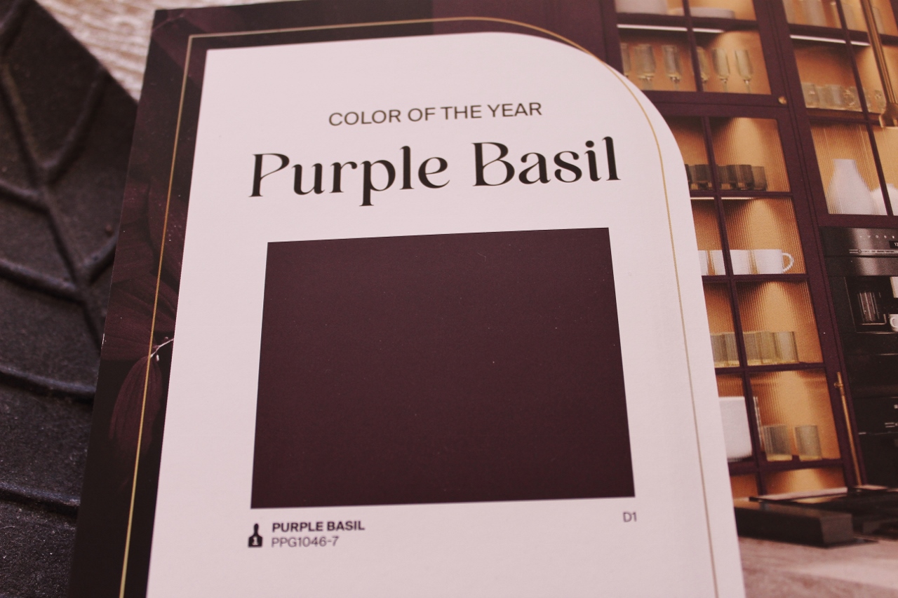
Photography doesn’t do it justice because it is a very saturated eggplant shade. Described as a “captivating blend of warmth and energy.” I liked that the entire brochure focused on a trend palette that fit this growing narrative of deeper moody colors. Color names like Honey Graham, Eagle Eye, Stained Glass and Dusty Trail start to paint a picture of the type of customer and home this has been curated around.
Behr

Perhaps the heaviest hitter of the past few years in the Color Trend of the Year marketing is Behr. Partly due to the exposure it receives as a prominent Home Depot brand. This year they choose the boldest burgundy-red and decided to call it “Rumors.” Their literature was hand’s down my favorite last year with their 2024 pick of Cracked Pepper.
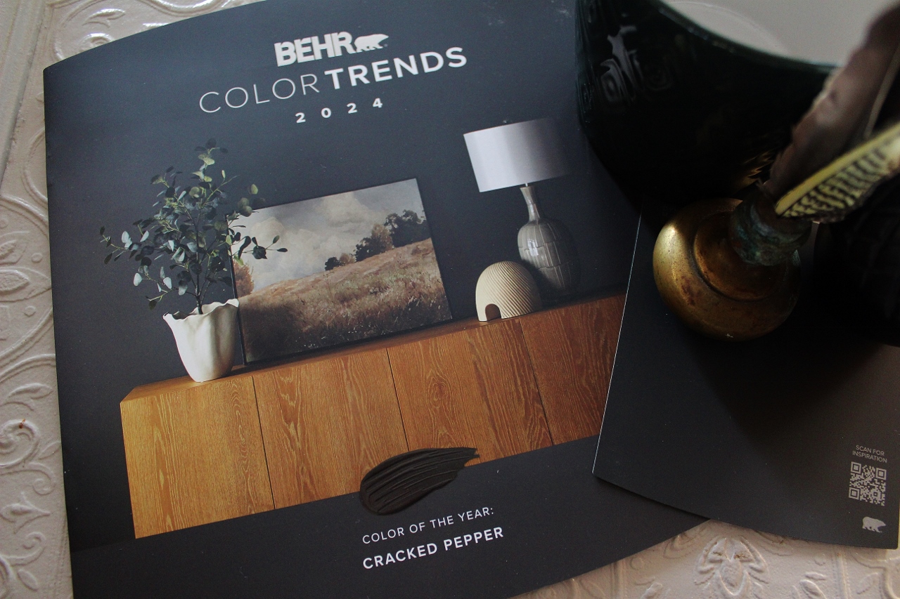
They do this very tactical brochure with the raised paint swipe that just makes it stand out as quality marketing.
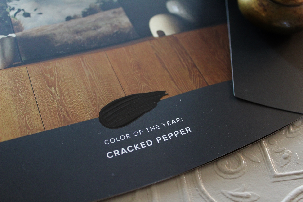
To go from last year’s black- representing the darkest of the spectrum, to an only slightly less intimidating shade of Bordeaux- is staying the course of embracing this bold color movement.
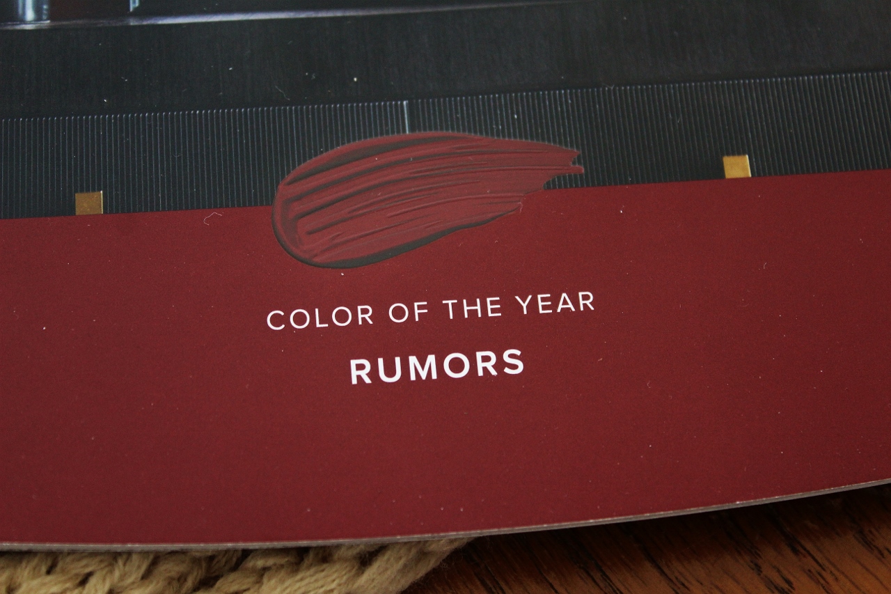
“Luxurious”
“Captivating”
However, they did a less comprehensive job than Glidden of naming their colors to create a story. With examples such as Blank Canvas, Nutmeg Frost, Wild Truffle and Aerial View, I’m not sure how the choice of “Rumors” came to be the headliner. It doesn’t quite flow.
Zinsser
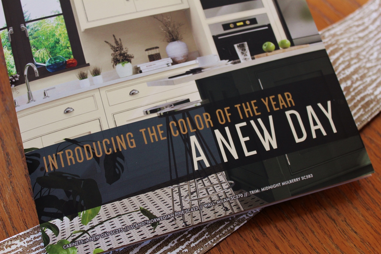
Many of you may not be familiar with Zinsser unless you are an avid Menards shopper. This is a reasonably priced versatile paint available at our original WI created home improvement chain. Considering the price point I was very impressed with the quality of the brochure and the dedication to throwing their hat in the ring of this yearly promo.
Their overall color story was my favorite, with additional colors such as Spanish Moss (a sage green), a near black shade of hunter green called Norwegian Pine and a burnt orange similar to my bathroom color named Turkish Coffee. They are a call back to the best of the craftsman-cottage colors of the mid 2000s.
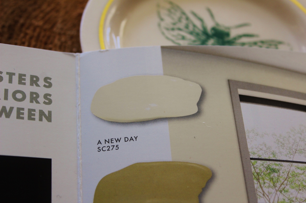
However, I will say that “A New Day” by Zinsser feels an awful lot like the Glidden 2024 color “Limitless”:
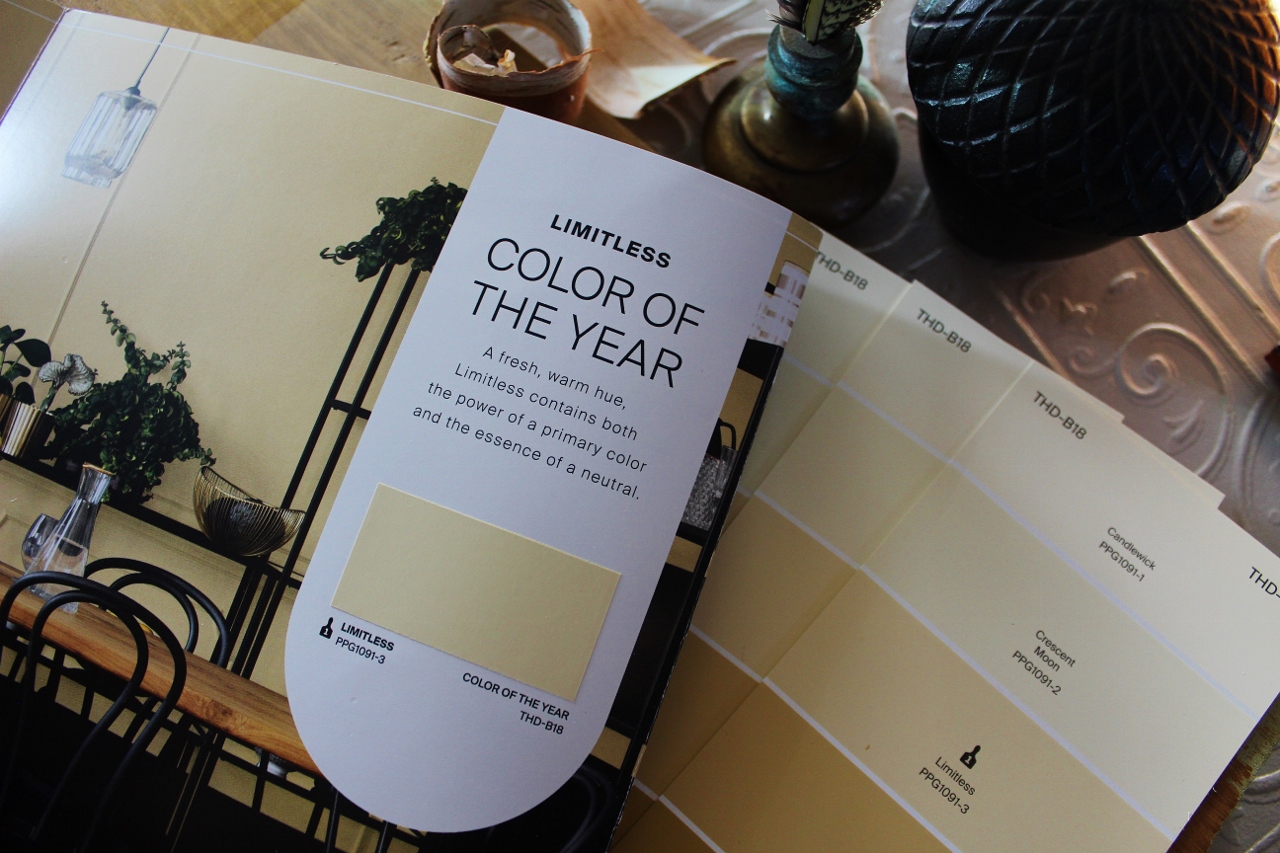
Which- kudos again to Glidden for going from a creamy neutral like this last year to that dark Purple Basil color of 2025. It shows the imagination to capture a wider audience.
Now in more disappointing news…
Sherwin Williams
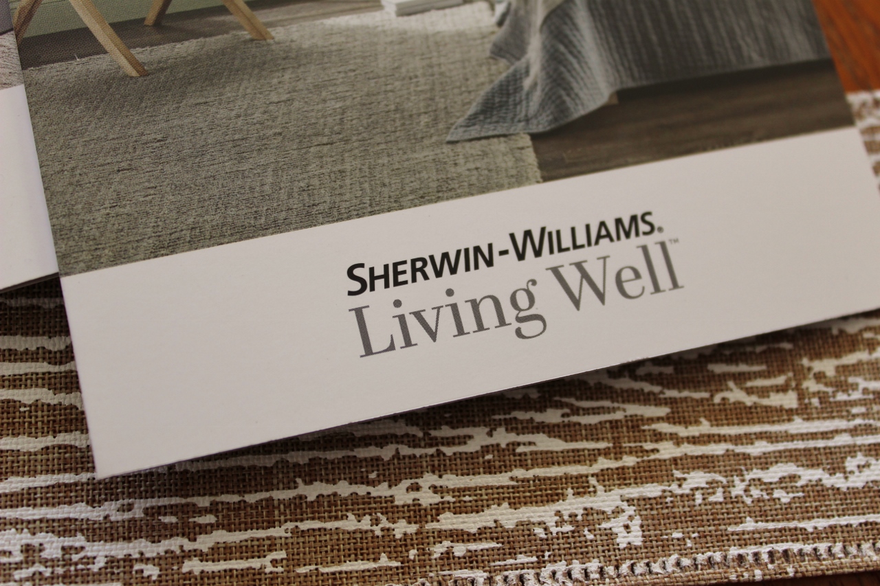
I walked into a Sherwin Williams stand alone paint store, not a paint department that sells Sherwin Williams, a dedicated store, and found no Color of the Year merchandising anywhere. When I asked the associate working there they gave me absolutely no direction as to what the annual color pick could be. Determined not to walk out empty handed, I took these nice pocket size color folios that I felt represent the current Wellness movement.
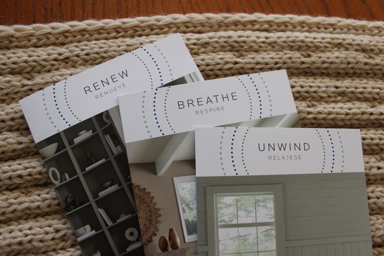
These marketing pieces are tidy and well designed. The “Unwind” color story promotes all soft shades with appropriate names like Stardew, Lullaby, Let it Rain and Pussywillow. Perfectly curated to hit home their messaging of- “serenity, lightness and ease…calming colors that stir a sense of well-being.”
From what I have gathered online since my visit SW decided to promote a Color Capsule this year, with the focus on a shade of brown called “Grounded” (not pictured).
In Conclusion
I will say that this 2025 sampling did more for me in terms of leaving me analyzing the marketing and vocabulary of the selections over the actual colors. All the brands used a similar focus in their secondary shades of connecting with nature and promoting wellness.
“This palette captures nature’s diversity, offering a spectrum of hues that mirror the beauty found from the sky above and the earth below.” –Glidden
“This color collection fosters serene and harmonious interiors that inspire connection between the mind and nature.” –Zinsser
“Restful retreats- create a serene sanctuary with soothing green tones.” –Behr
“Create your haven with a collection of colors and paints that help you live well.” –Sherwin Williams
While improving ones mental well-being might be a lot to put on any singular shade of paint, it’s not a totally ridiculous place to start!
Leave a Reply