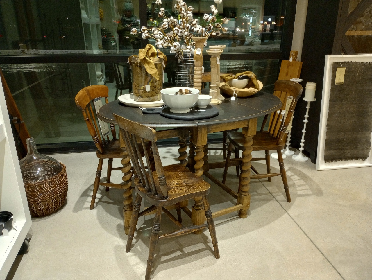
Can we please stop telling people what not to do in their homes?
I can admit I really hate being told what to do. I’m not referring to the dynamic of a respectful and constructive environment where someone needs to dole out tasks to get something accomplished. I’m talking about people making opinions a way of life. “You should really get an I-phone.” “You drive too much, you should move closer to your job.” “You’re going where on vacation? That doesn’t even sound like a vacation- you should go …”
In general I shouldn’t feel like I have to defend my position and I should just quickly disengage but today is not the day for that. Today I want to address an article I just read about “things to never put on your dining room table.” The use of “what not to do” is a powerful way to spark interest and get clicks, and hey- it worked on me. I read it. And it made me realize that we have quickly descended from what used to be the joyous era of DIY and helpful How To’s to a negative dialogue of designers wagging their fingers and scaring homeowners with the threat that there is a fundamental right and wrong way to enjoy your space.
So here’s my counter to this entire article. Sorry Homes and Gardens. But do better.
You say- No Large Centerpieces
First on the list was no larger centerpieces. I get the practicality of this for a dining table and during a dinner party but most people who would have giant centerpieces on their table have formal spaces they rarely use. I can’t think of anyone who wouldn’t know to move this off their table when everyone sat down to eat. In the meantime it is a way to dress up a room with something for the holidays. The alternative suggestion is seasonal fruit in a bowl or a single candle. If that speaks to you- go ahead. But we can all admit that a bowl of fruit is not interesting.
You say- No tall flower arrangements
Second on the list was no tall flower arrangements. So we have- no large and no tall. Feels repetitive, but okay, we’re covering our bases and stressing size is the problem. Again, I don’t know who the target audience for this article really is since I rarely see people in real life with tall and large arrangements on tables where people are eating. This has always been reserved as decor for formal spaces, on foyer tables to greet you when you enter and for, I don’t know, impact for photo shoots for magazine articles such as Homes and Gardens!?!
You say- No place mats
In an article where the photos were meant to demonstrate examples of well dressed tables, 2 of the 5 examples showed place mats. I would have either found different photos or just taken this “What not to do” out of the equation. If your vast Homes&Gardens photo library couldn’t support this (I want to say suggestion, but again, it feels like more of a scolding) then surely you could have conjured up some other staple table decor item to criticize.
(Back to size) You say- No small accessories
Ahhh… okay! The “no place mats” convo was just inserted in there so the whole article didn’t feel too Goldilocks. Too big, too small…tell us, please, what is just right!?! The “no small accessories” might as was well be “no accessories” because accessories are typically there to compliment your main attraction and since we aren’t allowed to have big or tall arrangements, your just right centerpiece would naturally be surrounded by “smaller” items.
You say- No faux flowers
I knew this one would be on the list. There is a derogatory attitude towards anyone who doesn’t subscribe to the level of maintenance house plants involve. Not to mention how impractical it can be for anyone who shares their space with a pet. But alas! The designers have weighed in once again to bully us all on our very reasonable desire to have something we only buy once and can reuse. No faux flowers. The suggested replacement? A bowl of moss. So for the record that’s- no big flowers, no tall flowers, no fake flowers. I think someone just doesn’t like flowers…
You say- I only hear what I want to
I don’t listen hard…
I don’t pay attention…
To anyone, anywhere…
I don’t understand.
Yes, I’m borrowing the words of Lisa Loeb to end my position here. In searching for photos to back up my article I found my favorite excessive table settings of all time- Thanksgiving at William Sonoma 6 or 7 years ago.

There’s color and pattern and whimsical dishes that are the accessories. Now realistically no one would put this much stuff on their table all at once, but even if they did- it still beats a bowl of fruit!
I guess my main point is the one I continue to nurture through my Collected Home Series. You should be finding things you love that bring you joy. If that means your table is full of tall and large faux flowers on place mats that you love, then do it. If these articles are meant for people who don’t know what they love or how to get started- then I stand by my argument that telling them “what not to do” isn’t very helpful. These types of people will just do nothing. And I would always prefer to see someone do something, even if it is a huge designer mistake, then do nothing.


Leave a Reply