Two aisles: the shocking difference between these competing trends
As I was shopping for birthday party decorations I found myself at a common crafting store abruptly torn between two aisles with extremely different feels. On the one hand it amused me because the “goth” inspired aisle took me back to the edgy decor of my HS years, while the “green” aisle just felt like every modern middle aged woman’s go-to summer accessories. Is it possible the point was to see ourselves in both scenarios? Here’s a fun side by side comparison for anyone who once fancied themselves an angry teen rebel but has found themselves live-laugh-loving in their farmhouse themed laundry room.
Heads will Roll
Apparently we want heads on display, or a Victorian bust to be exact, from the first example. The severity of the burgundy floral is dark and moody when compared to the bright green of the artificial succulents in the competing aisle. The ceramic white head planter has the vibe of an old Pier One Imports store and the mouth is formed as if … it should be blowing a bubble? Of course the Victorian bust is doing this- to, you know, enforce that it is youthful and playful and not old and dusty. I’m not sure what grand statement the lace over the eyes is making, other than it is giving me “God Save the Queen” from the Sex Pistols album cover.
Should I stay or should I go?
Quirky little gold chairs, heavily floral trays and no nonsense frames with messages like- Be Nice or Leave. Versus pastoral landscapes in smooth rounded frames, botanical storage boxes and completely gratuitous signs that you can flip from clean to dirty. While one aisle is bluntly enforcing boundaries, the other knows that most of us will buy any enamel black and white sign. The fact that it is also there to remind us not to put dirty dishes in the dishwasher with the clean ones truly shows how mundane adult-ing has become.
The Pillows have Eyes
There are a lot of references to eyes in the dark moody goth aisle. Eyes on vases, eyes on chairs, eyes on pillows. Does anyone else remember that 1995 movie with Drew Barrymore, “Mad Love”, when Chris’O Donnell’s character comes back to their room and she has cut outs of eyes from magazines all over the walls? No? Well, I do. I think about it every time I see collages from magazines or giant eyeballs on pillows (apparently). I would have been around 14 when that movie came out and I guess that scene really stuck with me. Meanwhile we have a plant. Green with leaves. Simple. No unnecessary body parts looking at me.
Don’t tell me to calm down
There is so much going on here in the first aisle! We have gold roller skates and black bird cages, pink plaid and stain glass letters. And then the polar opposite to this chaos- calm. Warm woods, soft letters, paintings that look like European countrysides, the texture of baskets and macrame. The youth in me embraced the messy randomness of life but as you age you look for peace. You appreciate repetition of colors and materials, you are soothed by the familiarity of it all.
A tale of two collections
Well, I guess we’re not done with the eyeballs. Although I can actually appreciate this little collection in a shadowbox. It feels like a nod to the strange and unusual, a curiosity shop if you will. In the other aisle there is more calm and tranquility. Classic pictures of birds, as if sourced from the Audubon. A trinket box and another landscape print.
Every rebel plays the cello

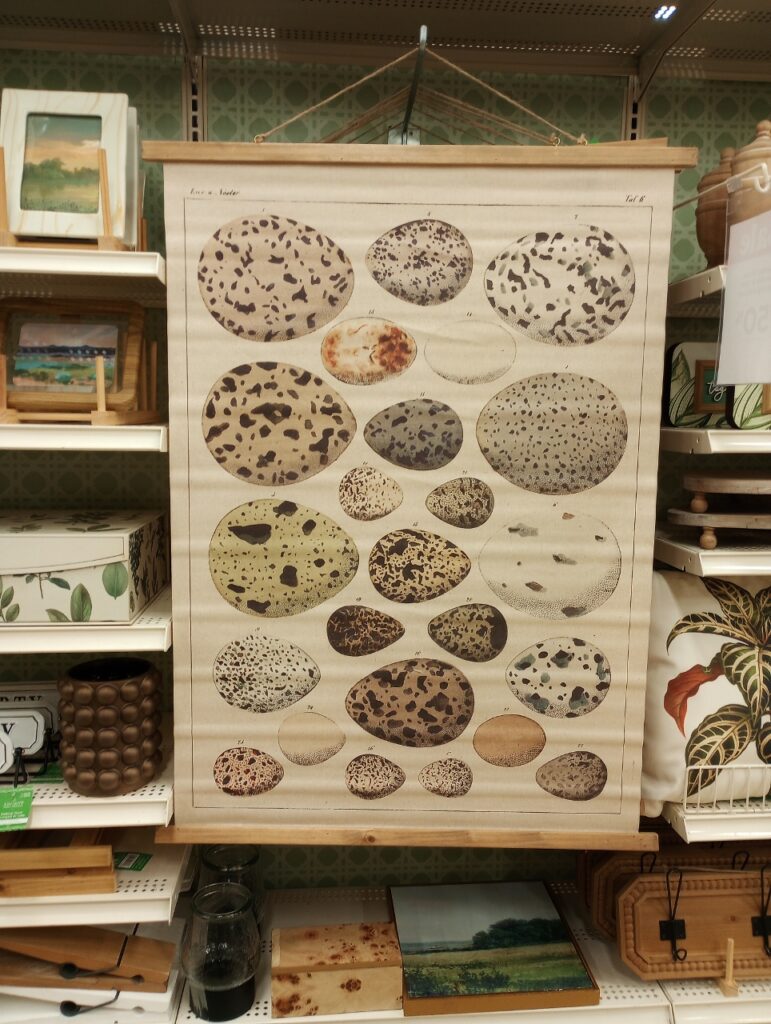
I will say I’m as surprised as you are to find a diagram of a cello and not an eye exam chart with letters arranged from large to small. In the green aisle we have one of my favorite subjects next to feathers- eggs. These two examples are actually the perfect commentary of nature vs society. The sophistication of an art form that is manufactured by mankind to create music- compared to the unregulated beauty of something that just exists naturally, that creates life. I do like both of these options. However, I know 40-something year old me is going with the eggs.
Better together?
And finally we have the frilly and the absurd- little dress forms with black lace and pearl necklaces, fairy tale books that resemble leather bound novels. And on the other side we see that same repetition-a familiar plant leaf, a soothing wood tone tray, an inspirational phrase. I leave you here as if you were like me, recalling the things your 16-year old self would have chosen. Cringing at the decorating decisions of our parents without realizing we would someday become them.
I think good design comes from keeping a little of our youth and mixing it with our mature tastes. You can have a touch of whimsy in a sophisticated space. I’m sure we’ve all had that little urge inside of us to add a quirky statement piece to our open shelving with perfectly stacked white dishes. We’ve all had that dark room in our house that felt too sad and imposing that we brightened up. There is no judgement here (okay, maybe a little side eye for all the eyes). You might see yourself fully in one aisle but still enjoy shopping in the other.
What makes us interesting is our ability to identify with ideas on both sides.
What makes design interesting is the ability to see how it can be even better together.
You Might Also Like-


Leave a Reply