A peek into the plans for our bonus room!
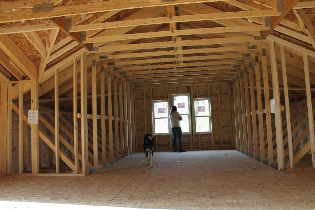
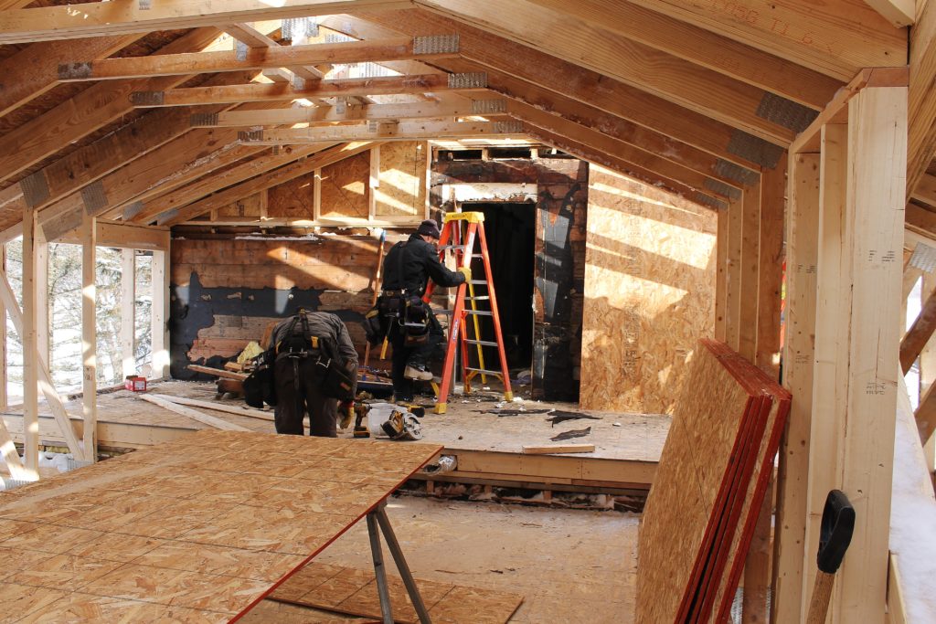
It is slow going out at our bonus room project these days, but considering how far we’ve come we’re happy to have roofing and siding done and a break from any sort of “demo” work. We recently had insulation added to some areas in the original part of our home and are on the schedule for concrete for the covered porches and garage floor later this month.
So I’m taking the opportunity to do some dreaming and get a little creative!
First, some background- since the thing we lack the most in our house is storage, it should come as no surprise that I am the most excited about the first phase of our bonus room project: “the attic.” That’s what I’m calling the 8 foot transition into the bonus room from the old upstairs. I designed the space to be flush with the old house floor and then step down into the rest of the bonus room to give a distinct separation between the spaces, and a clear sense that is was added on at some point.
Some people might prefer their additions to feel seamless, as if they were always an extension of the floor plan, but I actually like to draw attention to the evolution a house takes on over a century of trends and multiple home owners.
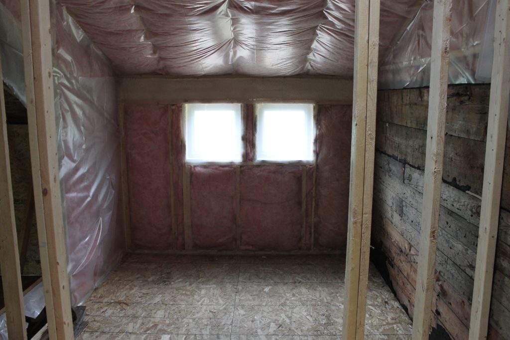
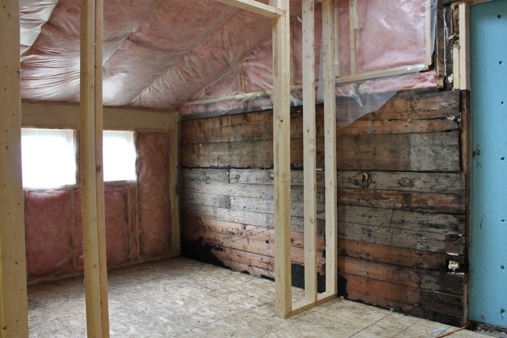
So that thought was my inspiration behind “the attic.” I wanted to create an entrance to the bonus room that would give me some much needed closet space, but I also wanted that space to be beautiful and interesting. Once the original sheathing on the outside of the house was exposed, I came up with the idea to finish the area to look like you were stepping through what could have been the old attic of the home.
The space has a vaulted ceiling, a closet on the left with windows out the front of the house and a closet on the left with a niche framed into the front for a console table. I added the skylight to the ceiling because the light from the front windows will eventually be behind closet doors and I always liked the light that came in through the dormer at the top of the stairs.
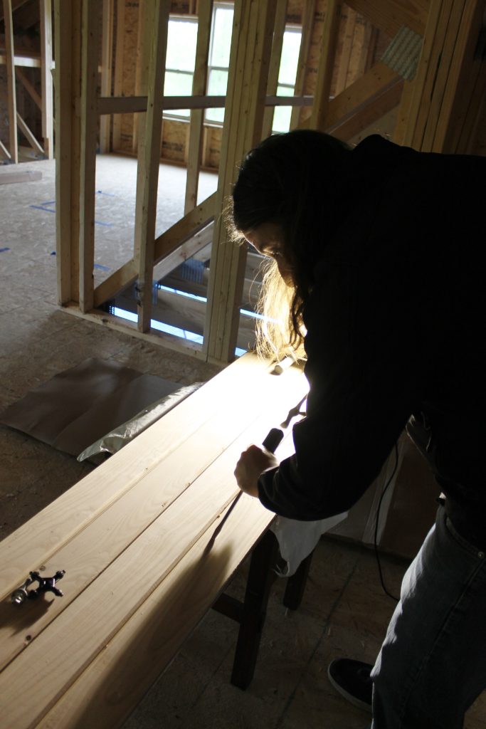
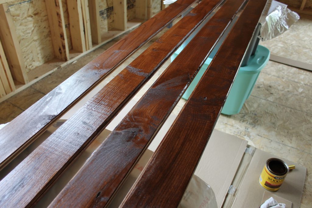
The old house sheathing that inspired my attic-vibe will end up being covered up since it needs more repair than what is possible to make it a presentable finished wall. But to bring the wood tones back in we have been distressing and finishing some tongue and groove ash for the ceiling.
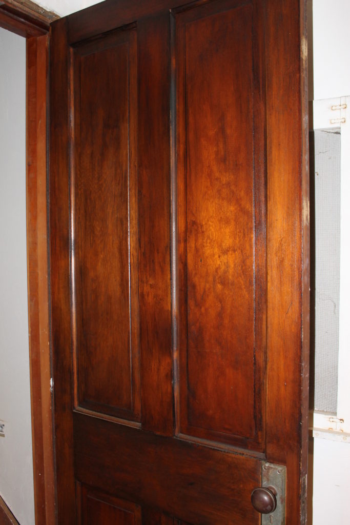
I started with a Chestnut stain and have since been adding a Polyshades finish to give it a more glazed and old-aged finish. This coloring is probably the most true to the original woodwork that we found in the house when we began gutting.
I was hoping to match the look of the original door to our upstairs that I was always going to replace until after I did some finishing techniques and ended up loving the authentic look of it.
Although there wasn’t a lot of the original trim left on the first floor when we started our house project- what we did have ended up in the barn. I am hoping I can scrounge up enough to trim out a set of closet doors. In that entire area I am hoping to incorporate a mismatched trim look like we appreciated at a popular brunch spot while on vacation in Savannah last fall.
The restaurant, called Prohibition, had an amazing mix of materials and textures, from the tin ceiling to the barn wood accented by riveted metal corners. I love how the board under the crown molding in this picture is a grey piece of wood with chippy white paint on it. It made me want to go picking back through our scrap wood pile for all the fascia wood that was on our house! This restaurant also makes good use of a brick wall behind the bar, another thought we are toying with for somewhere up there. I mean, who doesn’t love a little exposed brick?
So that’s what’s going on in our neck of the woods! I hope to have some updates on the garage next month and a future post laying out my plans for our mudroom.




Leave a Reply