Thinking about the fridge when laying out a kitchen
I recently helped a friend house hunt for an older character home and one of the things I noticed is prevalent in the kitchen designs of these homes is the awful location of the refrigerator. A complete after thought. I spent a lot of time looking at pictures of the kitchens in listings wondering- where is the fridge? It was usually out of the shot, either all by itself on the other side of the room or sometimes in it’s own room, like a mud room or an enclosed porch area near the kitchen. Updating them may require putting the fridge in the next room, but hopefully by taking out the wall the separates them first!
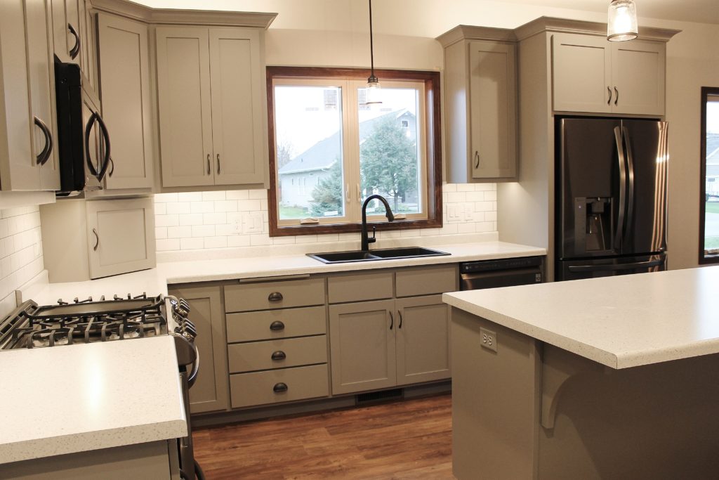
Here’s a look at some kitchens where the fridge is on the outside of the work triangle- in the right way!
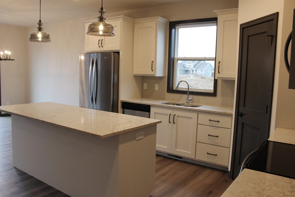
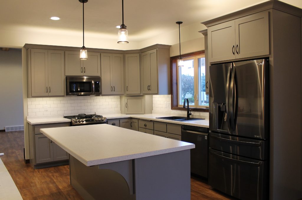
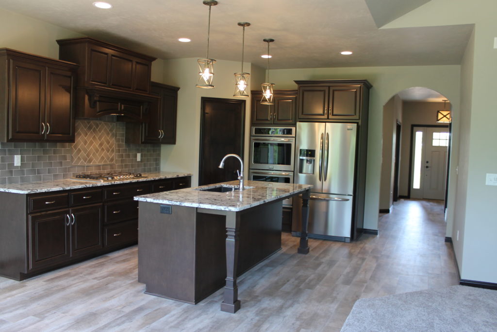
This kitchen features the fridge on the outside of the kitchen layout closest to the dining room.
It weight and depth of the fridge acts like a bookend on the cabinetry, giving the rooms some separation without a corner or another wall of cabinets to divide the space.
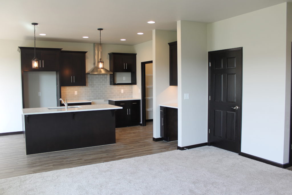
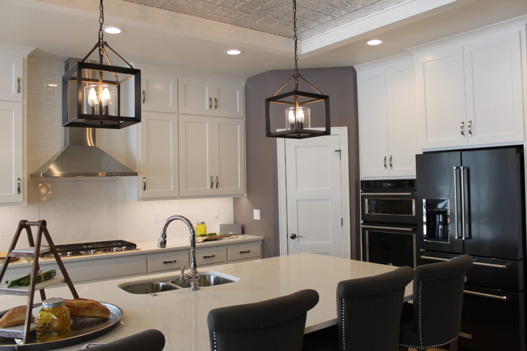
This kitchen layout is similar, with the fridge closest to the dining room and the sink centered under the window.
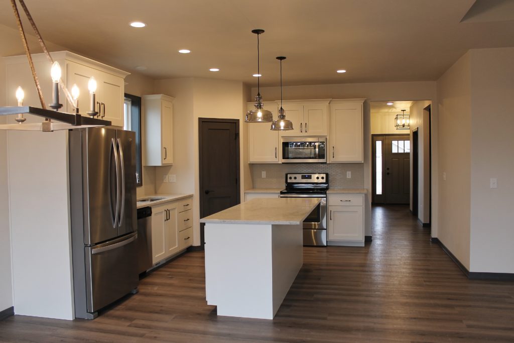
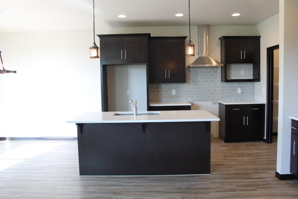
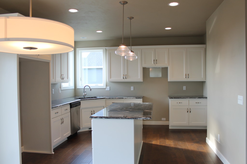
This kitchen shows the openings for the appliances, even though they aren’t installed yet. The fridge opening is to the left of the range.
It shares a wall with the dining area and balances the pantry in the opposite corner, adding a symmetry to the ends of the kitchen.
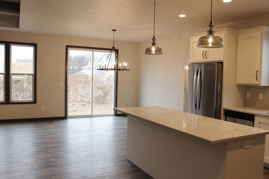
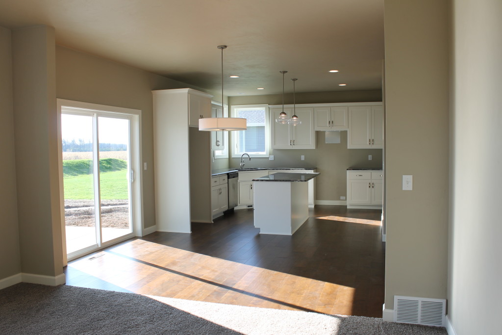
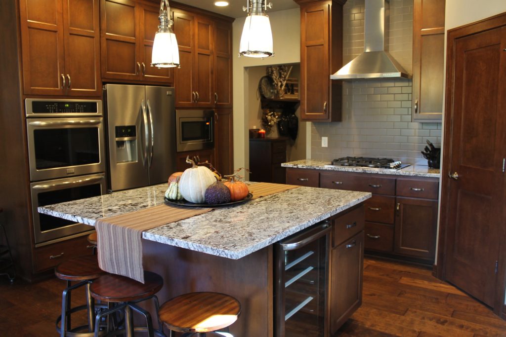
This kitchen also shows the opening for the fridge on the outside of the U-shape next to the patio door.
This location is preferred over the opposite corner where the fridge door would open against a wall and crowd the stove.
Of course the other trend is to do a complete appliance wall, where the fridge and ovens are built into cabinetry together without any counter space in between. This design works especially well if you are looking for more separation between your kitchen and other living spaces.
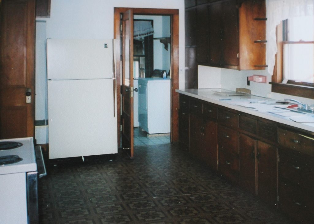
I’ll admit the fridge location was the thing I struggled with in my own old house makeover. Ultimately I had to keep it in the same spot, and it works well, but I would love to have been able to relocate it further from all the doorways in my space. Another old home quirk- why so many entrances into the kitchen?
Original photo of my house:
See the stove peaking out of the lower left hand corner of the photo? That was my weird “floating” appliance. It was just sitting there against a wall, no cabinetry around it. Older home kitchens! They just need a little love- and some good design!
Leave a Reply