How to Mix and Match Lighting for a Designer Look!
For those of you new to my Blog, we have been following the Millers as they build their custom MDH home in Amherst, WI. We’ve peeked into each room as the project came together and we will have a chance to catch up with the Millers after they move in. But today I wanted to follow-up on their unique lighting choices, which many of you noticed when you commented on the pendant lights they chose for their kitchen island.
When it comes to selecting lighting, all the rules have changed! You no longer have to pick from all one series or collection. Keep in mind your style and take these lighting tips from the Miller home to add a little mismatched perfection to your lighting list!
Make a first impression!
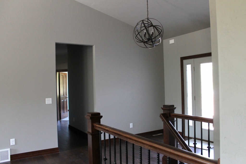
As soon as you enter their house, the foyer brings you a visual lighting treat!
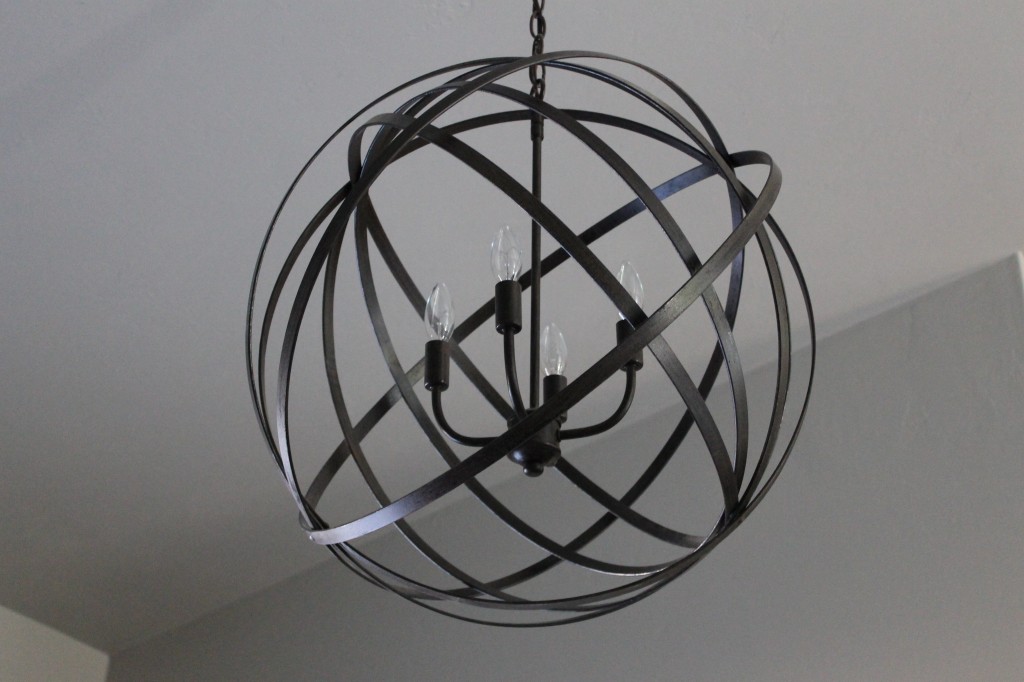
The sloping ceiling gives this orb enough space to hang down and become an accent. I think what really works about these orb lights is how they stand on their own and aren’t expected to match anything. Like a piece of abstract art.
Have fun with it!
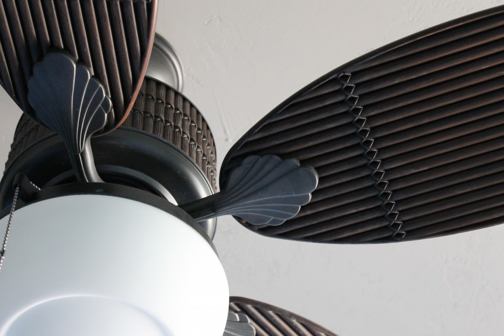
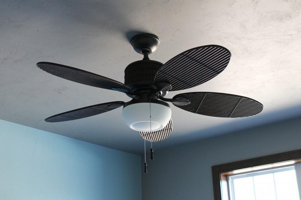
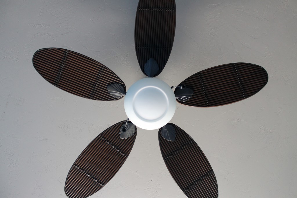
The dark wood of the trim and cabinetry throughout the home matches this ceiling fan in the guest bedroom perfectly, but the fun is in the grooved blades that give this a woven, tropical look.
The guest room is the spot for Tricia’s vacation art. A picture, to be revealed in a future post, that we chose the turqouise accent wall color around.
Who wouldn’t want to stare up at this cool ceiling fan if you were an overnight guest?
Don’t be so matchy-matchy!
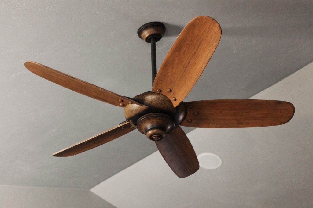
This ceiling fan is in the Great Room of the Miller’s home and the lighter honey colored fan blades still look great with the dark woods everywhere else.
Tricia knew that many of her pieces of furniture for the living room and foyer would be this warmer wood tone. The aged metal look and the rivet effect gives this fixture a tie in to the other metals you see throughout the lighting they chose.
Try something bold in a guest bath!
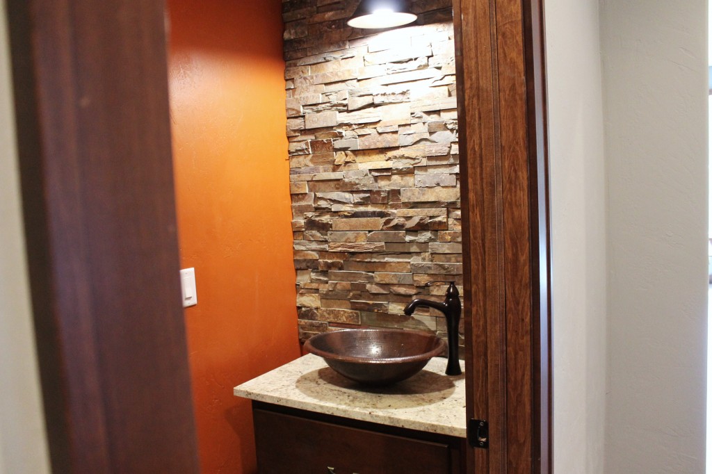
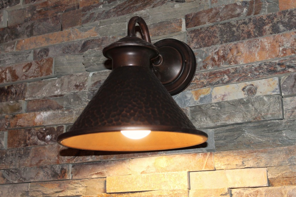
A guest bath is an opportunity to go for looks over function! It is not a room where you need a lot of light for shaving or putting on make-up. The Miller’s have an awesome half bath off their garage with a vessel bowl sink, furniture piece vanity and a slate-stone wall! The mirror is on its way, although it is almost a crime to cover up that stone…
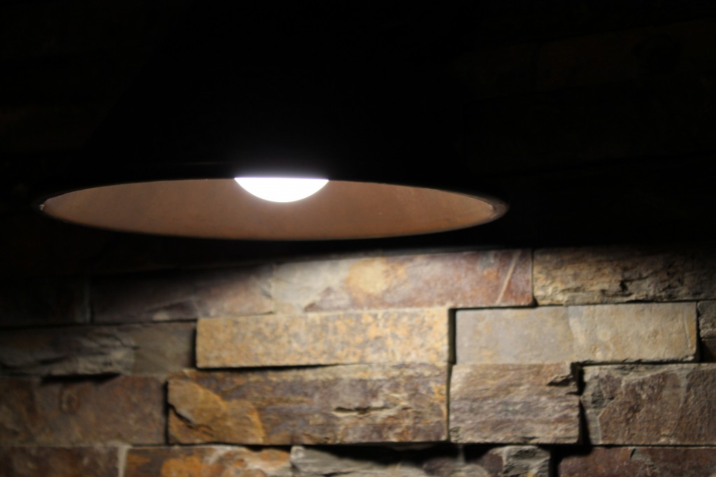
And hanging in the middle of this gorgeous stone wall is this hammered copper sconce light!
Go for drama where drama is due!
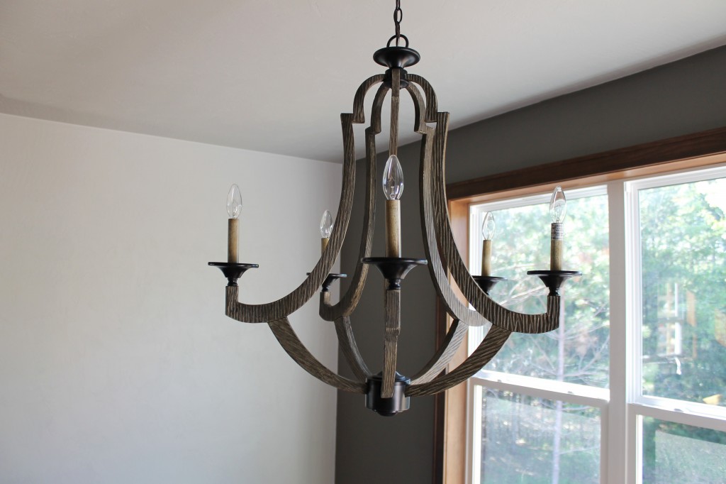
Since we met at the Hemlock design during the Green Bay Showcase of Homes, Tricia had her sights set on this chandelier. You may have recalled seeing it on my Top 6 Picks lighting list from spring.
Amongst the windows full of a view of greenery and trees, this skeletal wood and metal chandelier looks graceful and bold!
Always pick something you absolutely love!
I have a rule when I pick lighting for my house- I have to love it, or else I keep looking. Not every piece needs to be unique, but you should always have a favorite. That one lighting choice that you are willing to design a room around!
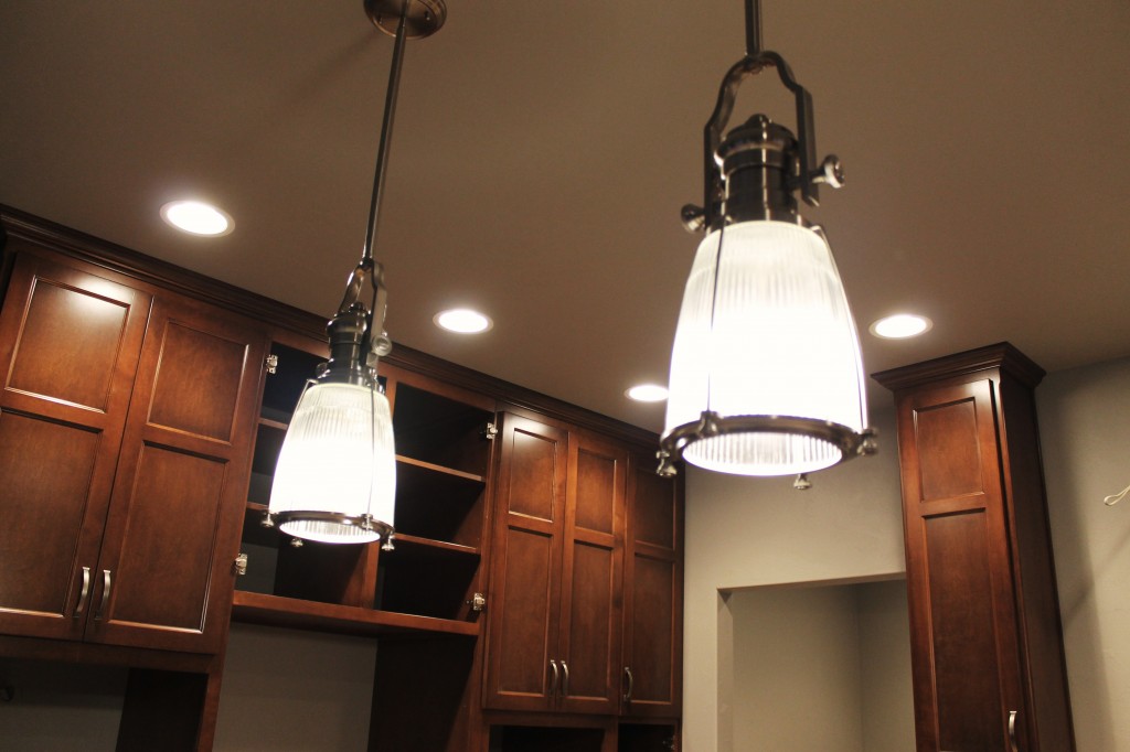
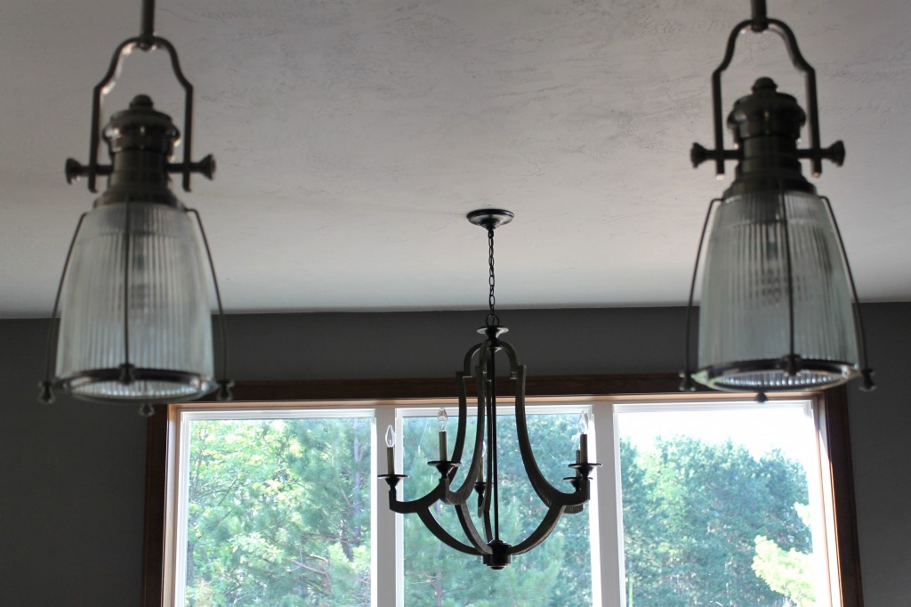
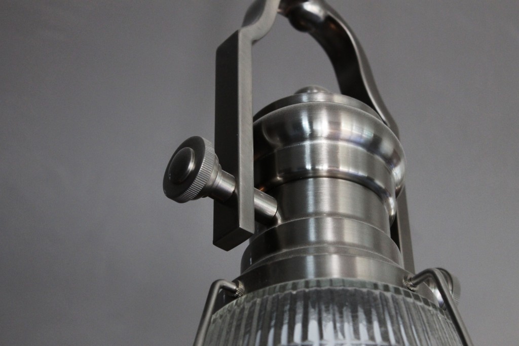
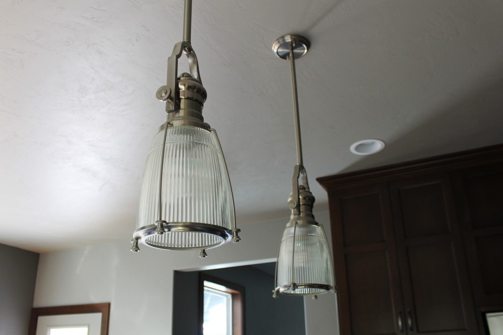
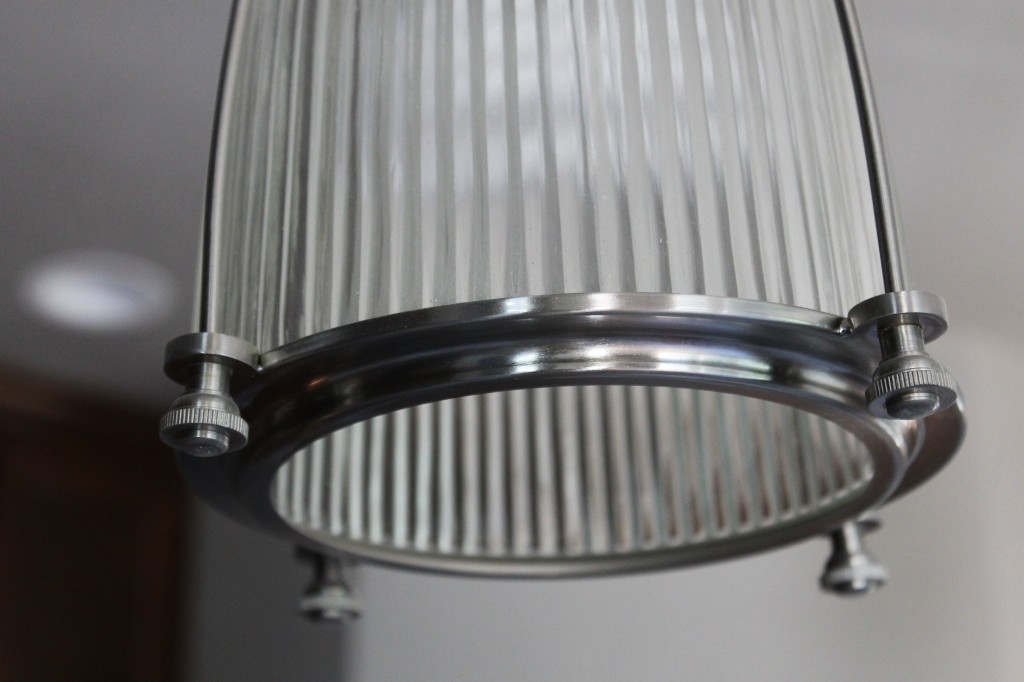
For the Millers, that was their pendant lights. They found them online and fell in love. At our framing walk-thru we had to pull the dimensions off the internet description to make the spacing work with the size of the island.
And it was totally worth all the math!
Chances are, if you pick something you love, others will love it too! And it might just be the thing everyone remembers the most about your home! Although here at Turkey Trail, there are several details that are unforgettable!
How about you? Do you have a favorite light in your house that was totally worth the splurge?


Leave a Reply