Paint Colors of the Year: Pantone vs Sherwin Williams
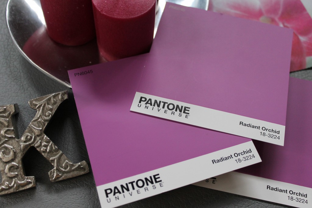
If you’re addicted to Project Runway like me, we were already introduced to the Pantone Color of the Year with the Nina Garcia design challenge last month. Pantone Paint’s 2014 color of the year was announced as Radiant Orchid, a high energy shade of purple. While I found it to be a fun and vibrant option for a fashion accessory, I am still wondering how I would respond to it on a wall. While in the paint department at Lowe’s, I almost grabbed a test pot of it, because for $4 I am sure I could find something in my house to paint Radiant Orchid. I have been drawn to the creative uses of the shade as a backdrop for a dining room or bedroom with a nuetral pallet of khakis, burlap and weathered driftwood stain. I also really love the picture on Pinterest of a dining room table painted in the hue, surrounded again by more nuetrals.
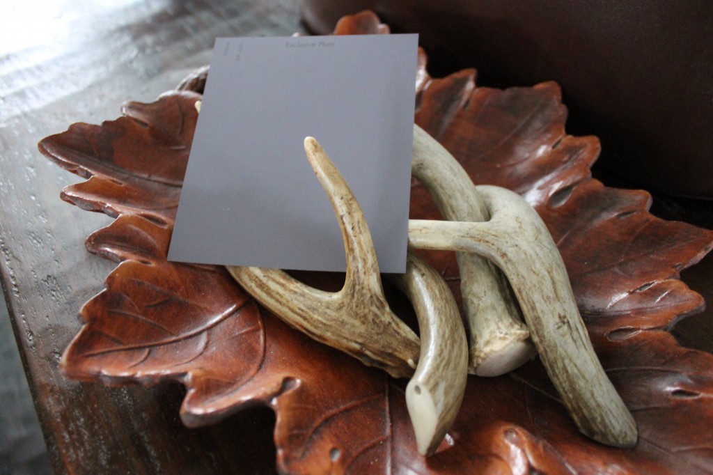
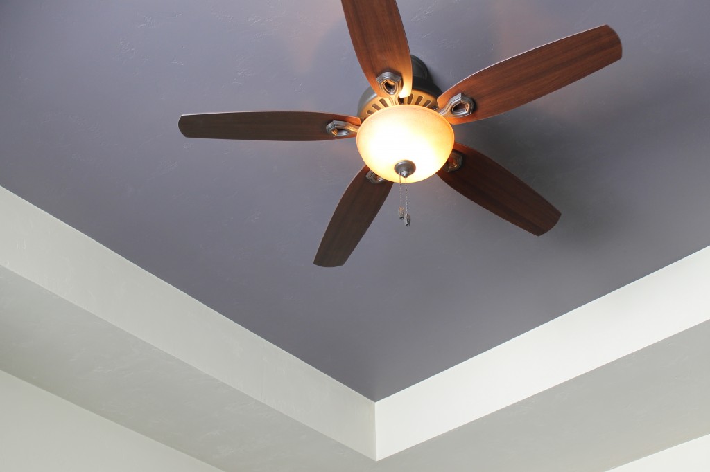
Compare this to the moody gray purple that Sherwin Williams announced as the 2014 Color of the Year. Not as bold but more on trend with the color schemes we have seen that often include white painted trim and rich dark wood floors.
I especially like this tray ceiling accented with Exclusive Plum.
Which color is more your style?


Leave a Reply